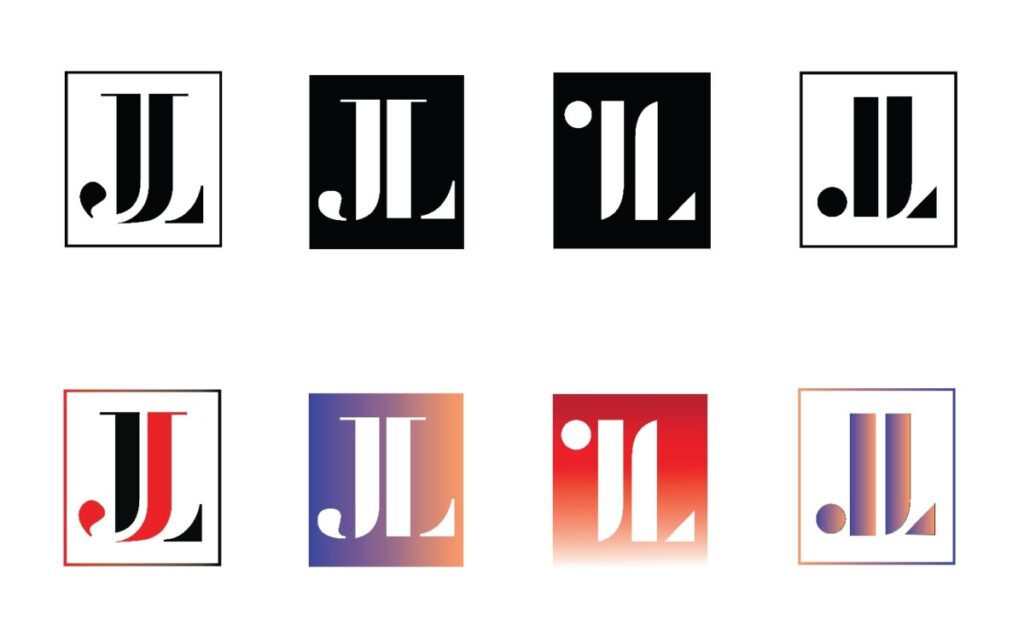
These were some of my sketches for the initial stages of this project in my Graphic Design II course. I eventually narrowed them down to four of my favorite ones and added color to them in Adobe Illustrator.
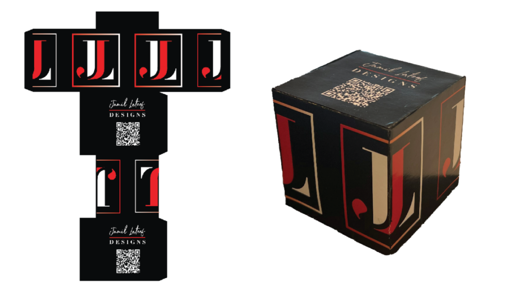
For my final ligature logo, I chose the red & black variation inside of a bounding box. The J and L are intertwined with one another in a way that I think presents very well. I then applied the logo to a physical cube mock up and a few digital mock ups to finalize Project 4.

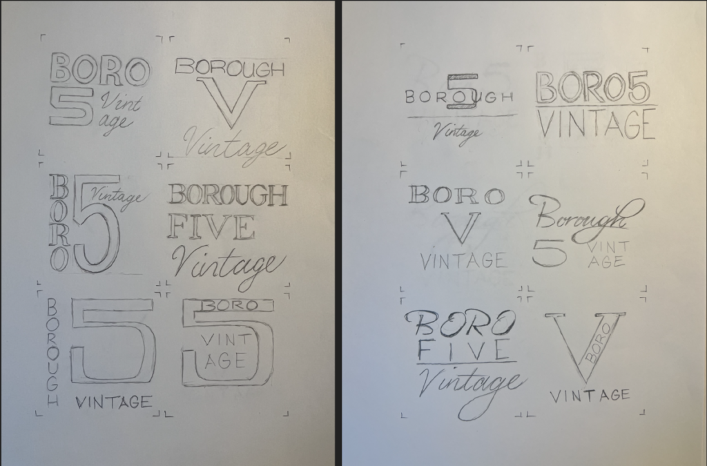
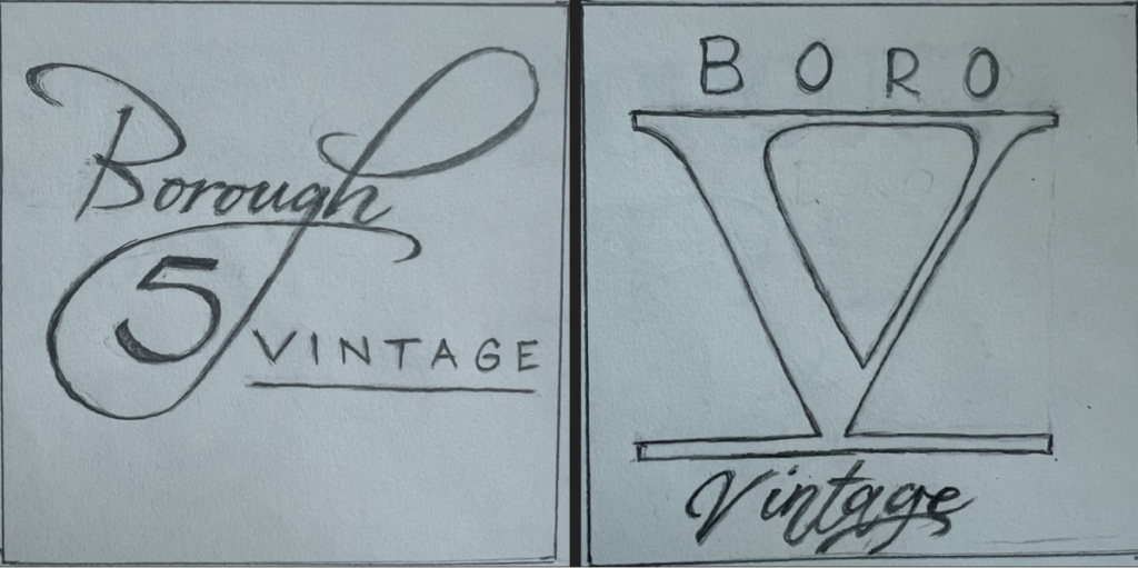
These were a series of rough sketches I did for the initial stages of a Logo project in an Advanced Typography class. I narrowed the sketches down to two and eventually settled on the logo pictured with the Roman numeral 5.
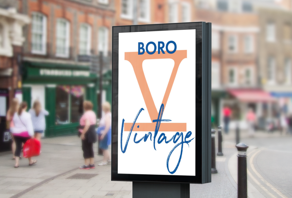
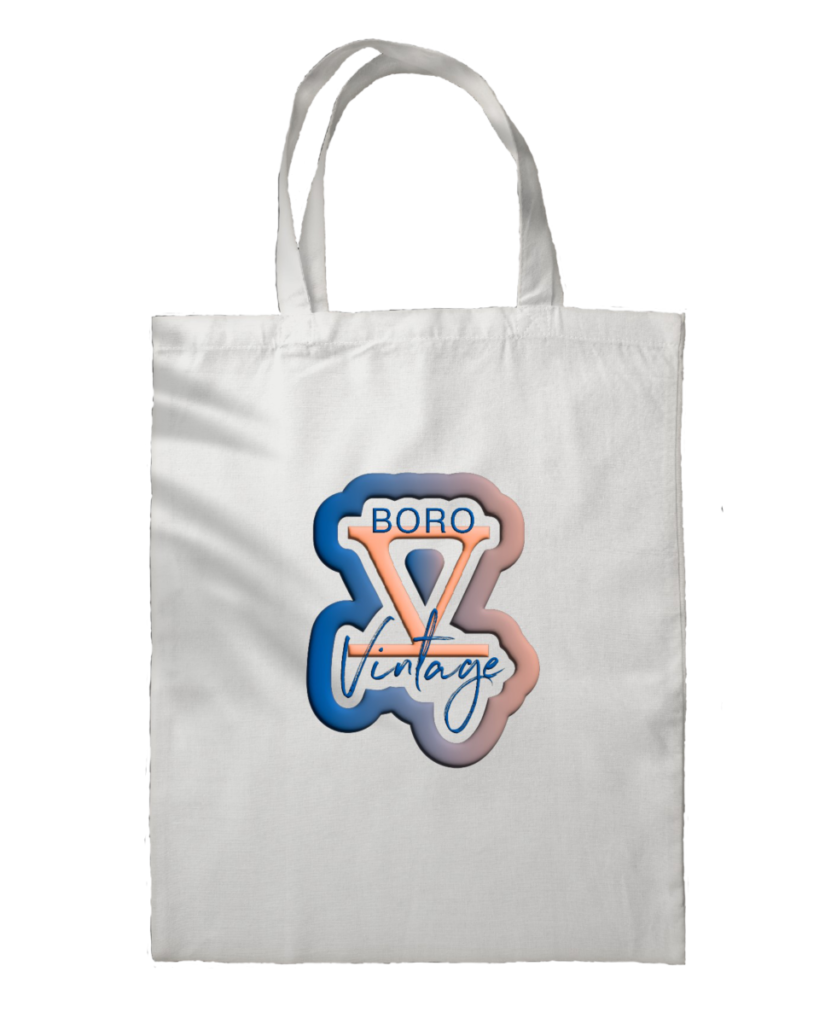
Here are a couple mockups I did for the Boro 5 Vintage logo. The one above is on a sign and the other one is on a tote bag. I added an inflated effect along with a stroke to the one below using Illustrator’s 3D & materials tool.
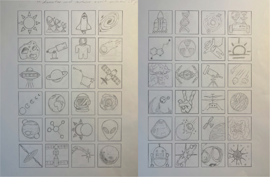
These were some of my initial thumbnail sketches for an icon project in Graphic Design II. We all had to choose a question from the board and create thumbnails based on that question. The question I chose was, “What do we mean when we say universe?” From there, I drew 96 thumbnails and then digitized 6 of them in Adobe illustrator.
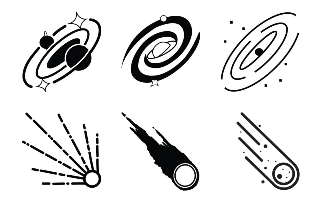
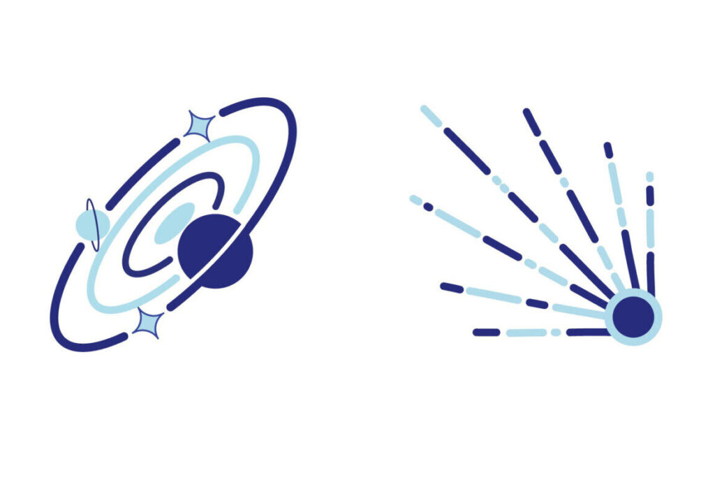
Below are the final two icons I decided on. One is a representation of a galaxy and the other is depicting a comet in motion somewhere in our universe. For this project, I really had to break the habit of making things busy and complicated. I learned a valuable lesson in design. And that is that less can really be more and it’s ok to simplify things especially if you need said things to communicate effectively and in a universal way.
