I love typography and being able to attend this event a second time was amazing. It is essentially a critique where 4-5 people submit typography related work beforehand, they present it, and then the audience gives feedback on it. It is surprising how much people knew about typography. They would mention terms I’ve never heard of and also notice small details that could be fixed. There were 4 presenters this time and each was given roughly 10 minutes total.
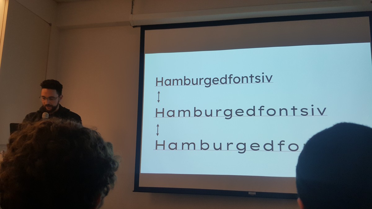
First was Thomas Jockin. He created the LXND font. He created it for the company Lexend which their goal is to improve reading for kids by encouraging reading materials to normalize their san serif font. Statistics show that kids are struggling to read and they believe that changing the font can improve reading proficiency. Compared to Times New Roman, LXND as less contrast and simple so it requires less strain for kids. Interesting enough, they did some studies and they saw 20% reading improvement in kids when using this font.
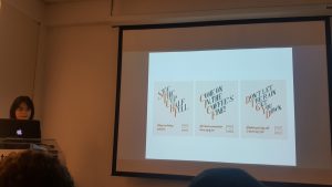
Next was Pamela. She did a poster campaign for Roasters Collective which is a Coffee Shop. She was going for a 1950’s vibe. For her campaign, she created her type from scratch which is super impressive. She created a serif to give it a classic feel. However, I was surprised on the amount of feedback she had. At first glance, I thought it was perfect but people noticed many inconsistencies within her type and spacing that needed to be fixed. But everyone agreed that it was a fantastic start and just needs some fixing to reach its full potential.
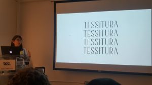
The third was Rebecca. Instantly, she received a lot of Ooos and Aaahs. The created a typeface called Tessitura. It was for a company but she was forced to alter it to how they wanted it and she didn’t really like it. So she has been working on the original typeface as a personal project. It is a beautiful typeface that gave a french, art deco, architectural vibe to it. It is a high contrast font and used as a display. The only critique she has was to fix her baseline for O’s, the width of some of her letters, and keep consistency.
And lastly, we had Samantha. What was interesting about her work is that it wasn’t a typeface but more like lettering. She based most of her work on her love for typefaces, growing up in NYC, her ethnic background and culture. She follows an unconventional theme throughout her work. She wanted help on how to fix a display font she was working on and also a lettering project aswell.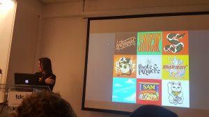
Afterward, It was networking time with some wine. Me and my friend, Giselle, talked to Carol, who was the Executive Director of the Type Director’s Club. She was sharing her story on how she started working there. She first was just helping out the company through her husband but she ended up doing most of the tasks that they offered her the job to work there. She also shared that back then, women were limited to do certain jobs such as nursing and being housewives. She was a housewife for 10 years but she always wanted to go to college and she finally did. Interesting fact: Her birthday is on Thanksgiving.

