Pictures were taken at three different locations
Green-Wood Cemetery, Brooklyn
Brooklyn Botanical Gardens
Research.Create.Inspire...

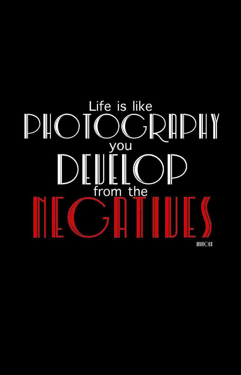
This concept is in black and white because it represents positive and negative and, It also resembles the feel of film. I chose this font because I find it feels elegant and contrasts each other. The font is center aligned for the purpose of illustrating that, although, we would like to have a straight forward or tight laced life, life has twists and turns and we are the ones that have to conform or color outside the lines.

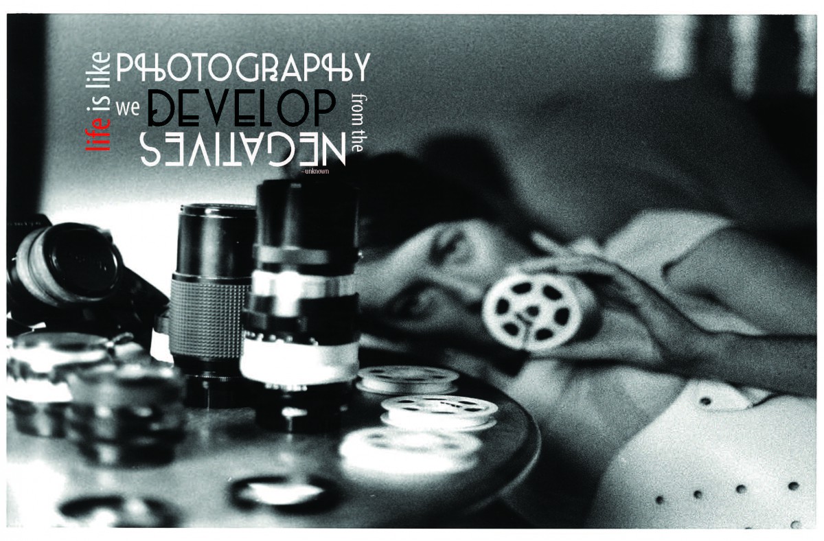
This concept is about life imitating art. I wanted to capture the reader to the quote and then gravitate them towards the image. The image is of photographer SK from Portland Oregon, that loves black and white images and only works with film still in this digital age.
This concept was me trying to do something different and elegantly simple. Life like photography has infinite possibilities, but it does not have to be hard. The positive and negative is working together to display this delicate balance.
Caleb Bradham, a pharmacist of New Bern, North Carolina created Pepsi in 1893, the famous soda was originally called “Brads Drink”. Bradham renamed and trademarked his popular drink Pepsi-Cola in 1903. Since Pepsi’s creation in 1893, there has been many enhancements and changes to the logo and stylized script font on the bottle and caps. Although the Pepsi-Cola brand was very lucrative early on as the depression of 1929 hit, Bradham went bankrupt. Since then Pepsi was acquired by several owners however, the brand’s name has not changed since 1950. In the early 1900’s many companies’ logos were comprised of decorative script typeface as a means of personalizing their product/brand.
Originally, the Pepsi logo started out as a centered stylized script font. After the United States second world war 1939-1945 the “Pepsi Globe” was created in Red white and blue in efforts to show their patriotism with a circular logo that incorporated a centered stylized script font 1950. The Pepsi logo then evolved into a san serif typeface above a red color block with a right aligned globe in 1991, to the current logo by the Arnell Group which is an controversially altered version of an emoticon where the colors are skewed inside of the globe shape.
Over the last century the owners of Pepsi have altered its logo inefforts to rebrand. To support the United States during the second world war the “Pepsi Globe” was created in red, white and blue with the script through the middle of the illustrated cap as a way of showing its patriotism. Which became a part of all the future logos for the companies marketing campaign. Until the 2008 redesign, the Pepsi Globe resembled the Taegeuk symbol that is widely used in South Korea. Pepsi has now settled with a 3D logo that vertical sans-serif lettering below.
The current Pepsi logo by the Arnell group which is an controversial version of an emoticon where the colors are skewed inside of the globe shape to represent several types of smiling faces. Although, I love Pepsi unil now, I never made that connection. Ultimately, it makes you wonder with all the billions of dollars being spent is the design as effective as the owners would like it to be. A simple answer would be yes, the Pepsi Globe is considered one of the world’s most recognizable corporate trademarks.
Works Cited
Crum, Madeleine. “Pepsi Logo Timeline: The Evolution Of The Company’s Brand.” The
Huffington Post. TheHuffingtonPost.com, 28 Dec. 2012. Web. 14 Sept. 2013.
Danielle M. Web log post. N.p., 1 Feb. 2011. Web. 15 Sept. 2013.
Glass, Chris. “Logo Design Love.” Thoughts about Pepsi. N.p., 2 Jan. 2009. Web. 12 Sept. 2013.
“Pepsi Globe.” Wikipedia. Wikimedia Foundation, 08 July 2013. Web. 12 Sept. 2013.
Perry-Zucker, Aaron. “Pepsi Logo Design Brief: Branding Lunacy to the Max | Fast Company |
Business Innovation.” Fast Company. N.p., 10 Feb. 2009. Web. 08 Nov. 2013.
© 2025 Jennifer Fortunato's ePortfolio
Theme by Anders Noren — Up ↑