Research.Create.Inspire...

Author: Jen

Brainstorming


I’m still in the brainstorming stage, I’ve done some drafting both by hand and on the computer to give me an idea of what I want to do. I’ve researched brochures from other homeless shelters to get a feel for what they are doing. I want to make sure that the design language is cohesive. I want to have a few design concepts before I really decide on which direction I want to go in.

While brainstorming, the very first step is to identify your brochures objectives.  Answering these questions determines the direction of  the brochure design. Who is the target population you are going to distribute your brochure to? What is the function of the brochure? How will it be distributed and what purpose does it serve?

Located at 55 West 110th Street across the street from Central Park. Its really inconspicuous, most people really do not have a clue its there. Because the shelter serves individuals with varing degrees of complexity they require extreme privacy.  While going through this process i had to question the support staff about the do’s and dont’s.

Ultimately, I want my supervisor and the staff to be proud of what I come up with. I don’t want to present them with something that they feel doesn’t fit their message. This will not only be a reflection of Aguila Inc. it will also be a reflection of my workThis brochures purpose is to be informative .

My Assignment

Having two different projects to work on can often be difficult. Working on rebranding the Shelters brochure and letter head is not an easy task. Being the Shelters first intern added another level of pressure. I’ve dealt with pressure juggling school, work and motherhood so this task while daunting isn’t something I can’t handle.

Being able to work from home is a huge plus. It gives me time to brainstorm ideas without distraction. I can focus on the tasks at hand as an intern and still have time to focus on the rebranding. I want to represent the culture of the shelter so that the letterhead and brochure fit them and doesn’t clash with the message of the shelter.

I wanted to start work on the letterhead and brochure as quickly as I could. I am eager to get feedback from my supervisor and the staff. I looked at the documentation that they have now and I want to modernize it and make it more visually inviting.

1st Day Jitters

My first day began with a two-hour information session, a breakdown of not only what i was to expect during my internship, and what will be expected of me. This information was vital for my understanding of my overall responsibilities as an intern.

Afterwards, my internship supervisor met us in the conference room where she further informed me of what to expect. At the end of our orientation, she introduce me to some of the other support staff and explain how they operate. It was really cool to hear that I was their first intern and frightening at the same time!

The great part was that they understood that i already worked full-time and they were considerably more understanding/ flexible. I have to admit, I initially thought the introduction process was going to be a boring, but i’m actually excited about the road ahead!

Orientation

This semester I will be working with Aguila Inc  which is a shelter for homeless people and families.  I interviewed and shortly afterwards attended an orientation with Aguila Inc on Sat Sept 9th. When I went for my interview I felt nervous and concerned about what the working environment might be.

I normally research a company before an interview and this time I was so busy with my personal life that I hadn’t. However, the interviewer was cool and easygoing. I dressed professionally and was open and honest about my skill sets during the interview.  I’ve worked in customer service for some time now and I figured it’s just about how interact and present yourself.

We spoke about my availability and I was surprised to hear that the job was flexible and that I could work from home. We discussed what I would be  doing while interning. Which is mainly working on rebranding their brochure and letter head.

Photography 1

Pictures were  taken at three different locations

Green-Wood Cemetery, Brooklyn

14148410201_f52cd26f2c_o  14123584752_079244b73f_o


Brooklyn Botanical Gardens


14127166734_32679a6806_o 14080295604_c3e53ee120_o


Prospect Park, Brooklyn14063626273_4ea5ef6107_o 14020499796_32b22e71f9_o

Visual Quote Project

negative1

This concept is in black and white because it represents positive and negative and, It also resembles the feel of film. I chose this font because I find it feels elegant and contrasts each other. The font is center aligned for the purpose of illustrating that, although, we would like to have a straight forward or tight laced life, life has twists and turns and we are the ones that have to conform or color outside the lines.


filmmquote


This concept is about life imitating art. I wanted to capture the reader to the quote and then gravitate them towards the image. The image is of photographer SK from Portland Oregon, that loves black and white images and only works with film still in this digital age.

camquote2

This concept was me trying to do something different and elegantly simple. Life like photography has infinite possibilities, but it does not have to be hard. The positive and negative is working together to display this delicate balance.

The Evolution of Pepsi

Caleb Bradham, a pharmacist of New Bern, North Carolina created Pepsi in 1893, the famous soda was originally called “Brads Drink”. Bradham renamed and trademarked his popular drink Pepsi-Cola in 1903. Since Pepsi’s creation in 1893, there has been many enhancements and changes to the logo and stylized script font on the bottle and caps. Although the Pepsi-Cola brand was very lucrative early on as the depression of 1929 hit, Bradham went bankrupt. Since then Pepsi was acquired by several owners however, the brand’s name has not changed since 1950. In the early 1900’s many companies’ logos were comprised of decorative script typeface as a means of personalizing their product/brand.

                            pepsi

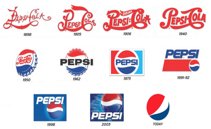
Originally, the Pepsi logo started out as a centered stylized script font. After the United States second world war 1939-1945 the “Pepsi Globe” was created in Red white and blue in efforts to show their patriotism with a circular logo that incorporated a centered stylized script font 1950. The Pepsi logo then evolved into a san serif typeface above a red color block with a right aligned globe in 1991, to the current logo by the Arnell Group which is an controversially altered version of an emoticon where the colors are skewed inside of the globe shape.

Over the last century the owners of Pepsi have altered its logo inefforts to rebrand. To support the United States during the second world war the “Pepsi Globe” was created in red, white and blue with the script through the middle of the illustrated cap as a way of showing its patriotism. Which became a part of all the future logos for the companies marketing campaign. Until the 2008 redesign, the Pepsi Globe resembled the Taegeuk symbol that is widely used in South Korea. Pepsi has now settled with a 3D logo that vertical sans-serif lettering below.

                                         pepsi_bottles

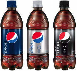
The current Pepsi logo by the Arnell group which is an controversial version of an emoticon where the colors are skewed inside of the globe shape to represent several types of smiling faces. Although, I love Pepsi unil now, I never made that connection. Ultimately, it makes you wonder with all the billions of dollars being spent is the design as effective as the owners would like it to be. A simple answer would be yes, the Pepsi Globe is considered one of the world’s most recognizable corporate trademarks.

Works Cited

Crum, Madeleine. “Pepsi Logo Timeline: The Evolution Of The Company’s Brand.” The

Huffington Post. TheHuffingtonPost.com, 28 Dec. 2012. Web. 14 Sept. 2013.

Danielle M. Web log post. N.p., 1 Feb. 2011. Web. 15 Sept. 2013.

Glass, Chris. “Logo Design Love.” Thoughts about Pepsi. N.p., 2 Jan. 2009. Web. 12 Sept. 2013.

“Pepsi Globe.” Wikipedia. Wikimedia Foundation, 08 July 2013. Web. 12 Sept. 2013.

Perry-Zucker, Aaron. “Pepsi Logo Design Brief: Branding Lunacy to the Max | Fast Company |

Business Innovation.” Fast Company. N.p., 10 Feb. 2009. Web. 08 Nov. 2013.