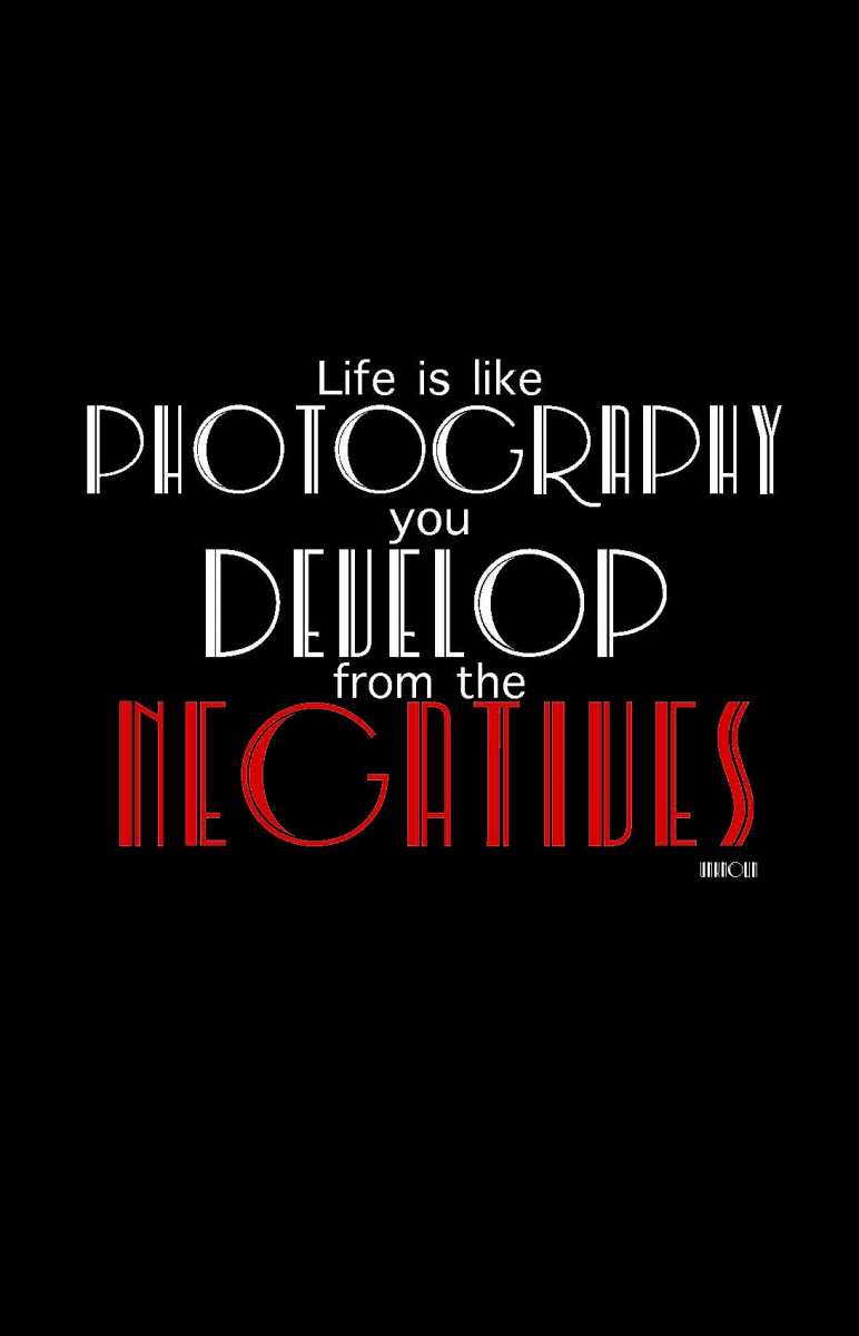
This concept is in black and white because it represents positive and negative and, It also resembles the feel of film. I chose this font because I find it feels elegant and contrasts each other. The font is center aligned for the purpose of illustrating that, although, we would like to have a straight forward or tight laced life, life has twists and turns and we are the ones that have to conform or color outside the lines.
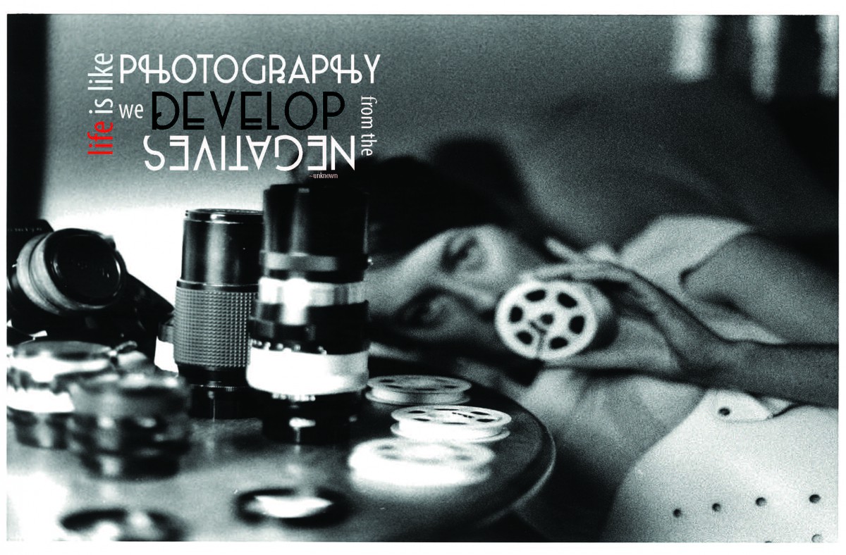
This concept is about life imitating art. I wanted to capture the reader to the quote and then gravitate them towards the image. The image is of photographer SK from Portland Oregon, that loves black and white images and only works with film still in this digital age.
This concept was me trying to do something different and elegantly simple. Life like photography has infinite possibilities, but it does not have to be hard. The positive and negative is working together to display this delicate balance.


Leave a Reply