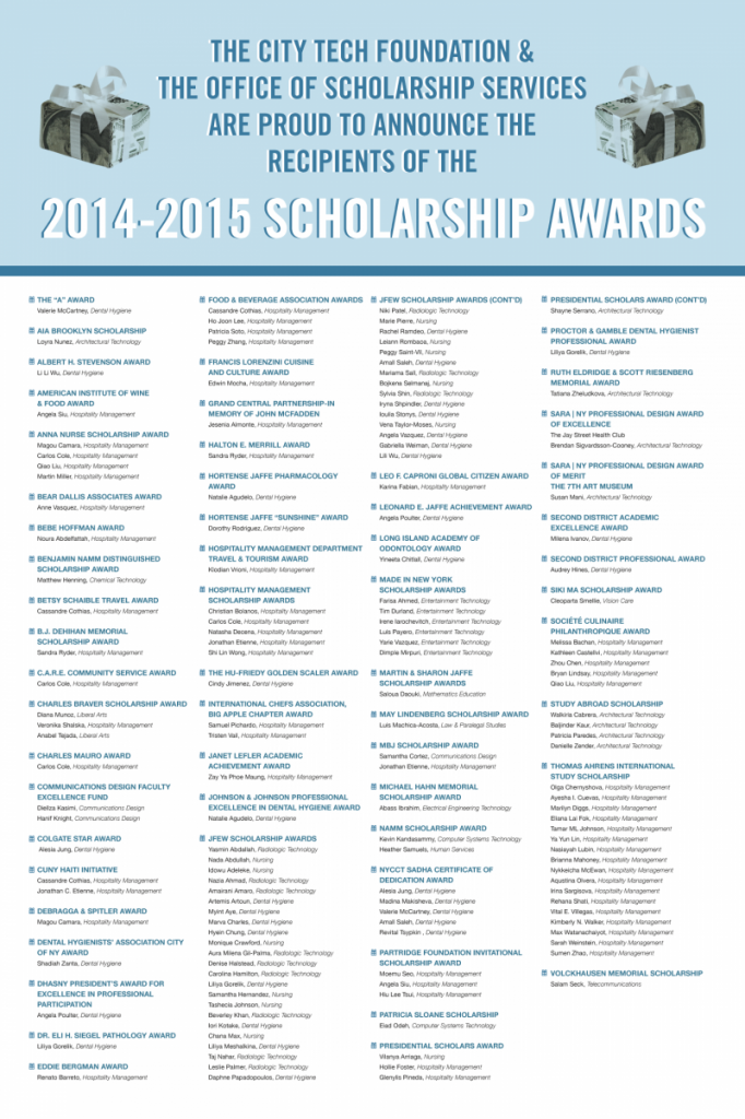
Today I was assigned a new project – to design a poster for the list of students who received scholarships this school year. This is a very text heavy poster – so designing it was a bit of a challenge. I’m comfortable with Indesign, so I made sure to create paragraph and character styles when needed. Discerning the text hierarchy was the most important aspect of this project. I made sure to use different colors and font-weights where appropriate. Looking at it now I feel like I did a good job solving this problem.
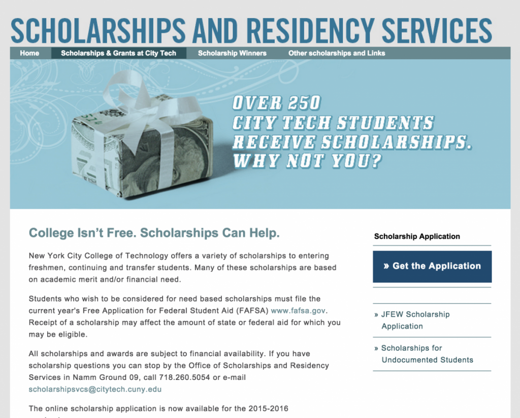
For the header, I used the money gift box that is used on the school’s scholarship page and used similar colors for the text and background.
After all the styling was completed I felt that there was a missing aspect to the poster. I then talked with Prof. Vargas and we decided on adding bullet points to the headline text of each category. This helped reduce the monotony of the text. Below is the completed version of the project – it should be up in the school halls soon!

