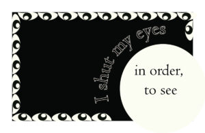
For this design, I was going for a simplistic look. Therefore, black and white were the colors I chose. With inspiration from a traditional postcard design, I knew i wanted to incorporate a border. So, I created a border with eyes to further emphasize visual memory. I wanted to give a spotlight effect to “in order to see” and bolding the font to make the type extra clear. I used Centaur typeface because I believe a serif would give off an old but clean look.
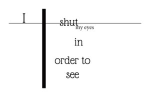
Concept two focuses on the typeface and the minimal design, For the typeface, I used glass antiqua because similar to the previous concept font, it brings an old antique feel. I wanted to play with the arrangement and alignment of words. There is a line through shut to give the word emphasis and life.
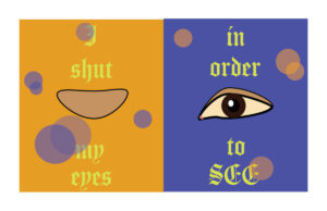
For my last concept, I wanted to play with colors and create a bezel effect. To make the design feel fun, I added circles of the opposite color and changed the opacity so that the letters behind the circles are visible. I chose orange and blue as the bezold background with yellow fill in the typeface because the typeface would pop a lot more with a blue background than an orange background. Therefore, I chose to have “I shut my eyes” with an orange background as itd be less visible than “in order to see” with a blue background.

