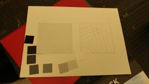
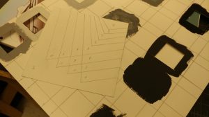

I’ve learned about how different materials make shades of black and white look different. Such as how magazine papers print out black and whites as opposed to painting them onto bristle paper.
A City Tech OpenLab ePortfolio


I’ve learned about how different materials make shades of black and white look different. Such as how magazine papers print out black and whites as opposed to painting them onto bristle paper.
I would like to work for these companies as they are around my interests. Adorama specializes in camera and video equipment. Tumblr is a social media platform that updates with new ideas constantly. J.Crew is a clothing store that caters to both women and men on the latest trends.

jajajajajajajajajajajajajajajajajajajaja funny venn diagram
Transparency ~
Layering ~
These examples showcase very strong transparency and layering ideas with the first 3 being transparency and the final 3 being layering. The transparency images are strong visual examples of themselves as they introduce a background and a subject that possesses multiple color values to imitate transparency. The layering images are strong visual successors to themselves as they showcase many shapes and ideas with different opacities, colors, and spacings.
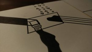
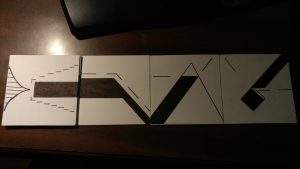
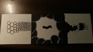
I learned how to think more creatively and approach contrast with an “out of the box” mentality while doing this project.


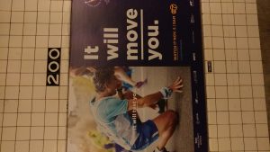
These subway advertisements show great examples of visual hierarchy as they all properly implemented layering and shape weights.
Rhythm –
These 3 projects are successful examples of rhythm because of the way the designs and placements have been executed. Although it may not look like it, rhythm is seen as a natural flow within art pieces. This ranges from regular posters to even patterns.
Movement –
These 3 images are successful examples of movement because they all depict a sense of motion without actually moving. Movement is just a motion but when combined with art, it is difficult to capture.
These 3 art pieces showcase successful practices of contrast by their shape, colors, and objects presented. The first image shows contrast by utilizing many objects that very different color variations from eachother. The second image shows contrast by using 3 objects where 2 of them are stacked and the final object is on its own next to the stack. The final image showcases contrast by utilizing neon colors on a black and white image.
Finally, after completing project 1, I have learned to be much more careful with the way that I conduct and finalize future projects. I don’t have a very sturdy hand when it comes to doing physical art (as I am more used to doing things digitally) but I’m hoping that later down the line I eventually master doing art on paper as opposed to a screen. There were a ton of messy areas on the project that were done too far down the line where I couldn’t re-make the entire thing all over again. I need to take more time and precision into consideration when doing other ideas so they could come out much nicer.