Kentucky Fried Chicken
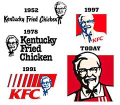
Kentucky Fried Chicken restaurant is a widely popular fast food restaurant since the 1950s. People everywhere recognize the infamous Colonel Sanders founder of the Kentucky Fried Chicken restaurant logo a mile away. Since1952, the Kentucky Fried Chicken (KFC) logo has changed about four times, but the distinctive picture of Colonel Sanders has always stayed the same. From 1952 to 1978, the KFC logo had a very simplistic and unappealing design that was in black and white. Its logo was very bland looking and not very eye catching. It showed a serious expression of Colonel Sanders that was not friendly and did not emit warmth or welcome customers. The only difference between the 1952 version and the 1978 was the change in the style and size of the typefaces. They only used black lettering and a San Serif based typefaces to show how serious they were about their product. The Colonel’s image did not have a welcoming feel towards consumers instead, he looked like a business man who to others indicated money and not a chef trying to entice people with his delicious food.Only until later on did KFC decide to change their logos gradually to fit in with the modern society and give off a warm and family oriented type of feeling.
It wasn’t until 1991 that color was added into the KFC logo to show a lively image of Colonel. It was during this time that the name Kentucky Fried Chicken was abbreviated into “KFC” to get away from the word “fried” that meant fatty and made their restaurant seem unhealthy to their customers. In 2007, a San Francisco based branding company named Tesser remade an American icon, the KFC logo into an appealing piece of art by bright colors and tight lines without having to use shading.Tesser is a branding company that goes all out to unify both the brand and the logo by using their environment and experiences to create a visual concept that will make a positive impact on their customers. They have made logos for well-known companies such as Popeye’s, Wendy’s, I Hop, Domino’s Pizza, Quizno’s and many other popular restaurant food chains. The KFC logo entails a picture of Colonel himself smiling with a bright red chef apron and a red background. Also there are thick lines used to define his facial features to make him look as if he’s popping out at you, which initially attracts people’s attention. The name of the restaurant is shortened to the initials of Kentucky fried chicken into KFC in thick black text underneath the framed picture of the Colonel. The text uses a slightly modified form of the Friz Quandrata typeface. It has a simplistic appeal to consumers. KFC started to grow and develop changing with the times and the demands of the costumers making them well known for their logo and delicious food. The Bright red color used in the logos brings a sense of warmth to the Colonels face which is inviting to consumers. 
All images were taken from google images (www.googleimages.com) Websites
http://rohitcgartist.blogspot.com/2012/12/kfc-logo-history.html http://www.famouslogos.net/kfc-logo http://www.dinesh.com/history_of_logos/restaurant_logos/kfc_logos_design_and_history.html http://www.tesser.com/client.aspx?id=28


Hello Dear, Nice website. I’m very happy to read your website.
thanks for sharing this, awesome content. Calum
Worst service I ever received at Sunward Park KFC