Color (Source)
Color occurs when light in different wavelengths strikes our eyes. Objects have no color of their own, only the ability to reflect a certain wavelength of light back to our eyes.
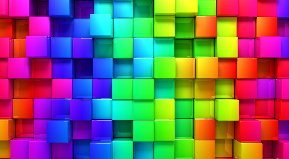
Informal: Color adds life to a design composition but varies on how it is viewed based on the viewer’s perception
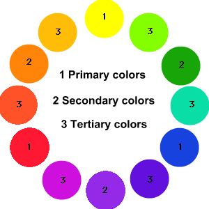
Hue (Source)
Hue is somewhat synonymous to what we usually refer to as “colors”. Red, green, blue, yellow, and orange are a few examples of different hues. The different hues have different wavelengths in the spectrum.
Informal:
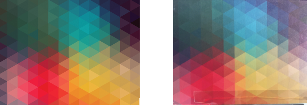
Saturation (Source)
Saturation is an expression for the relative bandwidth of the visible output from a light source. In the diagram, the saturation is represented by the steepness of the slopes of the curves. Here, the red curve represents a color having low saturation, the green curve represents a color having greater saturation, and the blue curve represents a color with fairly high saturation. As saturation increases, colors appear more “pure.” As saturation decreases, colors appear more “washed-out.”
Informal:
Intensity
Intensity, also called chroma or saturation, refers to the brightness of a color. A color is at full intensity when not mixed with black or white – a pure hue. You can change the intensity of a color, making it duller or more neutral by adding gray to the color. You can also change the intensity of a color by adding its complement (this is the color found directly opposite on the traditional color wheel). When changing colors this way, the color produced is called a tone.

