Author Archives: James

3 Companies I’d like to work for:

One design company I would love to work with is: Cibo. Link: https://cibosf.com/brand-experience-agency/?gclid=Cj0KEQjw3-W5BRCymr_7r7SFt8cBEiQAsLtM8kj0GWyZsagU7QY3TdnQYnQCw5no8XEn4vsam_VzQ6EaAgPY8P8HAQ

Reason: it’s a hi-end design firm with clients such as Lenovo computers and a car company… Tesla. It’s a small car company but certainly an innovator, I would give anything to work on such an account.

Another design company I would like to work for is: Lorraine Gregory Communications: Link: http://lorrainegregory.com/marketing/?gclid=Cj0KEQjw3-W5BRCymr_7r7SFt8cBEiQAsLtM8lV3arR-1Xqdchmy2ZAYe6uQ3p4dKMEughP3tnHhNxYaAi6R8P8HAQ

Reason: this company has a 21-century approach to design and marketing, it would be an excellent fit for me.

Avatar is another design company I’d like to work for: link: http://avatarnewyork.com/?campaign=adwords_local&matchtype=p&keyword=design%2520agencies%2520in%2520nyc&gclid=Cj0KEQjw3-W5BRCymr_7r7SFt8cBEiQAsLtM8jIQtaJUYBxDxk8znByl0eCsuqj-IeFF5Mpn17UEYjAaAlc38P8HAQ

Reason: cutting edge design work! They do a lot with fashion. I wish I could get into the firm.


Post for Visit to Cooper Hewitt:

pixar-process-lab

When we visit the Cooper-Hewitt 1 thing I’m excited about is: The “Pixar” exhibition looks very interesting! It has hand-drawn sketches, paintings, from over 25 Pixar films. Hands-on design activities that show how Pixar develops its characters – I would certainly like to do that, and it makes me want to look around and see what else they have to do and see.

ePortfolio Assignment 4 Due on 03/22/2016

Header Image Taken by James Massa, Site: http://www.jamesmassa.com

If you don’t already have the books for this class, use the link below to download them. : )

https://drive.google.com/folderview?id=0B-i_cSBjv-ymTzNpSTIwQU1NTDA&usp=sharing

Bullshit

Larisa when you asked me to come up with a pattern – what popped into my head was the graph of sine and cosine.

You didn’t like it – I will share with you what I have since learned because that is what you have asked us to do for this assignment Larisa – otherwise I would have just kept this to myself.

I wondered why I found the simple graph of sine and cosine so appealing. I made sine red and cosine blue – I wanted to show it to you, but you didn’t want to see it – anyway… I started to look into this, I found a great deal of information: trying to omit most of the math terminology I’ll point out what I’ve learned from sine and cosine and how and why they are so relevant to design.

  1. The Fibonacci Sequence – Leonardo da Vinci was on to something here…
  2. If you take the numbers from the Fibonacci sequence and you make an irrational expression from them – simplify the expression – then solve for x by setting up the expression as a quadratic equation you get something you can use for designing layouts.

X = 1.618………. this number goes on forever – think of pi – it’s just like that but this one is called phi. You can round it off to 3 decimal places because this is all you will need for design work.

This is how it works. Let’s say I want to do a layout – the format is a standard piece of paper – 8.5in by 11in’s.

Step 1. Multiply 1.618 x 11. This equals 17.798. Take this number and subtract 11. This will equal, 6.798 you can use this exact number (if you’re doing your layout on a computer) or you can just round it off to 7.

Step 2. Subtract 6.798 from 11. This equals 4.202. You can use the exact number or just round it off to 4.

You now have the ratio of 7 to 4. Or 4 to 7.

Step 2. Multiply 1.618 x 8.5. This equals, 13.753. Take this number and subtract 8.5. This will equal 5.253. Subtract 5.253 from 8.5. This will equal 3.247. You can round off to 1 decimal place or round of to whole numbers. You’ll get a ratio of 5.3 to 3.2 or 3.2 to 5.3 – or 5 to 3 or 3 to 5.

So what does this mean for design… does the diagram below ring any bells? I think you may have come across something like this before?  This is is useful information that I can use! This is what I’ve learned from this exercise on my own… combine this with gestalt principles and see the diagram below.

MotherFucker_)2

MotherFucker_1

Oh, and of course, the other things that I have learned is what you wanted to  instill in me Larisa – when cutting out and gluing pieces of paper be mindful of my craftsmanship – okay, got it. I won’t ever forget that important information.


ePortfolio Assignment 2 Due on 02/16/2016


When a White Square Is More than a White Square

“New York Times Article” by, Daniel McDermon, February 8, 2016

“There is far more to Robert Ryman’s work than first meets the eye. Here are some things to look for, as seen in a handful of the works now on display at Dia: Chelsea.”
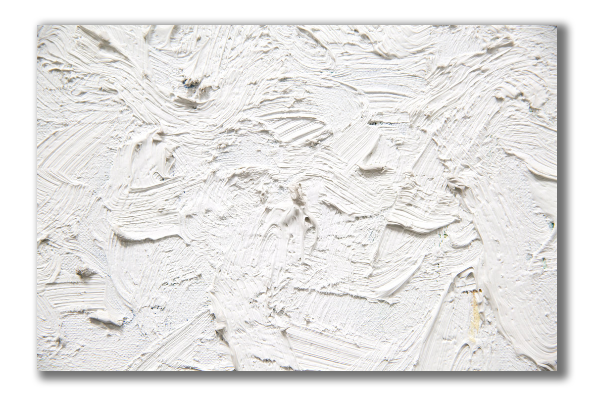
Image_1

“Untitled”

Circa 1960. Oil and gesso on linen

“The painter Robert Ryman’s works are often described by two characteristics: They are white, and they are square.

That isn’t entirely true — his abstract paintings include pigments and materials of many colors — but it is close enough that it remains the easiest way to describe Mr. Ryman’s work.

If you take a close look at the current exhibition at Dia: Chelsea, you quickly realize just how much can be contained within them. With smears and flecks and whorls of paint, built up in some places, washed out in others, the works catch the light in a singular way.”

Excerpt from “New York Times” article by, Daniel McDermon, February 8, 2016.

A rendition of the painting above “Untitled” painted by, Robert Ryman was featured in the “Netflix” series, “DareDevil” (love that show!). I would like to talk about that scene – where the future Mrs. King Pin shows that painting to the notorious arch-villain “King Pin” – she has this intriguing ability – she seems to know exactly what work of art would be most appealing to prospective buyers that visit her gallery…

But the assignment was to critique this painfully boring article in the New York Times art section… I think the point of the assignment was to gain some insight into design principles through the critique – oh, and to sign up for the 1-year free subscription to the Times.

I got the subscription… and the critique – Daniel McDermon article starts off well, but after the above excerpt, the article just pretentiously drones on  and on. LOL

However, I would like to share some thoughts on Figure/Ground and White Space that come to mind when I look at this and other paintings by avant-garde artist Robert Ryman.

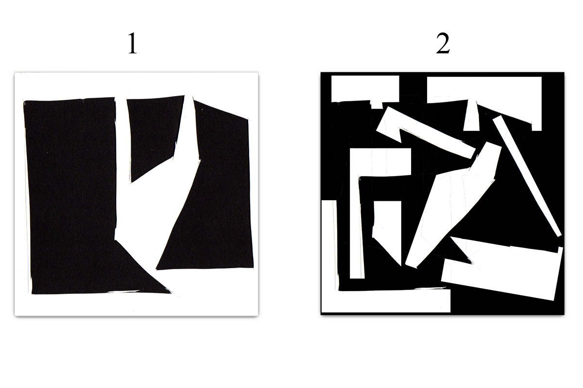
  • The first painting above:
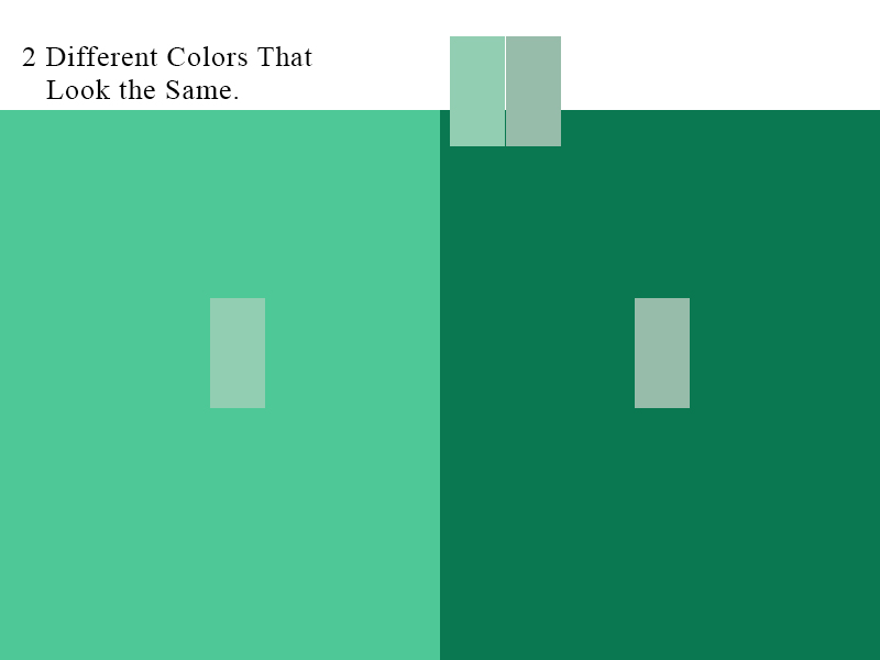
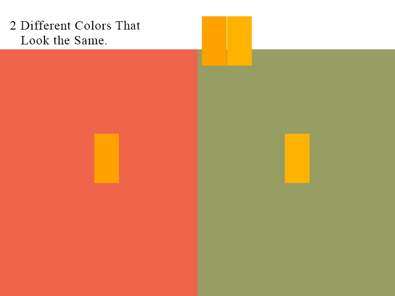
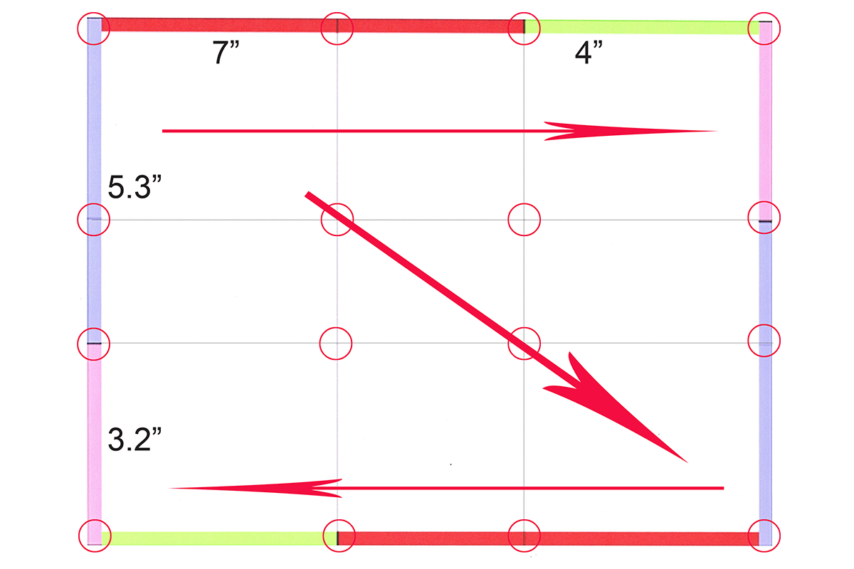
  • Space correlates to quality – more space entails fewer design elements, sophistication, simplicity, luxury, cleanliness, solitude, and openness.
  • Space is wasted when a designer fails to consider it – when it is overfilled – when trapped inside design elements – not allowed to connect to other space in the design.


Image_2

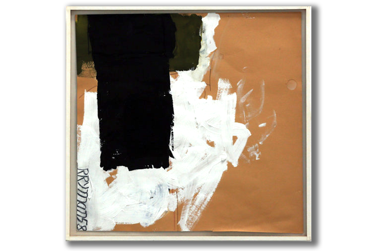
“To Gertrud Mellon,” from 1958, casein, graphite, and colored pencil on paper.Credit 2015 Robert Ryman/Artists Rights Society (ARS), New York; Hiroko Masuike/The New York Times.

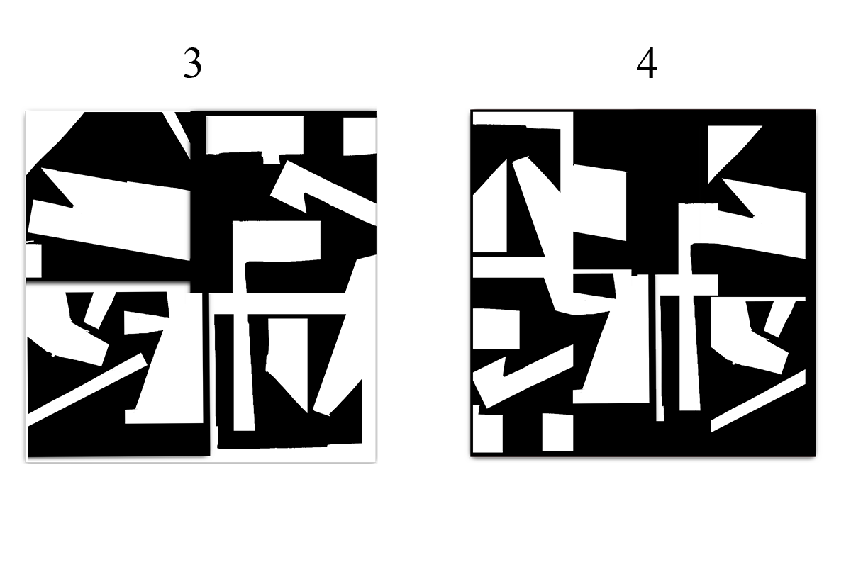
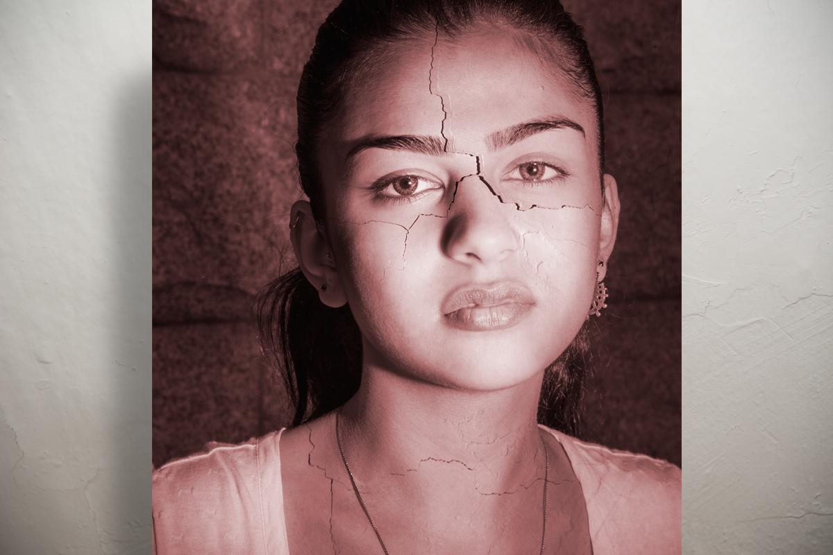
  • About the second painting.
  • As the figure-ground relationship implies, you have space only when something is present inside of it.
  • Prior to the addition of positive elements, space is undefined.
  • The figure-ground relationship has to be established before space can exist and its communication begins – establishing contrast, emphasizing hierarchy, and generating drama and tension.

Link to the “New York Times” article, When a White Square Is More than a White Square,

by, Daniel McDermon, February 8, 2016.

http://www.nytimes.com/interactive/2016/02/04/arts/design/robert-ryman-dia-chelsea.html?ref=arts

Set_1

Set_2