This is an assignment where I made a ligature out of my initials to represent my branding. This ligature will become my avatar and banner as well.
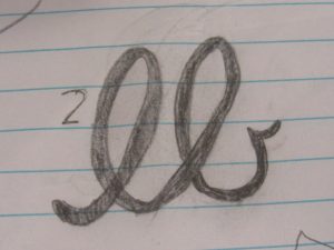
Idea #1: Almost-Identical Stroke
I chose this specific ligature type for my initials because I thought it would work well together while including the script font and my initials. Some issues I had while creating this design was if it would work in general and if the two initials would be noticeable in script font, as well as look good together. This design didn’t really work out for me in the end because I still wasn’t sure if I wanted to do script font since its too fancy for me, even though I wanted it to be my final design at first. I thought about it for a while and noticed it was just way too plain and bland for me to use as my design.
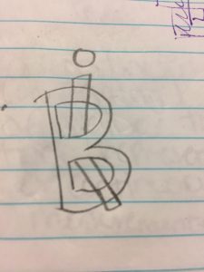
Idea #2: Interlock
I chose this idea because I needed a different kind of ligature for my initials and I was thinking what would look cool for it to be. The interlocking of the I and the B made it interesting for me since it reminded me of The Incredibles and how their logo for the movie is, especially since their new movie is coming out this year. I also found it interesting how the lowercase I and The B intersected leaving an interesting feel to the design itself. Some struggles I had with this design was coming up with it and making sure it didn’t look weird with how the I was placed inside of the B. Overall, I pretty much liked how it came out but not enough to make it my final design since I thought it needed a little more personality to it.
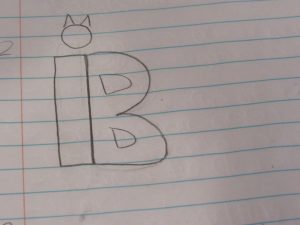
Idea #3: Uppercase & Lowercase
For this design, I thought it would be interesting to put a lowercase I with the B both together as one since I thought it would add a sort of interesting/weird feel to it. I chose it specifically because it looked pretty simple and pretty self-explanatory. I like things to be simple and clean since less is more. Some challenges I faced with this was trying to find a font type which would nice like this while also having to make the cat ears on the top of the I to make it interesting yet simple. I still pretty much like this design in all but I just want to make it kind of colorful but not too colorful to the point where it looks bad. I just want to make it interesting along with the colors and which those colors meaning something.
Final Design
For my final design, I thought it would be nice to add a little leaf to it because I love nature and everything that has to do with it. I just wanted to add a little personality to this design, as well as express my love for nature and design all in one. I also added the little cat ears on the dot of the lowercase “i” because I really love cats in general and i thought it would look fun and neat. Though my design is simple and clean I believe it says a lot about me since, for one I love being simple and minimalistic to the fact where everything just looks right together. At first i didn’t have an idea on how to start off this design only because i change my mind way too much and try to be a perfectionist, but I believe I’m pretty comfortable with this design on hand.


