Visual Quote
In this assignment we picked a quote and used different type families/typography to communicate our quote visually.
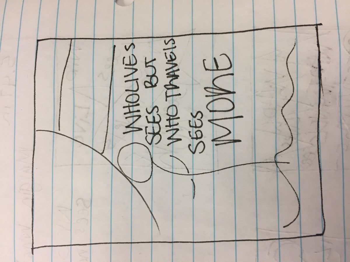
Idea #1
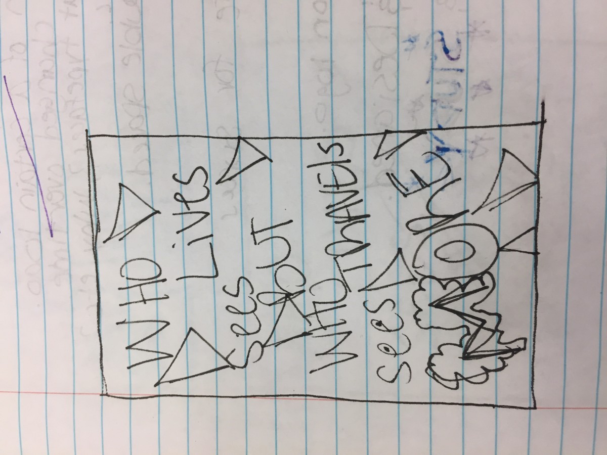
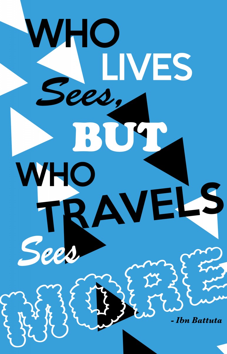
I chose this quote because to me it gives a lot of meaning since I do love to travel and see the world for its beauty and the satisfaction it gives me as an adventurous person. Although I know this quote can mean a lot of different things to other people, I kind of took it in the literal sense and thought of it as looking ahead and wanting to see the whole world someday. I tried to make this design look like its moving around a lot mostly because that’s what I think of when I think of travel and traveling.
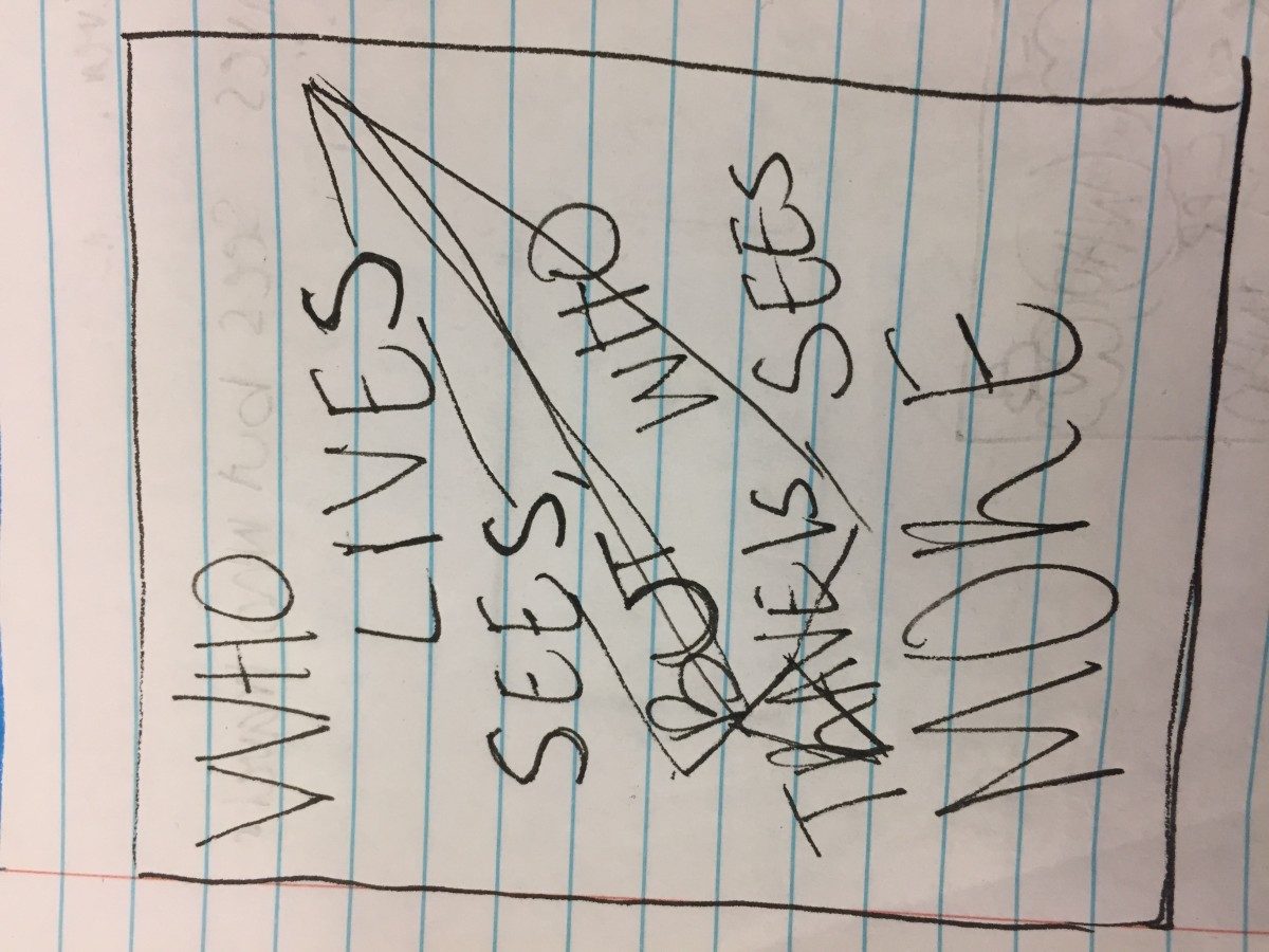
Idea #2
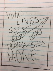
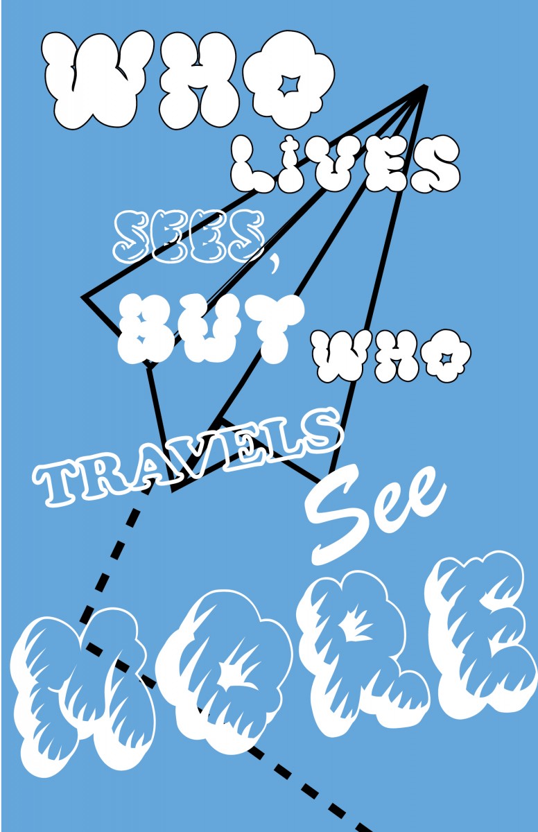
For this design, I decided to make a paper airplane sort of looking dawing to add to the fact that it was an airplane with some dashed lines to add movement to the piece. I tried to make the fonts look a bit cloudy like to show that the paper airplane was in the sky as well as to show a bit of personality. The problems I had with this was trying to figure out where to put the type and how to make it look nice as well as make sense.
Idea #3
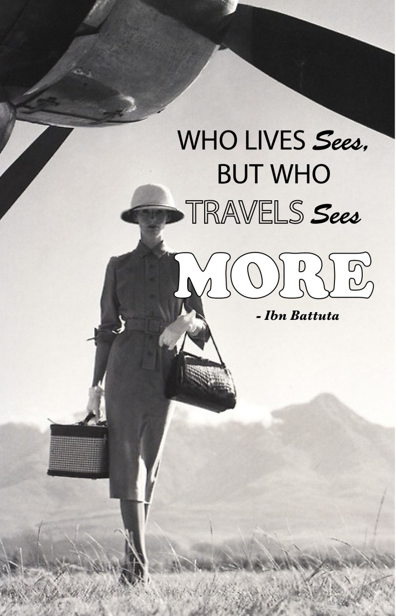
I personally really like how this design came out only because I did want a photo to help intrigue this quote the way I wanted to interpret it and this really helped it pop. The photo in itself looks pretty nice for the quote and I believe it goes well with the quote. The lady in the photo makes it way more interesting because it creates mystery leaving the audience intrigued on where she’s going and why she’s walking from a plane. The black and white in the photo makes the quote kind of pop only because it’s interesting and i really like how this turned out.

