Research on Logo
Build a Bear Workshop Logos
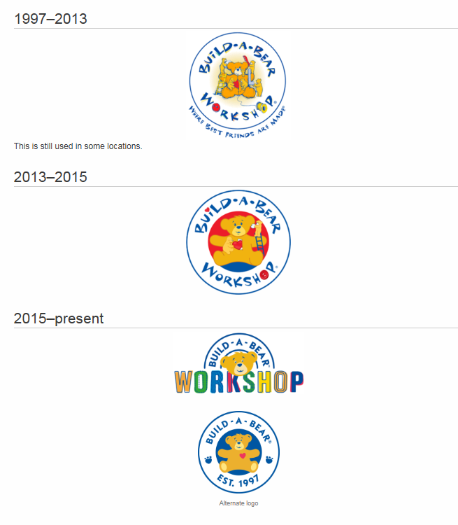
Build-a-Bear Workshop was established in 1997. It’s first logo has an illustration of a teddy bear being sewn together by other teddy bears. The company, known for allowing their customers to create and customize their own stuffed animals is shown in the illustration. Since it’s intended audience is children, the logo has child like type as well as the use of colors like blue, red and yellow. The slogan at the time is texted wrapped around the circle surrounding the logo. The second logo which was established in 2013, was intended to advance with the changing times. The newer logo still bears similarities with its predecsssor but it is much simpler. The slogan is gone and the illustration is a lot simpler. Finally, the current logo, developed two years later by a design company known as Idea Is Everything, has two logos one of which still looks similar but the type faced has changed and they changed the copy of some of label. The second logo is a half circle with a bear in front of the word “Workshop”. Build-a-Bear uses both logos interchangeably.

