Logo Design History Research Paper
Build a Bear Workshop: Rebranding and Logo
In 1997 a company named Build a Bear Workshop was founded. Build a Bear Workshop is a toy manufacturer/retail store that creates custom teddy bears and other assorted furry friends for their customers. Build a Bear Workshop for the past twenty years has dedicated themselves to the customer experience. They’re customizable stuffed animals allows children to “make their own teddy bear”. This process includes stuffing your own bear, giving it a heart, and dress them up. This is the only company of its kind that does this. In recent years Build a Bear Workshop has had a new CEO and a new rebranding to adjust to today’s children. Their new logo is one of the biggest changes to Build a Bear Workshop.
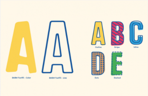
In 2013, Maxine Clark, the former CEO stepped down and the new CEO Sharon Price John became the new CEO. John was in the toy industry for quite some time. With this in mind she knew what she needed to do to cater to the millennial parents and children. (Fortune) Build a Bear Workshop had a rebrand and redesigned their logo. With the design team, Idea is Everything, they created two new logos. These logos were made because the company decided to split the company into two: One being the retail and one being the manufacturers. Build a Bear is now separate from Workshop, allowing the workshop to be a “…‘parent’ brand that provided more flexibility while allowing the Workshop brand to focus on the store experience.” (Idea Is Everything). They also created a new typeface for the logo. Creator of the font, Mitja Miklavcic created it so it’s ideal for multiple situations including using it for different countries. The new logo was the start of a rebranding for a newer audience.

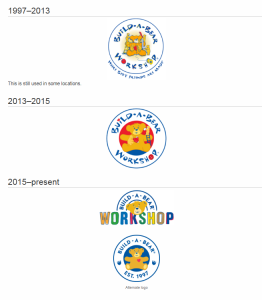
The original logo, used until 2013 was an ellipse with type on a circle path with the name Build a Bear Workshop inside the ellipse. The type is a custom font with the letter O replaced for a button and a spool of string. In the center of the logo is a teddy bear being built by a bunch of other teddy bears. On the outside of the ellipse the slogan “Where best friends are made” is typed. This logo was not discussed or criticized throughout its existence. The original logo was the building grounds for the current logo. In fact, all the logos that Build a Bear has made over the years are very much related to each other in terms of design.
There was a logo in between the original logo and the logos Build a Bear currently uses. This logo removed the slogan and made the teddy bear in the middle have its own circle and looks much more vectorized than the original. Due to its short time period this logo hasn’t received much criticism either.
 The Build a Bear logo that is used in retail stores is a half circle with just the teddy bear head. The type is noticeably different here. It looks more “grown up”. Meaning the type is much more geometrical. The word “Workshop” in its logo is the custom font made by Miklavic. The type has a custom outline making the type two layers. For the master brand of the logo its mush more similar to its predecessor. However, the word “Workshop” is no longer part of the master brand. Instead, the year that Build a Bear was established, 1997, is typed on the bottom of the logo. The teddy bear is still in the middle however it no longer has a bunch of other teddy bears working on it. Instead the bear has only a red heart. The heart is in all of the logos before it, representing the unique factor of being able to give your teddy bear an actual “heart” when you are creating your own bear at one of their retailed stores.
The new logos have had some criticism for the logo however. Comments on an article on a website called “Under Consideration” commented that while the new logo does look much better than the original logo, it looks much more formal and it doesn’t seem kid friendly. One comment said that it looked “very generic”. The design team, Idea is Everything made the logos so the company would be able to expand and grow over the years.
Build a Bear Workshop had a revamp on the logo because it was trying to rebrand itself. Retail stores are starting to become more technology-savvy. This includes having more electronic interactions with its customers. Now children who enter the store can type their stuffed animals into a “system” which is made for the case if they ever lose their stuffed animals. The stores themselves has even closed temporarily to renovate the new technology. Build a Bear needed this new rebranding because the company needed to return to profitability according to an article written by Business Wire. The company not only wanted to restore profitability they also wanted to “restructure the company’s product and marketing functions to consistently and simultaneously focus on key segments including younger girls, older girls, boys and gifting an affinity customer.” (Business Wire). Essentially, Build a Bear’s mission was to make it more functionable for the modern child.
Build a Bear’s rebranding is like another toy company’s rebranding. Mattel rebranded Barbie for the millennial audience as well. They made plus sized dolls, dolls with different nationalities, and are trying to remove the stereotype that is associated with Barbie. (Washington Post). Build a Bear has had an easier time rebranding because they haven’t made much controversy over the years with their products. However, with the modern age of technology, the thing that these two companies share is that the toy industry is trying to catch up to stay in business. Children aren’t obsessing over toys anymore like their parents use to when they were children. That’s the disappointing thing about starting a business. Eventually that will get outdated and the next new idea will be the reason why a twenty-year-old company like Build a Bear must rebrand themselves. As designers, this relates even if you’re not in advertising. You need to be able to make new ideas, new art, new creations to stay relevant. And that’s what Build a Bear is trying to do. They are trying to stay relevant, so they can keep their business of “creating new best friends” alive.
Sources:
- Lee, You-Jin. “Build-a-Bear Workshop: Its Aesthetic and Ideology.” Art Education, vol. 61, no. 6, 2008, pp. 20–24. JSTOR, JSTOR, jstor.org/stable/27696304.
- “Build-A-Bear.” Idea Is Everything, ideaiseverything.com/work/build-a-bear/.
- “A Bear Market.” Brand New: New Logo and Identity for Build-a-Bear by Idea is Everything, www.underconsideration.com/brandnew/archives/new_logo_and_identity_for_build-a-bear_by_idea_is_everything.php.
- “ Shop PAWsome Collections .” Shop, Explore and Play at Build-A-Bear, buildabear.com/.
- Olson, Elizabeth. “Build-A-Bear Goes High Tech.” The New York Times, The New York Times, 26 Sept. 2012, www.nytimes.com/2012/09/27/business/media/build-a-bear-adds-a-technology-factor.html?rref=collection%2Ftimestopic%2FBuild-A-Bear Workshop Inc.
- Eng, Dinah. “Who Built Build-A-Bear?.” Fortune, vol. 165, no. 4, 19 Mar. 2012, pp. 49-52. EBSCOhost, citytech.ezproxy.cuny.edu:2048/login?url=http://search.ebscohost.com/login.aspx?direct=true&db=bth&AN=73033361&site=ehost-live&scope=site.
- “Build-a-Bear Builds a Brand Around the Customer Experience.” TeleTech, teletech.com/resources/articles/build-bear-builds-brand-around-customer-experience#.WeYqBhOPIUE.
- Halzack, Sarah. “Barbie’s got a new body – and now Mattel is tackling her other big image problem.” The Washington Post, WP Company, 12 July 2016, washingtonpost.com/business/economy/barbies-got-a-new-body–and-now-mattel-is-tackling-her-other-big-image-problem/2016/07/12/9615b1ae-483c-11e6-90a8-fb84201e0645_story.html?utm_term=.5c878328fb3d.
- “Build-A-Bear Workshop Unveils New Store Design at Flagship Mall of America® Store in Next Phase of Brand Refresh.” Business Wire, 1 Sept. 2015, businesswire.com/news/home/20150901006548/en/Build-A-Bear-Workshop-Unveils-New-Store-Design-Flagship.
- “Meet the woman who rescued Build-A-Bear Workshop.” Fortune, fortune.com/2015/07/14/sharon-price-john-dealing-with-change/.


