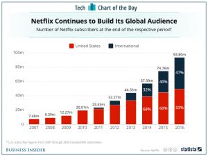
The reason why I chose this graph is because I know that Netflix is a very popular streaming service within the U.S and I was curious to know if people in other countries are subscribed to Netflix as well. On the graph it shows low numbers for the amount of international subscribers when compared to the U.S, so that makes me wonder if they are using another streaming service that is exclusive to their country. On the graph you can see that the number of subscribers in the U.S. has been over 50 percent while the percent of international users is less than 50 percent. In 2017 it seems that the percentage of international subscribers is growing close to 50 percent. I predict that it will reach at least 50 percent after 2018 ends. From 2007 to 2010 there is an absence of international subscribers. This could mean that Netflix was less known back then and so eventually it gained popularity and went international in 2011. I’m guessing that the international subscribers were using another streaming service at from 2007-2010.
http://www.businessinsider.com/netflix-subscribers-chart-2017-1


at what rate is the INternational Netflix users increasing compared to US Netflix users ? which year will the amount of international Netflix users catch up or surpass to US Netflix users ?
I believe that the graph can show some more information like when Netflix international started and then divide that year into before netflix international and after netflix international. Another nice thing I’d think to see is the amount of growth coming from international and U.S customers instead of just total population percentages. The word problem I’d make is
What was the user growth in each year from 2007 to 2016. I picked this because the graph only shows absolute terms so it’d also be nice to see a graph which showed the information relatively.