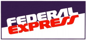
FedEx Logo
I particularly found the FedEx logo to be astonishing masterpiece of a logo. The reason is because there is a hidden message in the logo. There is an arrow in between the E and X. The way he used negative space is very impressing in the FedEx logo; which was designed Lindon Leader in 1994 in San Francisco, CA. What led him to such a clean and successful logo is the design philosophy of “simplicity and clarity”; also subtraction and the use of negative space.
 During the design process of the FedEx logo Lindon he started playing with the E and x typefaces he placed the high x of Univers67 font and mixed with a stroke of Futura Bold. He rose the x to the crossbar of the lowered E; after he tweaked he ended up with a new letterform. After all the process he had realized he done something interesting with the E and x he created a hidden arrow.
The first FedEx logo was much different at the time FedEx was Federal Express its name was written diagonal. The logo’s typeface was bold and the Federal typeface was white sitting on a blue background. The Expres typeface was red sitting on a white background. 


