Places Visited
The Trip To UFT
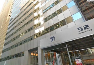
Two weeks ago the class GRA1111: Intro To Graphic Communications went to the UFT to The United Federation of Teachers Print facility on 52 Broadway in Manhattan. I actually didn’t get the chance to go unfortunately but from my knowledge The United Federation of Teachers, represents teachers, paraprofessionals, guidance counselors, psychologists, social workers, adult education teachers, nurses and speech therapists.
The class went to the Print facility where things get published and printed such as newspapers for schools and other paperwork for other schools such as Elementary, Junior-High Schools and High Schools.I found out that they went to the main headquarters of the UFT although each borough has its own UFT offices. As well to mention that UFT supplies over 200,000 staff on their roster and the UFT serves as a union to these respected employees.
From, other students I heard it was a hectic experience they said that a lot of running around was going on and many other things were going on. Pretty much the UFT’s print facility is printing something everyday for other schools and other facilities they support. There printing facility supplies other facilities that are associated with the UFT. Everyday their printers are printing papers that are supplied to many of the schools in the five boroughs in New York.
The Letterpress Machine At City Tech
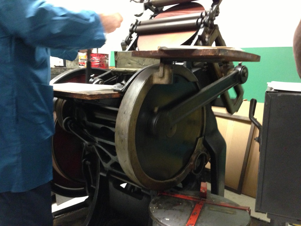
Mainly today was the day we got to see one of the old print processing machines. This machine was the machine used many years ago was used in 60s to process images and words/letters.You start the machine by painting the ink in the middle of round thing that is in the front. This machine is called the Letterpress machine the main process of the machine is putting in one of image that is on tablet into the machine grabbing a paper and placing it in the center of the machine. The actual technique of letterpress printing also known as relief printing using a printing press. The way it works is a person using the machine locks the moveable type into the bed of a press, and inks it, and then you press the paper against it to transfer the ink from the type.
In practice, the letterpress also includes different forms of relief printing with printing presses, such as wood engravings, photo and linoleum blocks, which can be used alongside the metal type in a single operation. The letterpress printing was the normal form of printing text from its invention by Johannes Gutenberg in the mid-15th century up until the 19th century was widely used for printing books and other uses. It remained the primary way to print and show information.
The Trip To AIGA
In the class Graphic Communications Workshop one of the field trips we went to was the AIGA National Design Center in Manhattan. Founded in 1914 as the American Institute of Graphic Arts known as AIGA, is one of the oldest and largest membership organization of design. AIGA is all about design in the field of Graphic Design, as the professions largest community they work to enhance the value and the impact of design on business, society and in their collective future.
Credits
One of the things I found to be something I liked during the trip was the Superman Brand Book by Little & Company called Indestructible. It’s a comic book of Superman. The art and illustration is executed beautifully it stands out a lot. This is a comic I would actually purchase because I appreciate the art of the artist and, how superman is drawn nice and big on the front cover. The front cover is the most attention grabbing part of the book. It shows that superman is the main thing that the book focuses on.
Credits
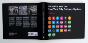
The other piece of art that grabbed my attention was the book called Helvetica and the New York City Subway System by Paul Shaw. It grabbed my attention because I like the way the layout was placed in the book; everything was organized. What got my attention was the front cover and how it has all the numbers and letters of the train lines in New York. It is also interesting that the book shows the pictures of the Helvetica typeface used on subway signs. The book is very appealing to subway fans that are interested in type and art in general. The book merges text, photography into a single design to help the reader and refer to any footnotes without flipping the page.
Credits
Another piece of art that also grabbed my attention is the Wings Michael Jordan poster. It’s a photograph of Michael Jordan with his arms stretched out holding a basketball on his right hand. The photograph is a classic because it is elegant, one of the first oversized Nike poster created, it is black and white and Michael Jordan is a legend. Even people that don’t watch basketball know at least something about Michael Jordan. Everything goes with the poster including the typeface on the top of the image. The poster for the most parts depicts that Jordan is the right man with wings in literally terms when it came to basketball.


