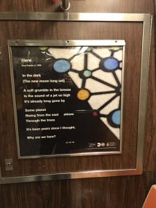
I think these posters are good examples of Visual hierarchy, because when you see first is from the text inform the middle ground then move to background.

Our goal is to make the OpenLab accessible for all users.
Our goal is to make the OpenLab accessible for all users.


