You must be logged in to reply to this topic.
- Week 2: How Next Level Design is Driving the Beer World
-
August 27, 2018 at 11:06 pm #49782

Sara Gómez WoolleyParticipantREAD: How Next Level Design is Driving the Craft Beer World
This Article by Veronica Meewes for the online design magazine PUNCH, explores the “new generation of eye catching label design” with a close up on five example breweries and the inspiration behind the labels that have become “ their visual calling card.”
After reading this article, consider how YOUR label design is a visual calling card for the product. Write a few sentences describing the intention of your label.
Lastly, find a label design which uses illustration in a manner you find interesting, eye catching and inspirational. POST the designs along with your comments on them for in class DISCUSSION next week.
-
This topic was modified 5 years, 8 months ago by
 Sara Gómez Woolley.
-
This topic was modified 5 years, 8 months ago by Sara Gómez Woolley.
September 18, 2018 at 9:33 pm #50469
Isabella GomezParticipantThe beer I chose to base my illustrations on is named “Evil Urges”. I don’t want my subject matter to be too dark or brooding, despite the beer name. I want to use symbolism of what is typically seen as evil, and take inspiration from elements of horror to make illustrations that are fun and light hearted, but still embody “evil urges”.
From the article’s standpoint, beer labels are starting to become more experimental and daring. This is too ensure that beers stand out from one another. The craft beer market is growing and so is the thought and the art behind it.
September 22, 2018 at 4:39 pm #50541
Laura WongParticipantThe label I choose is “Morning Thunder” from a tea company called Celestial Tea. I want my label to feel calming yet energetic for someone who is starting their day or someone who wants a tea to make them feel rejuvenated. I want my audience to have a great day feeling fresh and strong like a brand new day instead of feeling groggy or sluggish.
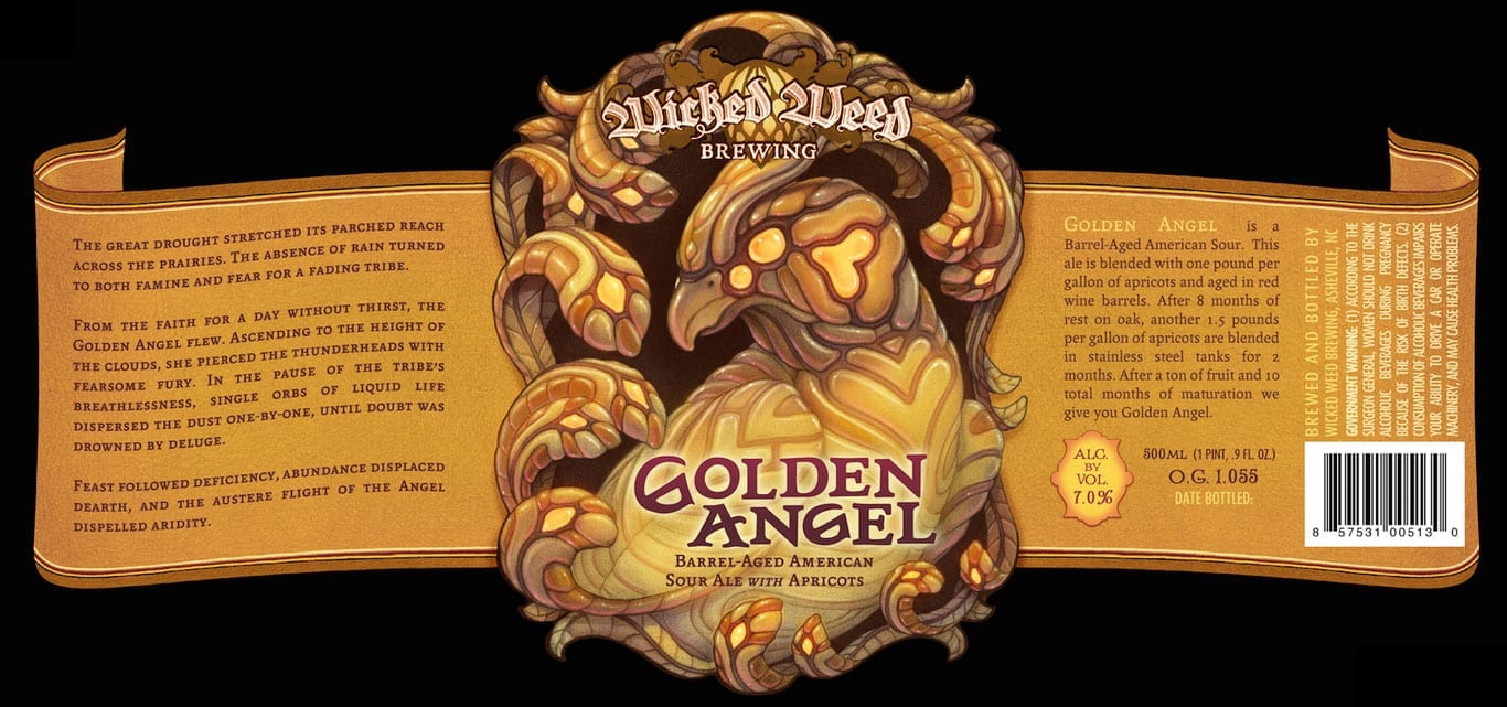
What I like about this design are the neutral warm colors and how they design the bird itself. The design on the bird looks mystical, and you would not associate a bird for a golden angel.
September 23, 2018 at 2:18 am #50544
Yimei HanParticipantThe brand I choose is called Hipster Ale from EvilTwin Brewing. I’m trying to associate my illustration to hipster but in an unusual way. So, I combined the hipsters with my favorite artworks ukiyo-e together. To create a scene which shows the hipster spirit also ukiyo-e elements.

This label is from 21st commandment called Sneak Attack. I like how they relate history to the beer label and make fun of it. Also, the details in this illustration are very precise everyone has a different expression. The background looks like winter but they are wearing summer clothes.
September 23, 2018 at 12:48 pm #50547
Alex VictoriaParticipantThe brand I chose to work with is called Wizard Wolf Session Ale. My approach is mainly trying to get the two subjects coincide with each other effortlessly. Im trying to find ways to show representations of each thing without boldly placing a wizard and wolf. Along with that i like the illustration to really go with the brands personality to make sure t really fits who they are.
What I like about this label is its color and its style. it fits the name so well and at the same time is still humorous. To me it makes it a smart label for the brand. The illustration style and attention to detail draws me in when i see it.
September 23, 2018 at 7:39 pm #50558
Savannah HendricksonParticipantThe brand that I chose is called “Fire Cat” by Big Axe Brewing Inc. My intention for this illustration is to strongly express the overall feeling of the brand itself, which is fierce and aggressive. I want to illustrate this brand in a way that would add more to the the intensity of a “Fire Cat.” I’m trying to illustrate as if I’m telling the audience the story of the “fire cat.”

The illustration for “Darkness” from Surly Brewing Company is interesting to me. I like the overall dark theme of the design and the illustration of the Harpy sitting over her cauldron. I also like how this illustration feels like it’s telling the story of the Harpy.
September 24, 2018 at 10:09 pm #50634
Yong WuParticipantThe brand that I chose is called “醒吉” by Prodigy Brewing Inc. The layout of the original design caught my attention, and the illusions are very interesting and the color use is shape and similar with the traditional Chinese color. The “醒吉” means “awake” and “lucky”, and I want to use some Chinese elements into this beer label, such as the Beijing opera types of facial makeup in operas, dragon, dancing Lion and cock.
-
This topic was modified 5 years, 8 months ago by

You must be logged in to reply to this topic.

