Pattern
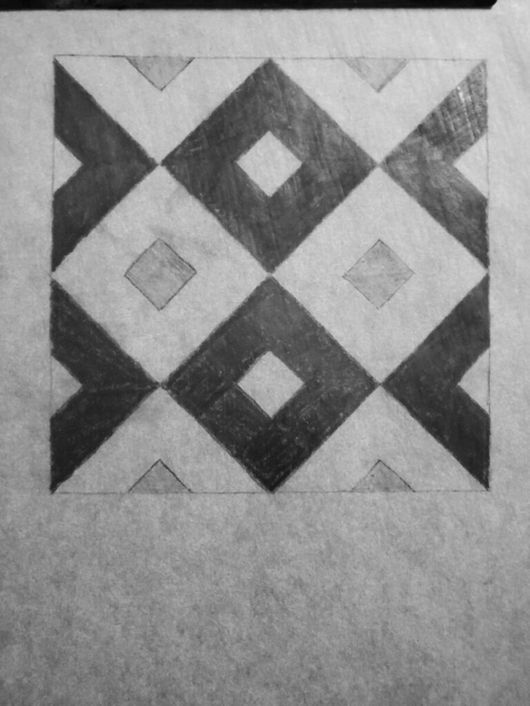
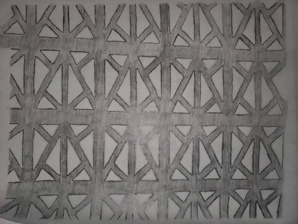
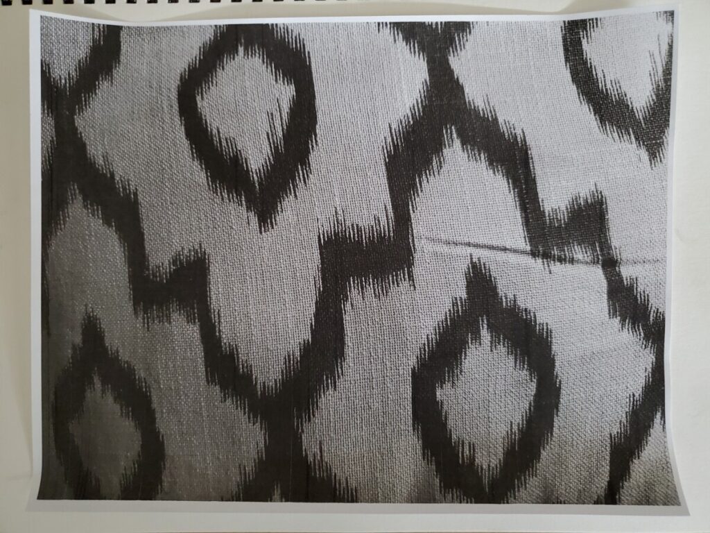
This image is reminiscent of tiles that you would find at a Mediterranean style home. This tile pattern is very structured. The image of the patterns is compact so it gives the feeling that these patterns are never-ending. There really isn’t much that separates this image from the rest, aside from its uniformity. The variety of greyscale colors detach the pattern from even more repetition, which helps with appealing any audience. This pattern can be seen anywhere, from the previously mentioned home to clothes to restaurants.
The flow of this pattern is stagnant. Besides the greys, there are no changes. It can look boring, but it seems very stable. What makes the image look really clean is the fact that there are no strokes. Strokes are the borders to a shape. If a stroke were added to this pattern, the image would seem heavy and repetitive, which is not appealing. Another good things about this image is the balance it creates. It’s stability creates balance for any design additions. Whether it would be color, lines, or letters, the pattern will remain noticeable.
Texture
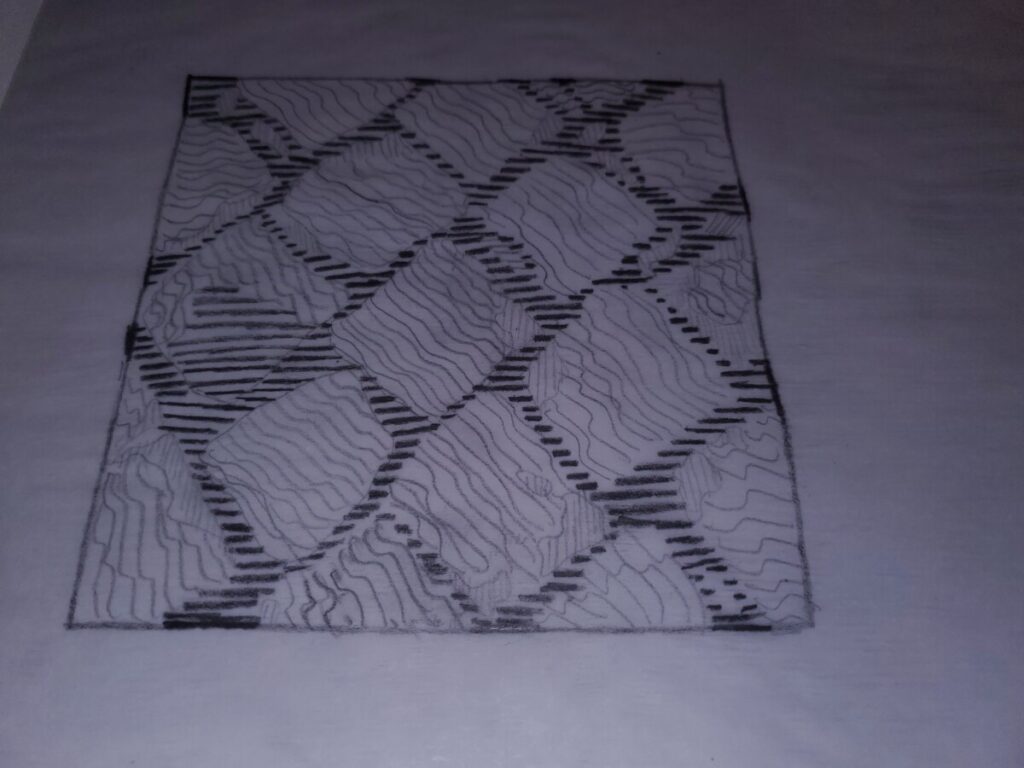
The texture of this image reminds me of the cobblestone streets of SoHo, Manhattan. They look uniformed from a bird’s eye view but up close, they are chipped and scattered. The lack of pattern up close gives the image a more organic appearance. That’s what makes it fashionable. But the different sizes of shapes also gives a feeling of firm uncertainty. It reminds me of how careful I have to be when walking on these stones to avoid tripping. Organic and unorganized would be two words to describe this picture.
This image is so rigid that it seems like no flow even exists. However, the movement of the stones appear like they are going in the southeast direction. It looks like it’s leading me somewhere, but I’m unsure of where its taking me due to the lack of flow and rhythm. Like previously stated, the lack of pattern makes the stones look more organic, thanks to the contrasts.

