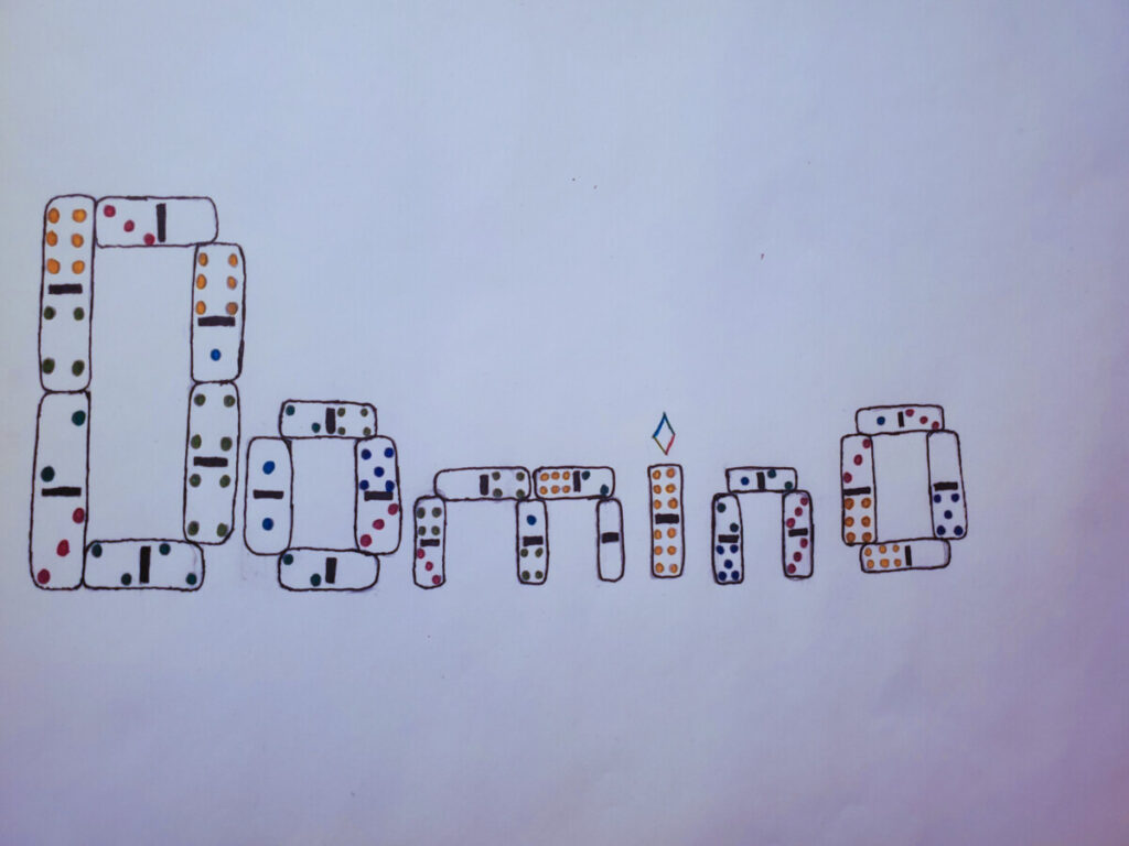
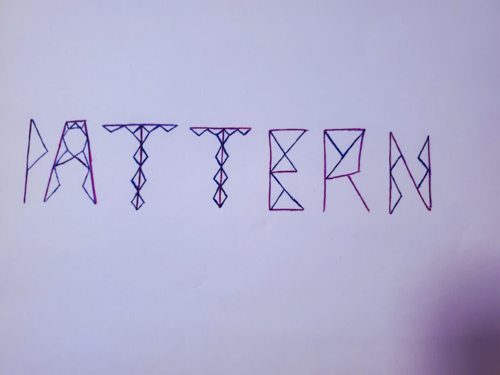
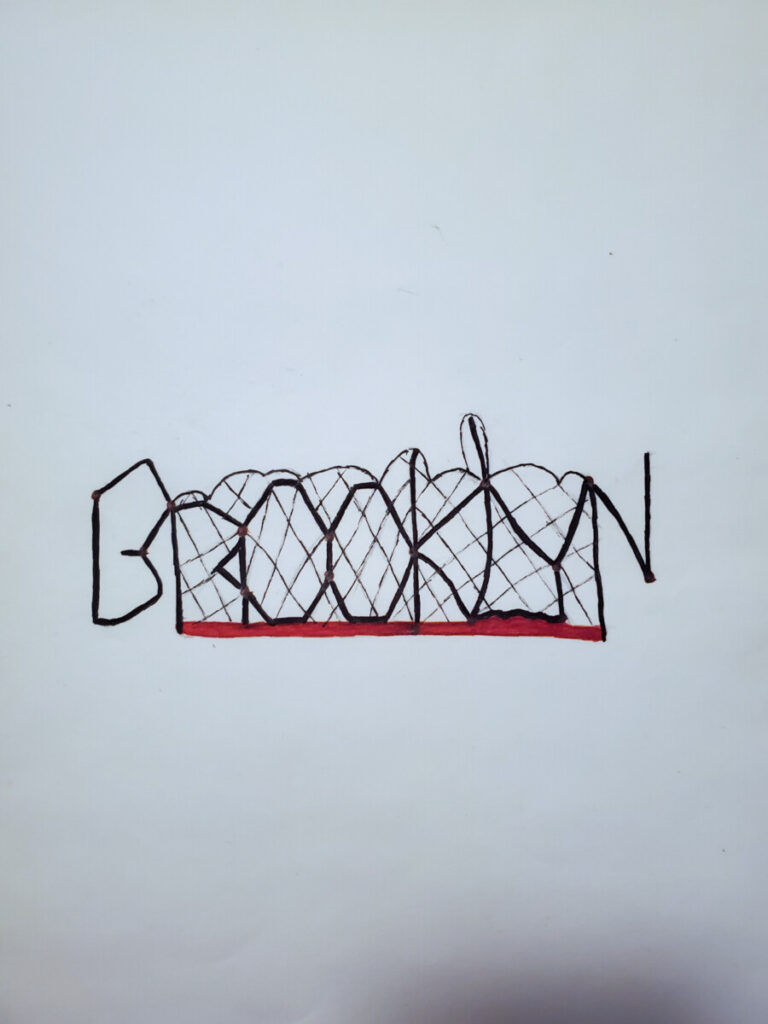
This project was a great way to test some of my ideas in a creative sense. The process revealed my growth from uncertainty in what the concept was to a grasp of what I needed to show. The most difficult part of the project was trying to figure out how I would capture the essence of the pictures via the decorated font. Another difficulty I had was trying to properly manage how much (or how little) space I should use for.. let’s say an ambiguous photo. I would hesitate to figure out which is dominant..the foreground or background? Should I add design around the word? Behind? In front? In the end, I ultimately decided to go with less by decorating only the letters of the word, hence the idea of a decorative typeface. But the part of the process I enjoyed the most was coloring the font to add vibrancy to project. Overall, I feel like I better advanced my skills in creating a simple but practical decorative font.

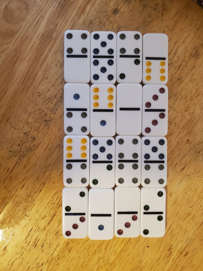



You did a great job with the way you used the triangle pattern to make your type face! And the way you used the shadow from the dominos that makes a diamond for the top of the i on your type face.