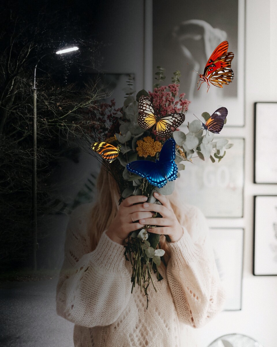
Photoshop First Idea

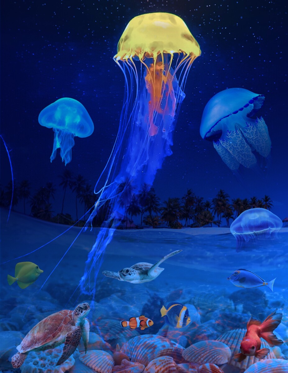
Final Photoshop Artwork

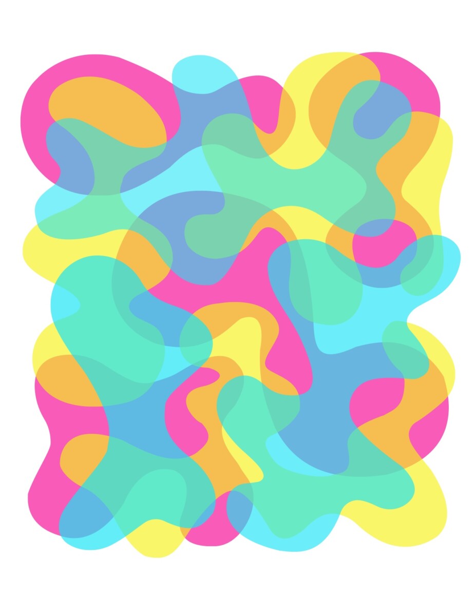
Illustrator Abstracts
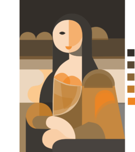
I began the illustrator part of this project by creating an abstract drawing that stood out by its brightness and vitality. I separated different shapes into layers and colored them. And overlapping parts created a different shade. However, it lacked a clear theme. I think looked for an image with definite shapes that would match a variety of hues. I found a Mona Lisa artwork on Pinterest and I traced the image in Adobe Illustrator with the pen tool.
I used Adobe Color to find a color scheme, I played around with split complimentary and triad. But I liked the monochrome palette the most. To find the hues with the goal of achieving a skin like appearance. I went for more orange tone. Although, it looks like there are more than five shade, I enhanced the effect by adjusting the opacity. For example, I utilized an orange shade for the hands and face, adjusting the opacity to 30% to have the skin like hue.
Photoshop: I made several collage images by combining composite images. At first, I had the idea of having a dark and light side and adding woman holding flowers. As I was working on it, I didn’t like the idea much. I then created new art board and had the idea of switching the sea underworld, which also didn’t go as planned.
For the final Photoshop artwork, I collaged three images: the beach, jellyfish, and shells beneath water. I used the beach as my based image and built the rest. To dull the images, I dropped the opacity of the other image and added a gradient. I had to alter the beach image to make it darker to match the jellyfish image.
Other fishes, turtles, and small jellyfish are part of the composite image; I reduced the opacity of each of them to make them blend in better.
Just like every project, conceptualization was difficult at first. Having an identified color palette and an understanding of the topic. It makes work so much easier.


Leave a Reply