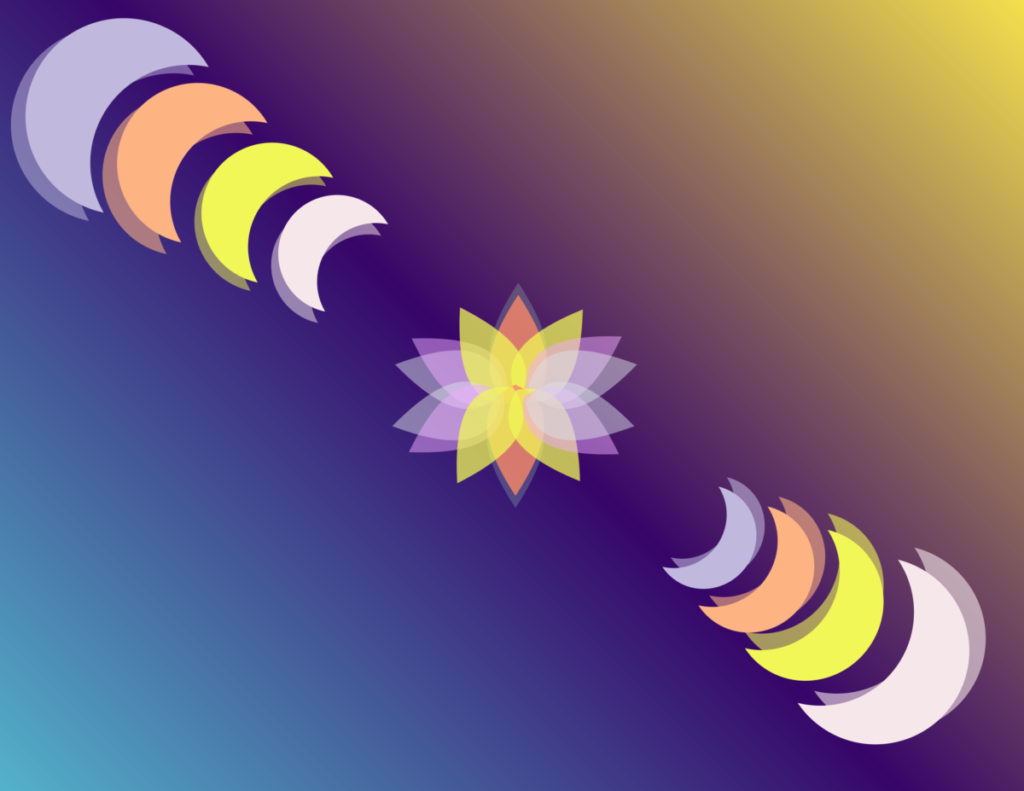
Transparency on illustration.
Transparency was a fun follow-up to the color wheel project completed beforehand. Experimenting with opacity and transparency to see how the color changed or blended together when working with different shapes was interesting. The colors shown reflect the image I made in Photoshop and the background colors complement the pastel color scheme. I chose a split complimentary style for the background using blue, purple, and yellow. These colors added depth as if looking up at the sky. The flower in the middle is the main focus of this part of the transparency project but I believe it offers a focus and gives the viewer a sense of balance and equilibrium.


Leave a Reply