
This is my color wheel. I think the most difficult part about this was getting the measurements right. Like the .375 inch margin and making all the square aligned evenly. I struggled the most with the green color, like making it bolder. But per feedback the green right next to the yellow should be a bit lighter.
Color Palette Reference:
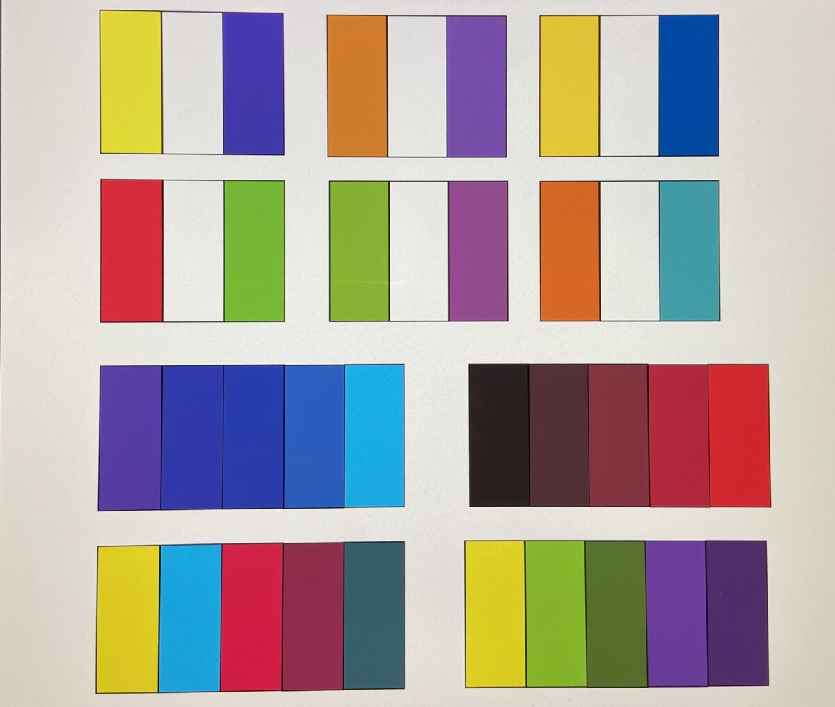
This is what I was going by when doing my color palettes. But this shows up more in my color palette as the colors in my complementary color palette are different from what I chose in this.
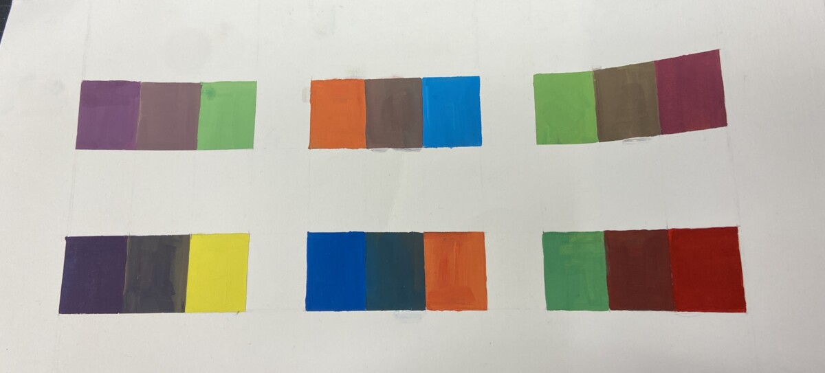
These are my complementary squares. What I found challenging in this was painting the middle squares without the paint going over the surrounding squares. Also, getting the same exact color in order to go for second coats, which is seen in the purple/yellow combination. And the lower row of the boxes aren’t as accurate considering they’re all too dark/ leaning towards one color.
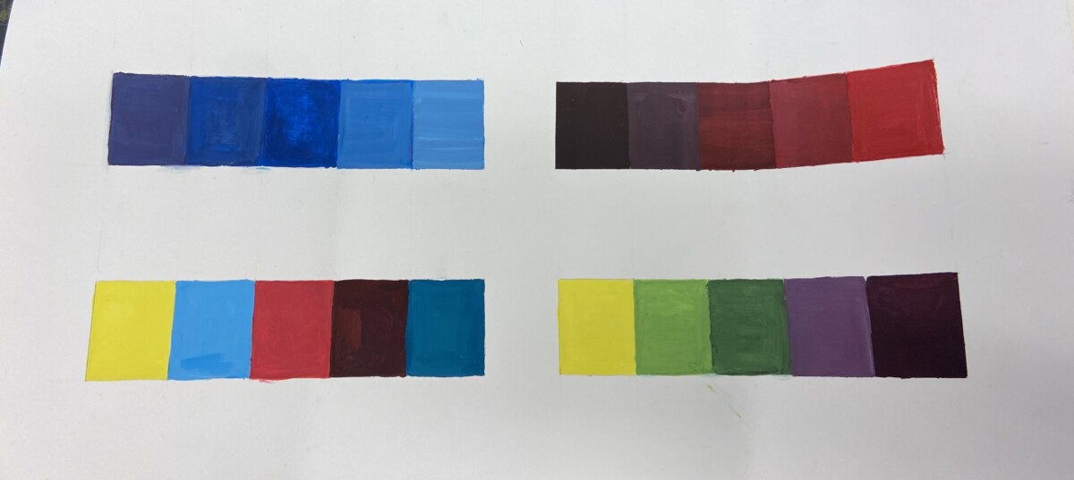
And this is my final part from my color palette. I understand the top two may be confused for one another, but the blue one is analogous and the one on the right is monochromatic. I had difficulty showing the difference between the blues because they are very similar. Overall, this project was ok.


Leave a Reply