Table of Contents
Research
Process
Presentation
Reflection
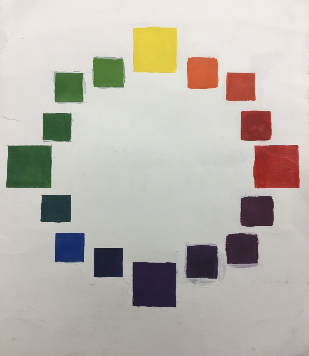
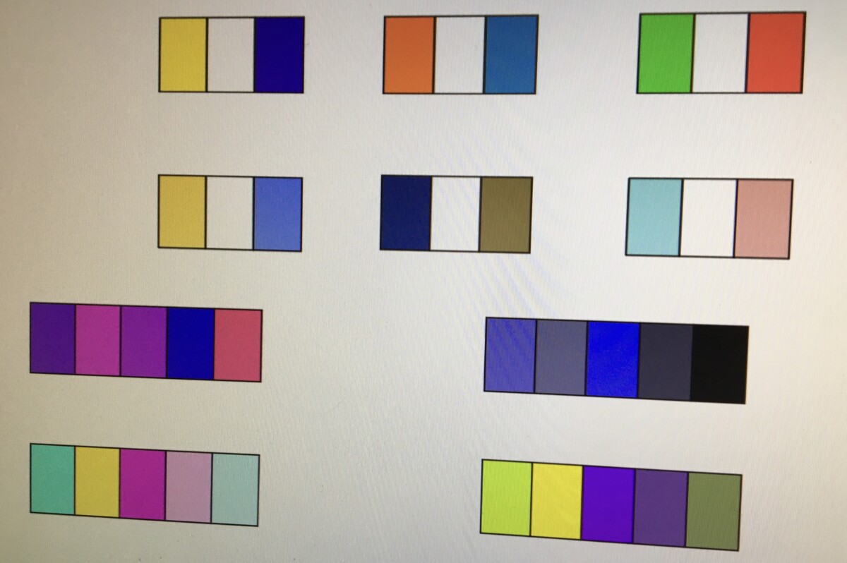
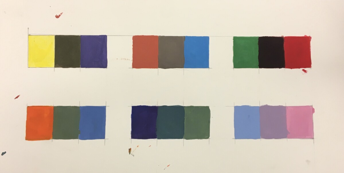
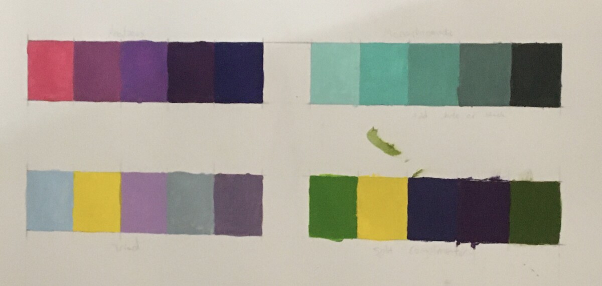
This project is pretty hard for me since I am very messy when painting. Mixing color to the accurate shade is hard as well. Especially for purple, where the color is too dark for me to visually see the shade until I put it on paper. Same with the orange and green because one issue, no matter how much I mix, the color is practically the same if you don’t look closely. If I was to do this again, I would put tape to minimize the mess, and experiment more with paint.


Leave a Reply