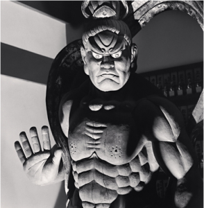
This photograph, Ungyo Guardian, was taken by Michael Kenna. When I look at this picture the first thing I see is the eyes staring at me as if it were giving me a warning. If I didn’t know the name of this human like object I would still think it was a guardian because of the position of the hand. The hand is telling me to halt or do not come any further. The use of black and white, I feel, really was an excellent choice to bring about the mood of intimidation. I love the characteristics of this Guardian. This whole serious demeanor has to do with the staring of the huge eyes and the way his mouth is pushed up as his chin is stern. You can tell this guy means business.
This photograph is quite interesting and uses the contrast of light and dark to shape the mood of the image. Now the way the lighting is, you can tell it is coming from below. If you watch any movies when people are trying to tell a scary story they put the flashlight to their chin facing up. This is the same technique the artist used to portray fear. Now another thing is that the light is helping to define the guardian’s defined muscular upper body. So this isn’t any scrawny statue with a mean look but he has the muscle to back it up. I mean look at his abs! He does not have a four pack, not a six pack, but a well defined eight pack which means he isn’t taking no for an answer ladies and gentleman. This image also gives us a sense of the background or land this was taken at. It gives you the feeling that he is like a samurai body guard. Even though I know where this was taken at which is Japan, I would have figured that out as Im sure you guys have already. Amazing work by Michael!
http://michaelkenna.net/gallery.php?id=4


As you state lighting from below is common to horror movies and makes the statue look creepy. It is also shot at a low angle making it look bigger and placed at the top of the frame.