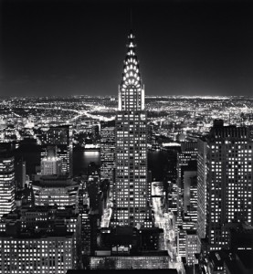
This photograph was taken by Michael Kenna and it is called Chrysler Building, Study 2, New York City, USA, 2006. This photo shows the City that never sleeps. It portrays New York City as a city that is always working and always very busy. It doesn’t matter what time of day, as long as you’re in New York City, there’s always something to keep an individual busy. The feeling I get from this photograph is a relaxed and calm feeling.
The photographer’s use of line in this photograph is pretty simple. They are mostly straight lines as they are buildings and lines in the backdrop of the photo shows movement throughout the city. The framing in this photograph is amazing. The buildings to the side directs the audience’s attention to the Chrysler Building, which is the main purpose of this photograph. There really isn’t a pattern going on in this photograph. Michael Kenna wants us, the audience, to focus on the buildings mainly the Chrysler Building. The backdrop of the photograph is a bit blurred so we can focus on the buildings more than what’s going on in the background. The contrast of light and dark is pretty balanced. The light doesn’t over power the dark and the dark doesn’t overpower the light. The light areas are where Michael wants us to look at, the buildings, the movements of people in their vehicles in the background. The dark makes the light areas stand out to the audience. The angle of view makes the person looking at the photograph feel as if they are on the roof of a building looking into the city. This particular angle shows how beautiful New York City is at this time of day and that there is still a lot going on in the city at this time. All of these elements create a feeling of being calm and relaxed, especially looking at a city that’s always moving at a fast pace. The angle of view and the depth of field is what creates the mood of the photograph out of all the elements. The feeling and mood would definitely be the opposite of what it is now if it weren’t for the angle of view and depth of field.


As you say the photographer’s use of line is simple but it is also just perfect. the whole building is a line through the center of the photo. And the top of the Chrysler building aligns perfectly with the sky.