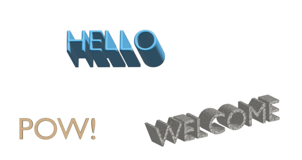
I like the poster Spring 2013 that is created by Jake Barton. I like how the letters have this 3D effect. They use bold sans serif to make the poster stand out more, it’s in black in white and it … Read More
Author: Sam
To be honest the type of font I use is the classic font that I normally uses at school such as Ariel, times new roman and Script. It’s the fonts that I am most familiar with and it the one … Read More


