Contents
Class Info
- Class Date: Tuesday, April 18
TOPIC
- Color and Typography
Complex background (image) and foreground (typography) relationship
Refer to QR PDF page 3 - InDesign: Grids and Art Placement
- Typography Selection (AGAIN: find typefaces that are not on your computer)
OUTCOMES
- Understand the relationship between complex background imagery and legible typography.
- Understand how to improve legibility
- Learn how to work with more complex grid for type and art placement.
Participation Activity During Class
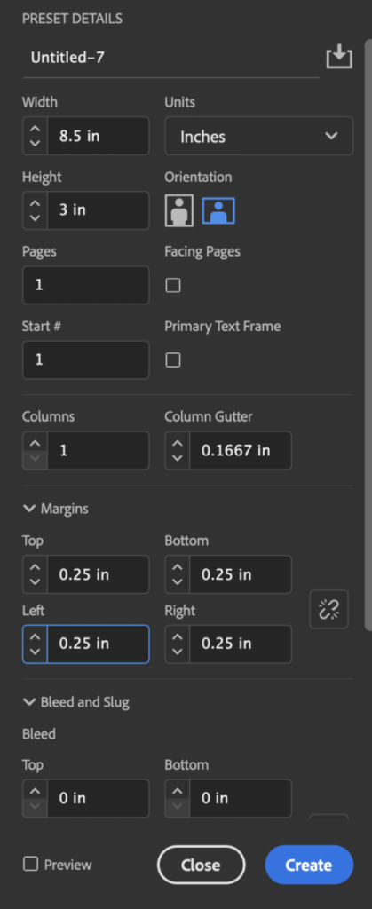
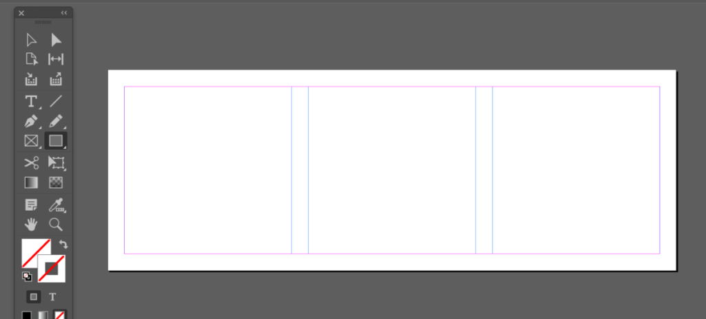
How to place art in InDesign?
We did this as Part of Project 1 already, but let’s revisit and go into further detail.
2:30 to 3pm.
Save InDesign File/ Export PDF
lastname_TC_art_placement.pdf
Once Completed place in Dropbox.
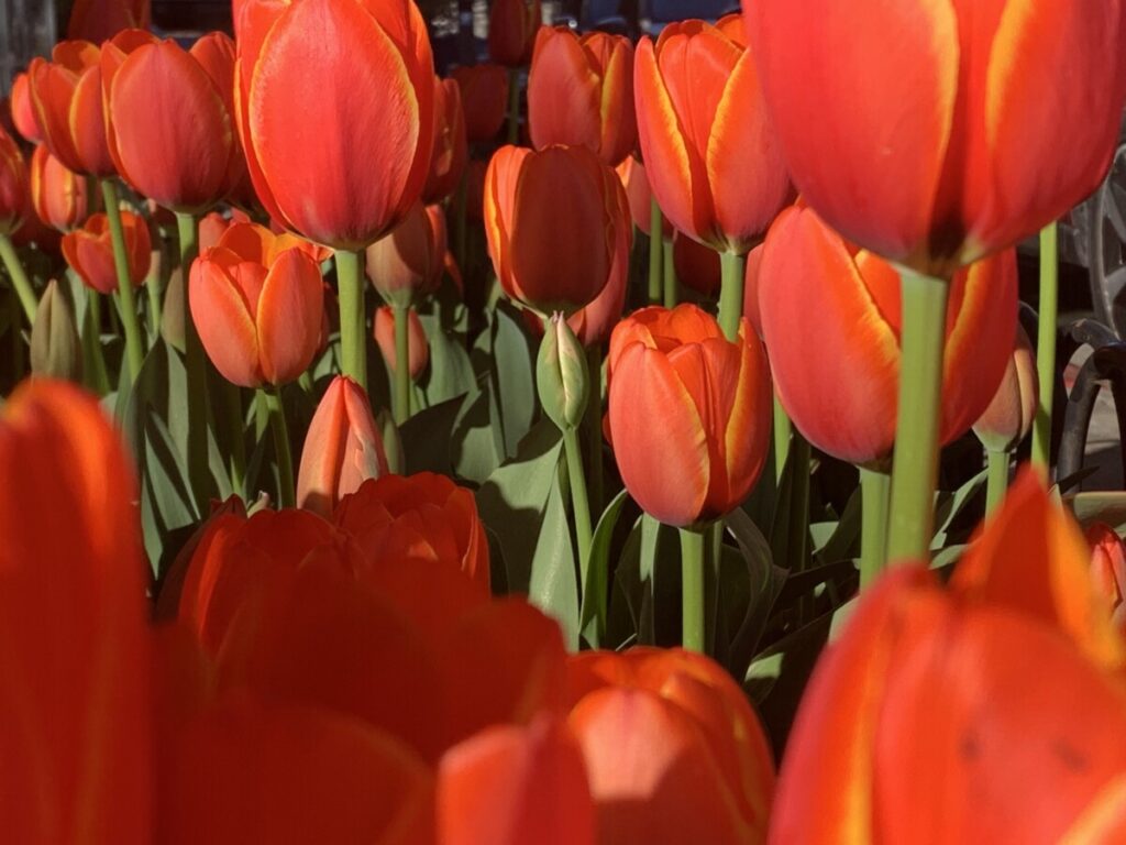
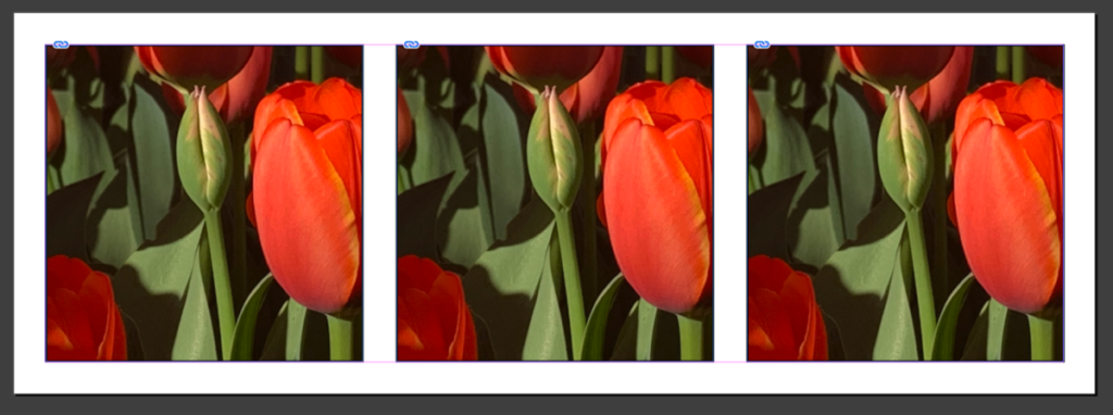
You can use this jpeg:
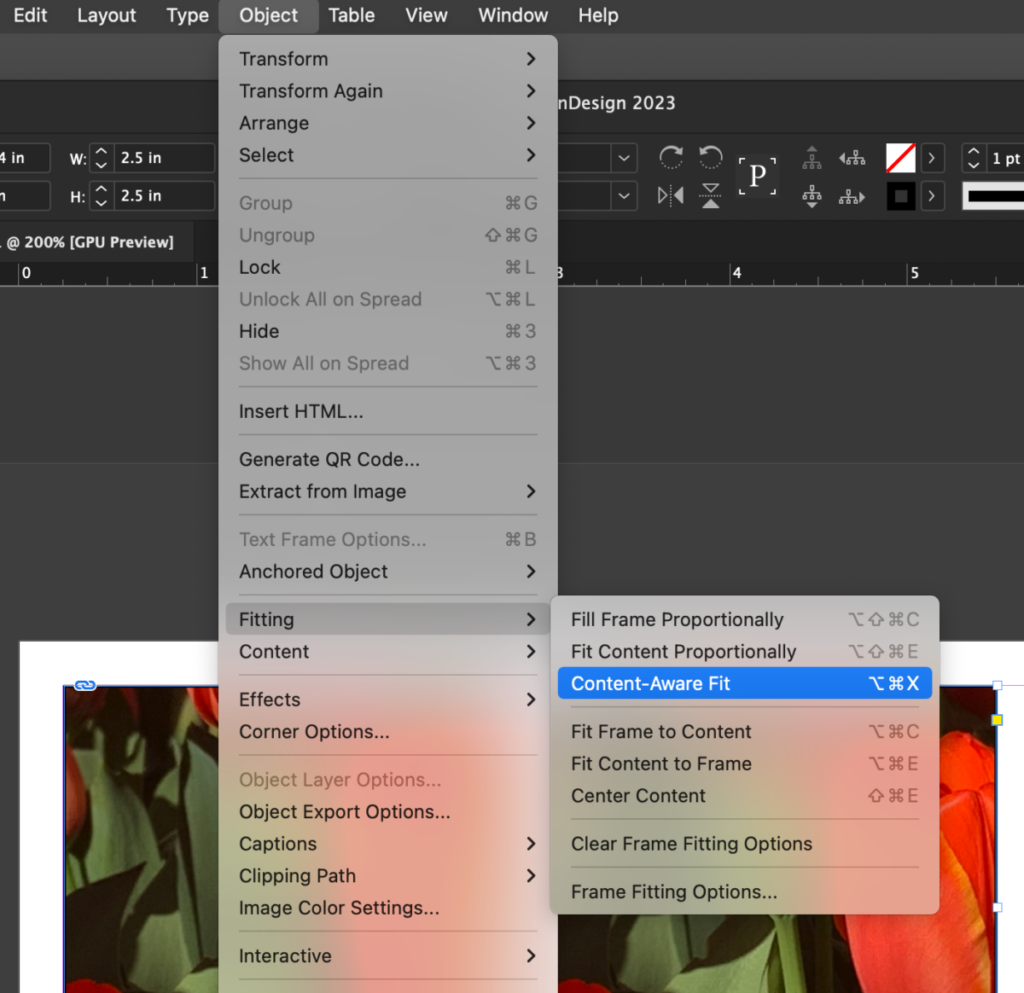
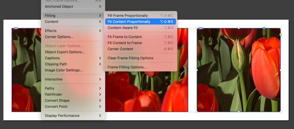
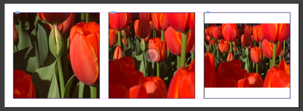
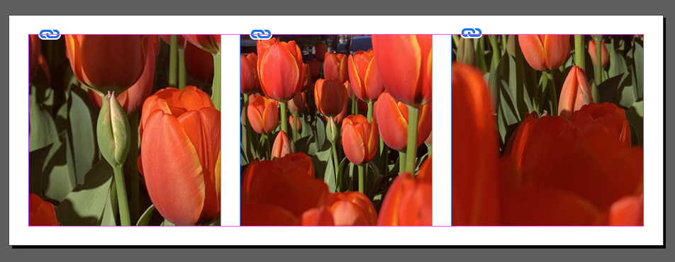
Assignment: Start in Class
This is a stand alone assignment and will have its own grade. Not part of a project.
- Create a new InDesign Document


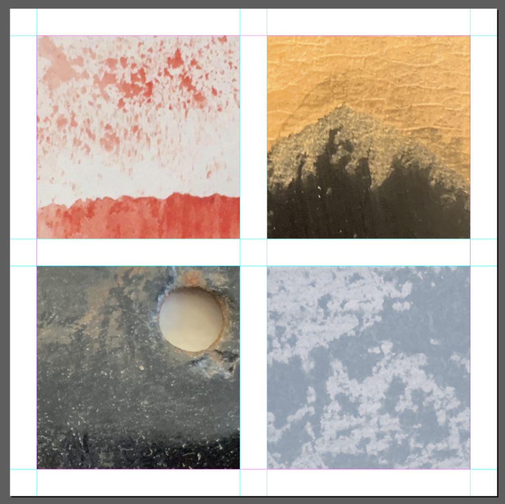
- Textures and Color
- Place textures (one per each square) These squares were created by grid.
- Choose 4 words (thing/concept) that each of your image makes you think about: For example below I am using OIL SPILL
- Think about the image itself and how the word could be designed to represent it. WORD must be legible
- Place these words over your texture (one word or thing per texture)
- IMPORTANT: This is a typography class. Think of typeface (Go to Adobe Fonts), variations of type style, size, case, word spacing, placement, meaning, color and contrast.
- Ways of Improving Legibility (part 1)
- Do not use colors from the default palette (CMY and RGB). Instead use colors that will work well with the image.
- COLOR CONTINUITY: Consider using colors that relate to the actual image, rather than the default colors from InDesign
HOW and WHY to get actual colors from a photograph and place them in the swatch panel

- Go to Window: color > swatches
- COLOR THEME TOOL
On the toolbox> go to the EYE dropper tool and switch it to the COLOR THEME tool - Click over the image with the COLOR THEME tool. You will see a strip of colors (and variation under the little arrow right next to it).
- Select the following icon to ADD this THEME to SWATCHES
- Finally you will see your colors on the swatch panel and you can use them to make a more cohesive design and relate the typography color to the image.

Do this for all 4 images with 4 different words.
Here are some examples done by your peers (past semesters)
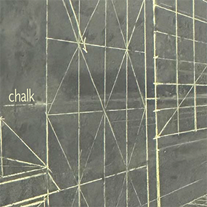
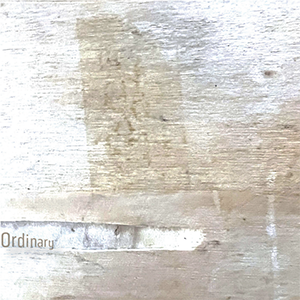
Notice the softer color palette and type choices (light/ condensed) as these relate to image
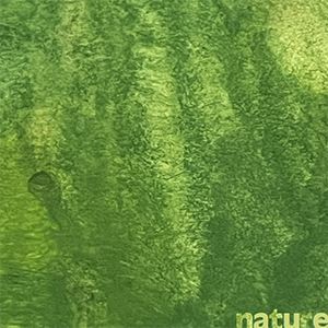
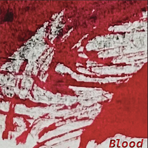
Notice the stronger color palette and type choices(bold / case etc.) as these relate to image
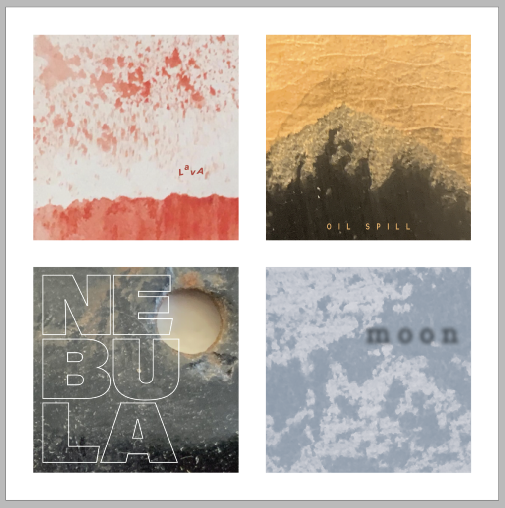
Here are my completed examples. These are only so you can see a variety of solutions. Your work should not resemble these.
Assignment
Complete all 4 words
Save Indesign File
Export Page as a PDF
Last name_type_textures_1.pdf
Place in Dropbox
__________________________________________________________________________________________
Graphic Assignments are always due the day before class at 11:30 pm, and must be placed in class drive (DROPBOX Spring 23) unless indicated otherwise. Assignments uploaded during class on the day that they are due are marked as late.
Participation Activities (Scavenger Hunts, Type Talks and Type Challenges) are due during class or the day before class at 11:30 pm if indicated by the instructor.


Leave a Reply