Thursday, April 27
_______________________________________________________________
Contents
TOPIC:
- CONTINUE discussion on how items fit on a typographical GRID and how this establishes visual hierarchy.
- A look at examples and demo
Participation Activity during class:
Go to Student Post; Type Talk. Follow this link
Type Talk: Posters by Rocco Piscatello
This activity requires you to look at work, comment.
Additionally you will comment on a reflection of written text.
This activity must be completed before editing work.
________________________________________________________________________________________
EXAMPLES:
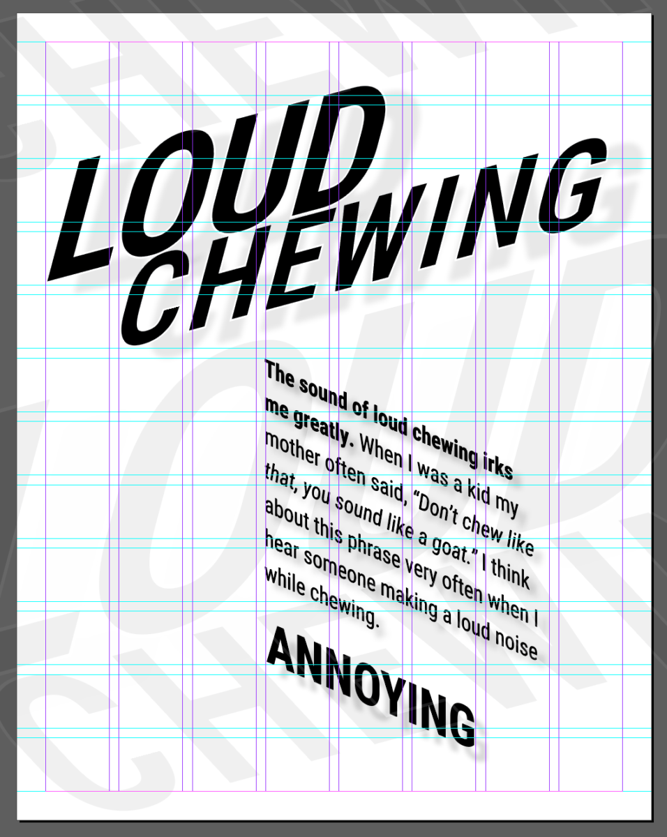
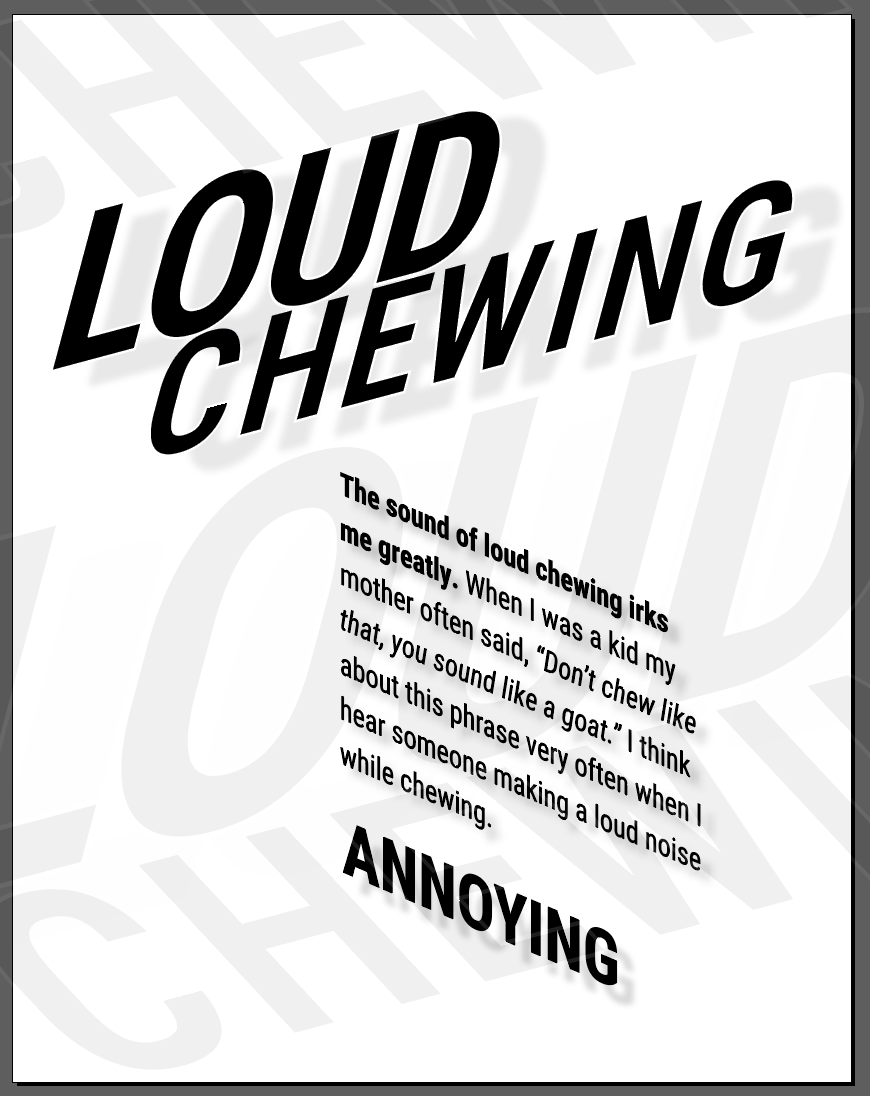
Be reflective and edit your work
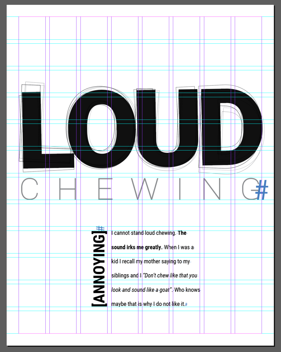
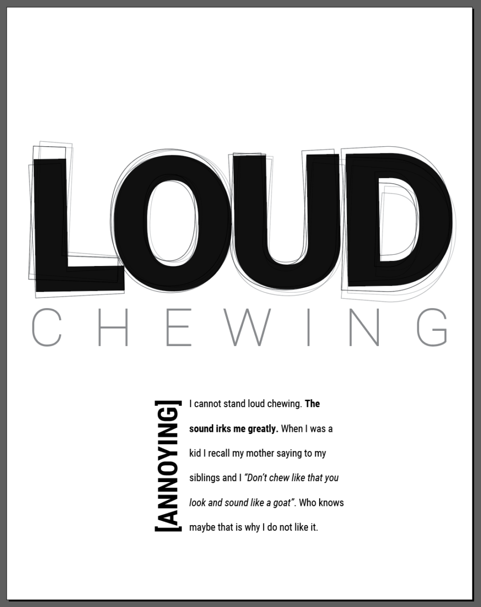
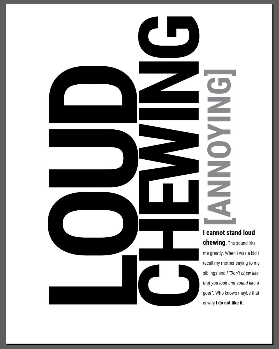
Note my visual hierarchy, and how different items follow grid.
I still have to edit placement and must look carefully at kerning, tracking, alignment, variations, etc.
You do not have to do this, but sometimes it is useful to know how to create a grid in Illustrator:
Creating a GRID in Illustrator
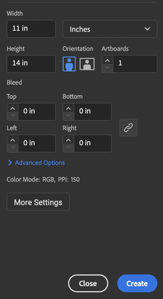
In Illustrator:
Create a 11 x 14 inches document
1 artboard
Leave all other settings as defaults
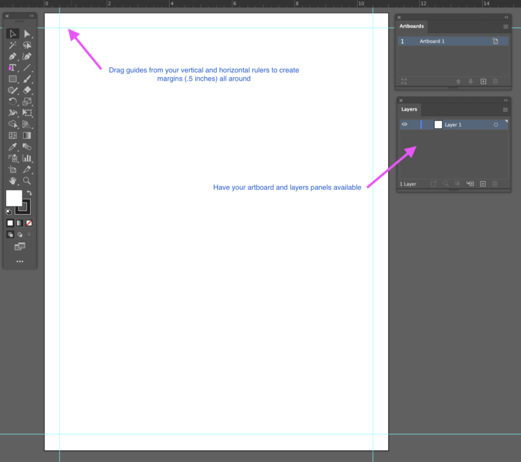
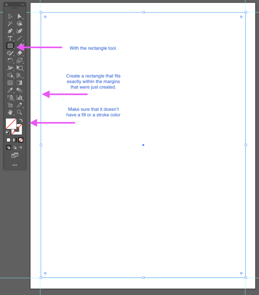
Include
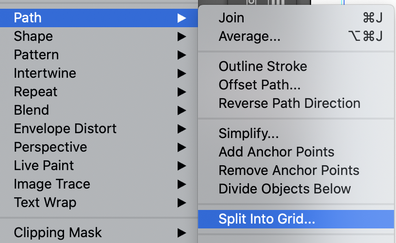
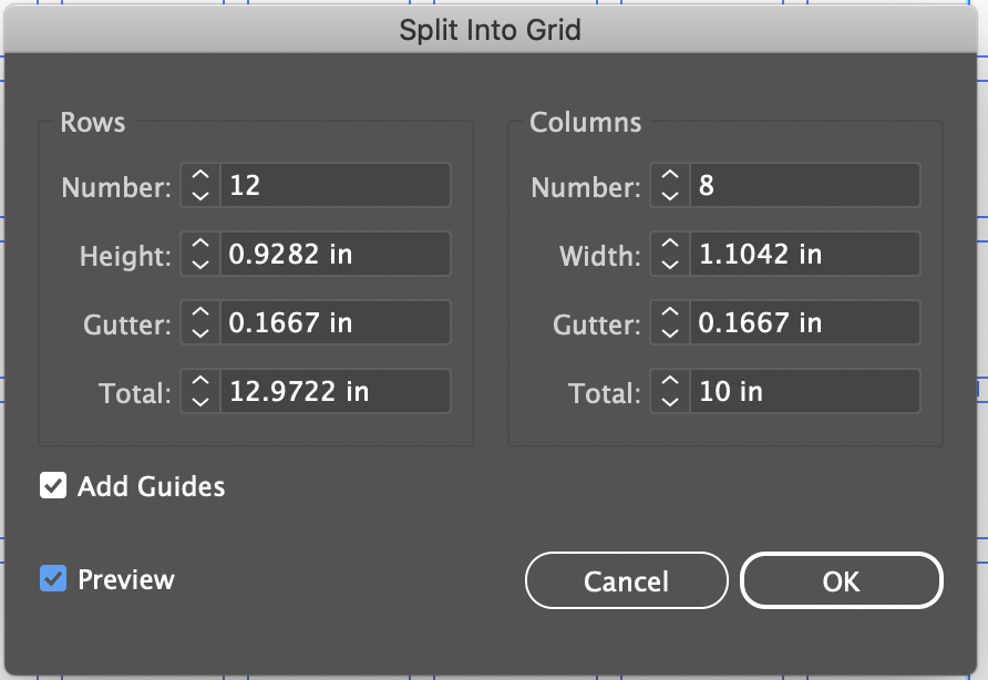
Make sure ADD guides and PREVIEW are selected
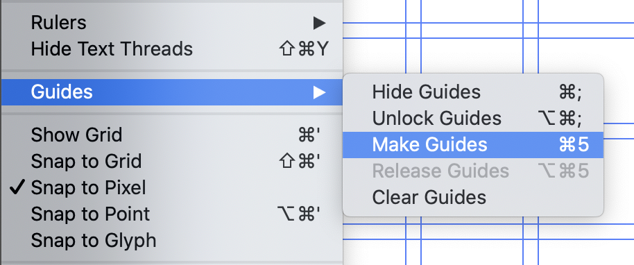
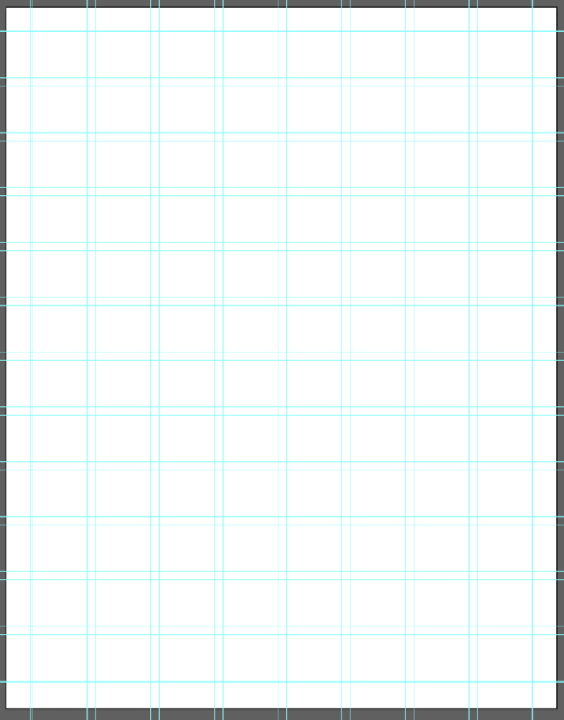
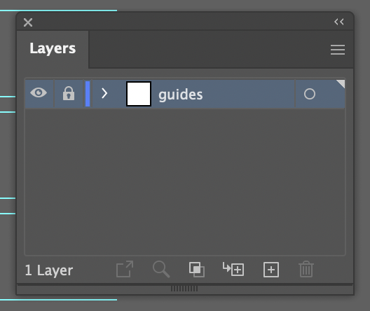
Can also Refer to video tutorial to create guides and grids. Please note that the tutorial does not include every step above
If needed: Passcode: QbmVm?X7
Assignment:
REFLECT, EDIT, IMPROVE, EDIT!
Edit 2 posters as per discussion.
Plece PDF in Dropbox
Lastname_posters_edited.pdf
This will be graded
Next class: Will work on Social Media and Motion
Graphic Assignments are always due the day before class at 11:30 pm, and must be placed in class drive (DROPBOX Spring 23) unless indicated otherwise. Assignments uploaded during class on the day that they are due are marked as late.
Participation Activities (Scavenger Hunts, Type Talks and Type Challenges) are due during class or the day before class at 11:30 pm if indicated by the instructor.


1 poster and 1 reflection
And the one reflection i chose is, reflection number 7 “Differences within consistency”