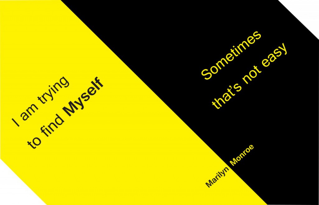
In this quote I was trying to combine the colors together and looking for which two colors will make people look very appealing, and comfortable feeling. Finally, I chose the combination of yellow and black, and I did not do much design on my typeface, because I feel that the color change is enough.

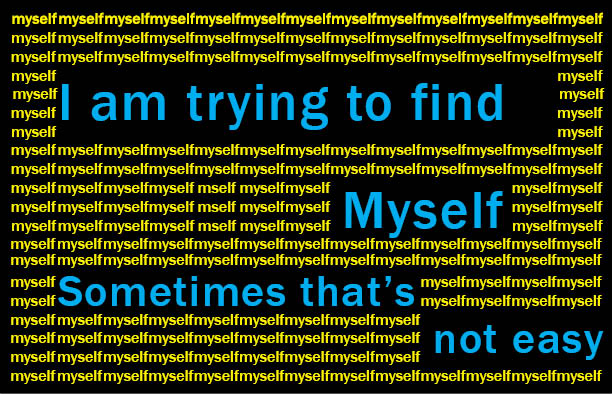
The second quote I changed the key words “Myself”, and repeated many times, even change a variety of different colors, to tell the people the main words is “Myself”, as well as tell you that the first quote on behalf of meaning.
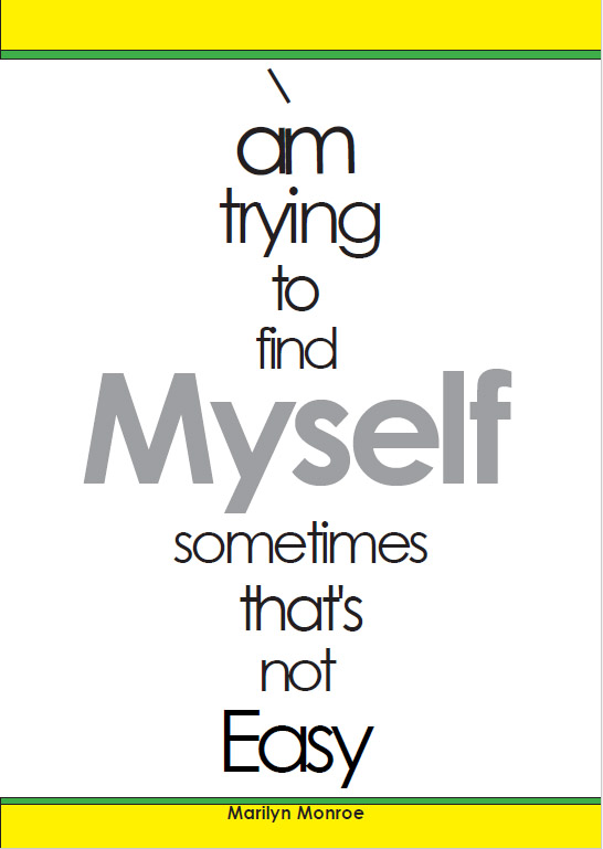
In this quote I changed the tracking, and changed the point size of each words, then I started to set size of main words myself, and makes it larger , as well as make the word word blur,let people have more clear on the meaning. Otherwise, I had make the two frames in top and bottom, it feels like the top and bottom are connected together.


