Tag Archives: scatterplot

Scatterplot: “How Ebola compares to other infectious diseases

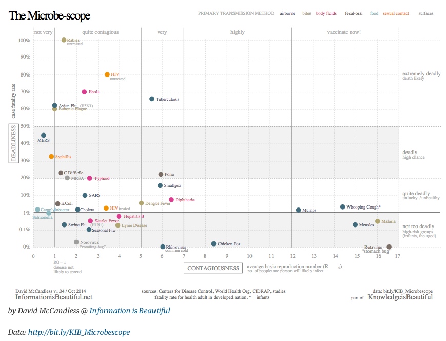
Here is the scatterplot from The Guardian Data Blog I showed briefly in class, which plots “deadliness” vs “contagiousness” for various infectious diseases:

ebolascatter

Here, “deadliness” is measured by the average case fatality rate (the % of infectees who die) and contagiousness is measured by an epidemiological statistics called R0, the basic reproduction number.

Note that the data behind this scatterplot is available at http://bit.ly/KIB_Microbescopein the form of a Google spreadsheet.

GapMinder: “Wealth & Health of Nations”

GapMinder is the site I showed earlier in the semester when we discussed scatterplots. Here is the scatterplot of the “Wealth & Health of Nations“, as measured by life expectancy (a measure of a country’s health) vs. GDP per capita (a measure of its wealth):

gapminder

Recall that GapMinder shows a time-lapse movie of such scatterplots, showing how this paired data set evolved over the past 200 years. In fact, they produced a video called “200 years that changed the world” in which Hans Rosling, the medical doctor and statistician who created GapMinder, provides commentary on this time-lapse data.

Rosling became widely known through his TED talks. His first one, from 2006, is titled “The best stats you’ve ever seen

Note that GapMinder has a wealth of data that is available for download.