Category Archives: Uncategorized

The Central Limit Theorem in Words (via “Statistics: A Very Short Introduction”

If you’d like to get a more conceptual overview of the topics we’re studying, you could take a look at this book:

statistics-veryshortintro

The nice thing is that you can access an electronic copy of this book via the CUNY library–try this link.

Here is description from the publisher:

Statistical ideas and methods underlie just about every aspect of modern life. From randomized clinical trials in medical research, to statistical models of risk in banking and hedge fund industries, to the statistical tools used to probe vast astronomical databases, the field of statistics has become centrally important to how we understand our world. But the discipline underlying all these is not the dull statistics of the popular imagination. Long gone are the days of manual arithmetic manipulation. Nowadays statistics is a dynamic discipline, revolutionized by the computer, which uses advanced software tools to probe numerical data, seeking structures, patterns, and relationships. This Very Short Introduction sets the study of statistics in context, describing its history and giving examples of its impact, summarizes methods of gathering and evaluating data, and explains the role played by the science of chance, of probability, in statistical methods. The book also explores deep philosophical issues of induction–how we use statistics to discern the true nature of reality from the limited observations we necessarily must make.

Here is the author on the Central Limit Theorem (p73):

Imagine drawing many sets of values from some distribution, each set being of size n. For each set calculate its mean. Then the calculated means themselves are a sample from a distribution – the distribution of possible values for the mean of a sample of size n. The Central Limit Theorem then tells us that the distribution of these means itself approximately follows a normal distribution, and that the approximation gets better and better the larger the value of n. In fact, more than this, it also tells us that the mean of this distribution of means is identical to the mean of the overall population of values, and that the variance of the distribution of means is only 1/n times the size of the variance of the distribution of the overall population. This turns out to be extremely useful in statistics, because it implies that we can estimate a population mean as accurately as we like, just by taking a large enough sample (taking n large enough), with the Central Limit Theorem telling us how large a sample we must take to achieve a high probability of being that accurate. More generally, the principle that we can get better and better estimates by taking larger samples is an immensely powerful one.  We already saw one way that this idea is used in practice when we looked at survey sampling in Chapter 3.

Here is another example. In astronomy, distant objects are very faint, and observations are complicated by random fluctuations in the signals. However, if we take many pictures of the same object and superimpose them, it is as if we are averaging many measurements of the same thing, each measurement drawn from the same distribution but with some extra random component. The laws of probability outlined above mean that the randomness is averaged away, leaving a clear view of the underlying signal – the astronomical object.

 

Nate Silver’s “The Signal & the Noise”: Outline + Project Ideas

I encourage you to read Nate Silver’s book The Signal and the Noise at some point (there is a copy in the CityTech library), since it discusses a number of applications of statistics and probability. Hence, it raises a number of different ideas for projects. Here is an outline of the topics of the book, along with some project ideas:

  • Chapter 1 (“A Catastrophic Failure of Prediction”) discusses the financial crisis of 2007. It starts by looking at mortgage-backed securities (MBS) and collateralized debt obligations (CDOs), and how the credit ratings agencies miscalculated the probabilities of default on such securities, and underestimated how such defaults could be correlated.  One idea for a project is to go through the simplified CDO example that Silver presents in this chapter, and more generally look at probabilities and risk in such “fixed income” securities (the simplest of which are bonds). A related article to look at for this is a 2009 Wired article titled “Recipe for Disaster: The Formula That Killed Wall Street“.
  • Chapter 2 (“Are You Smarter Than a Television Pundit?”) discusses predictions and punditry in politics. It also introduces one of the central themes of the book: “thinking probabilistically.”  Though it’s not explicitly discussed in the book, a great idea for a project would be to look at the details of Silver’s 538 election forecasting model. There is a good writeup on the 538 website: “How The FiveThirtyEight Senate Forecast Model Works“.(Before going into the quantitative details, Silver introduces some principles for a good model, the first one of which is: “Principle 1: A good model should be probabilistic, not deterministic.”)
  • Chapter 3 (“All I Care About is W’s and L’s”) discusses Silver’s original foray into statistical modeling: baseball. He tells the story of how he developed his model for forecasting baseball player performance and development, PECOTA.  Again, it’s not discussed in detail in the book, but if you’re interested in baseball, a project could look at some of the details of PECOTA (here is something Silver wrote about it), and/or some of the “advanced stats” that have been developed for baseball, such as Win Expectancy, Win Probability Added, or Wins Above Replacement. I have a copy of another book titled “Baseball Between the Numbers” which is a collection of articles about the quantitative/statistical approach to baseball.

    Such advanced statistical approaches are also being applied to other sports (often under the heading “advanced stats” or “advanced analytics).  For example, a great subject for a project would be to look at a still-developing statistic for basketball called “expected value possession” (EVP). Here is the basic idea, taken from a Grantland article titled “Databall” by a one of the people who is working on it:

    Every “state” of a basketball possession has a value. This value is based on the probability of a made basket occurring, and is equal to the total number of expected points that will result from that possession. While the average NBA possession is worth close to one point, that exact value of expected points fluctuates moment to moment, and these fluctuations depend on what’s happening on the floor.

    See also this Grantland interview with the two Harvard statistics PhD students who developed this idea, and the paper they presented earlier this year at the annual MIT Sloan Sports Analytics Conference.  There’s also this link which goes through an example and relates it to baseball’s Run Expectancy and football’s Expected Points Added.

  • Chapter 4 discusses advances in weather forecasting, and includes a little bit about the philosophical debate about “determinism vs. probabilism” and “Laplace’s demon“, before discussing some aspects of chaos theory (namely, sensitivity to initial conditions) and why it means weather forecasts are probabilistic. Silver also presents statistics showing that weather forecasting has been getting steadily better over the past few decades.One project idea would be to look at how probability is used in weather forecasting; there is an article by two meteorologists from the National Oceanic & Atmospheric Administration’s National Severe Storms Laboratory on “Probability Forecasting“. You could also look at the technique of “ensemble forecasting,” which is alluded to in Silver’s chapter.
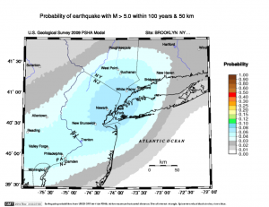
  • Chapter 5 (“Desperately Seeking Signal”) describes the difficulty of predicting earthquakes from data. Some concepts discussed here that could lead to projects are the Gutenberg–Richter law, which “posits that there is a simple relationship between the magnitude of an earthquake and how often one occurs.”

    This is part of a model used by the United States Geological Survey to calculate the probability of an earthquake occurring at any given location within a given time frame. See the USGS link Earthquake Probability Mapping, which was used to generate this map of earthquake probabilities for our region:earthquake

Outline to be completed:

  • Chapter 6: economic forecasting
  • Chapter 7: infectious diseases
  • Chapter 8: gambling on sports (and Bayesian statistics)
  • Chapter 9, “Rage Against the Machines”: computer chess (which was also the subject of a short film on FiveThirtyEight’s website: “Exploring The Epic Chess Match Of Our Time“)
  • Chapter 10, “The Poker Bubble”: the probabilities (and economics) of poker
  • Chapter 11 returns to some topics in finance, with a focus on the efficient-market hypothesis and financial bubbles. There has been a lot of statistical work on testing the efficient market hypothesis, some of which Silver discusses, and which could be a good topic for a project, especially if you’re interested in the stock market.
  • Chapter 12, “A Climate of Healthy Skepticism”: climate forecasting and predictions of global warming
  • Chapter 13 focuses on terrorism, including statistics of terror attack frequency

Scatterplot: “How Ebola compares to other infectious diseases

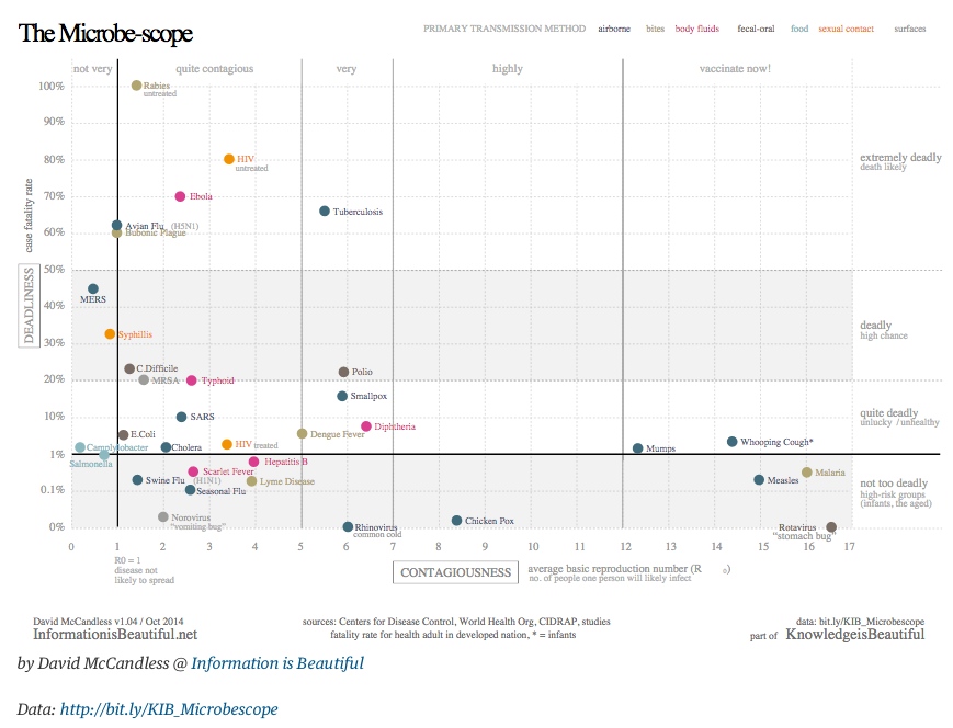
Here is the scatterplot from The Guardian Data Blog I showed briefly in class, which plots “deadliness” vs “contagiousness” for various infectious diseases:

ebolascatter

Here, “deadliness” is measured by the average case fatality rate (the % of infectees who die) and contagiousness is measured by an epidemiological statistics called R0, the basic reproduction number.

Note that the data behind this scatterplot is available at http://bit.ly/KIB_Microbescopein the form of a Google spreadsheet.

GapMinder: “Wealth & Health of Nations”

GapMinder is the site I showed earlier in the semester when we discussed scatterplots. Here is the scatterplot of the “Wealth & Health of Nations“, as measured by life expectancy (a measure of a country’s health) vs. GDP per capita (a measure of its wealth):

gapminder

Recall that GapMinder shows a time-lapse movie of such scatterplots, showing how this paired data set evolved over the past 200 years. In fact, they produced a video called “200 years that changed the world” in which Hans Rosling, the medical doctor and statistician who created GapMinder, provides commentary on this time-lapse data.

Rosling became widely known through his TED talks. His first one, from 2006, is titled “The best stats you’ve ever seen

Note that GapMinder has a wealth of data that is available for download.

Frequency Histograms Showing “The Aging of America”

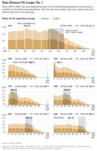
Here is the example I showed in class when we discussed frequency distributions and histograms at the beginning of the semester, which shows the age distributions of the US population over time:

A similar post appeared on WashingtonPost’s Wonkblog:

  • “This is a mesmerizing little animation created by Bill McBride of Calculated Risk. It shows the distribution of the U.S. population by age over time, starting at 1900 and ending with Census Bureau forecasts between now and 2060.”

What do you notice about how the distributions evolve over time? Click thru to either the CalculatedRisk blog post on which this animation first appeared or to the WashingtonPost link to read some discussion.

Also here is a related set of histograms that were featured in the NYT Business section in May, as part of an article titled “Younger Turn for a Graying Nation“:

NYT-graying

That was an installment of a weekly column in the NYT Business section titled “Off the Charts,” which discusses a graph and the underlying data every Saturday.