From the Field
We the Designers: Reframing Political Issues in the Obama Era
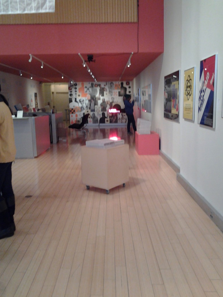
This year the American Institute of Graphic Arts presented its national We the Designers exhibit, titled Reframing Political Issues in the Obama Era. The title of the exhibition is a giveaway as for what would be displayed in the gallery. The purpose of the exhibit was to showcase the works of self-authored designers that undertook the responsibility to influence and enlighten citizens about the issues facing our society during the Obama administration through visual arts instead of the verbal actions which our generation seems to notice less. The Barack Obama campaign of 2008 was one of the most visible political campaigns of our time; this was mainly because on the extensive involvement of design and branding; not very typical in Politics, starting with the Obama logo which cleverly helped communicates to the public the candidate’s slogan of hope and change. I was particularly excited to see this exhibit because of the controversy and attention the Obama administration has had throughout the years. I’ve also never seen any of AIGA exhibitions, I really didn’t know what to expect as I entered their very contemporary gallery at 164th Fifth Avenue. Below are three designs that in my opinion, truly captured the idea the designers were trying to convey.
Thomas Starr
American b.1948
Birth Certificate
2011
Inkjet print
8x10in
Photograph by Ernest Withers
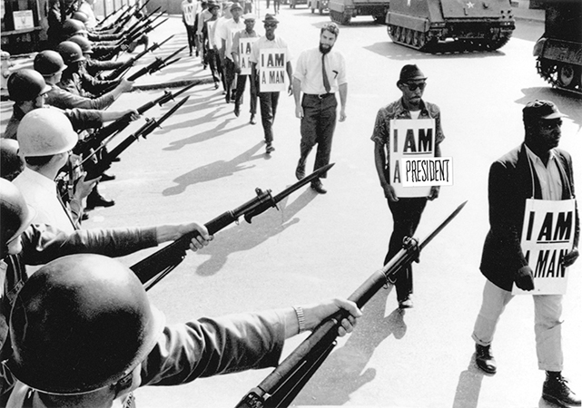
One of the pieces that I found very interesting and clever was by Thomas Starr a graduate from Parsons and Yale in Graphic Design. The piece is a photograph, taken by Ernest Withers in 1968 in Memphis, Tennessee at the epicenter of the Civil Rights Movement and adjusted by Thomas Starr. The image alone has a great impact at first hand.Thomas Starr took the original photograph of Withers and made a minor change to create a relation between what was happening in the that era and relating it to this time period. The image presents a line of very well organized march of composed colored African American man with hanging signs on their necks with the words “I AM A MAN” written in a large sans serif typeface. At their right are military soldiers pointing at them with very large rifles with bayonets fixed at the end of the guns and war tanks marching at their left. This image at first to me it seems very disturbing until I notice that one of the marking colored man sign actually had something written differently from the others it read “I AM A PRESIDENT” and that’s when my whole perspective on the photograph changed. Thomas Starr did an excellent job on through his design to unconsciously allow the audience to reflect on how far this country has come; from Martin Luther King Jr. and the Civil Rights Movement to having the first African American President.
Steven McCarthy
Dad+Mom
2011
Toner on paper
26x26in
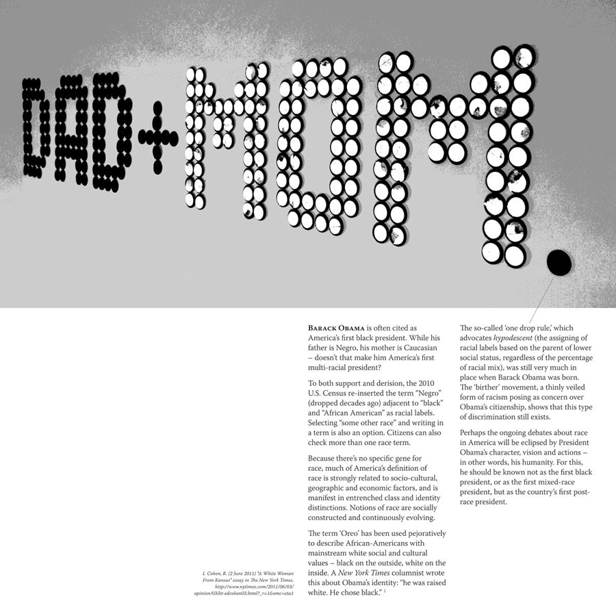
Another piece that I found interesting was that of Steven McCarthy. The piece named Dad+Mom is a Photograph of toner on paper with the Dad+Mom written on a flat surface with black and white circles and mirrors.The piece also includes an essay by Cohen, R published in The New York Times that accentuates the photograph. This piece is certainly extremely straight forward conveying the main controversy on the Obama Administration which was one of the Former President races; having an African American dad and a Caucasian mother. This issue added to the influence his election to presidency had on the citizens of the U.S. and the clear achievement of the people that supported him after his election.
I.O.U
2011
Digital Print
60x43in
The last piece that caught my attention in the exhibit was by cover book designer Christopher Brand. As I have mentioned the designer of the piece title I.O.U is mainly known for his cover book designs which design style is greatly reflected on this piece. The digital print is 60 inch by 43 inch image of the United States map on a black background. The map is filled with sheet paper which is form of horizontal stripes and the vertical red line of the margin that has been left exposed at the left corner of the map. In the center of the map are the letters I.O.U., with the Obama Logo as the O. What interested me about this peace was its simplicity and how the designer really let the logo speak for itself having the only color in the piece making the logo stand among the other parts of the image. Another aspect that I like is the connection that it has the abbreviation “I love you” reference, by changing the love for the Obama logo.
[Images courtesy of AIGA]


