Academic Examples
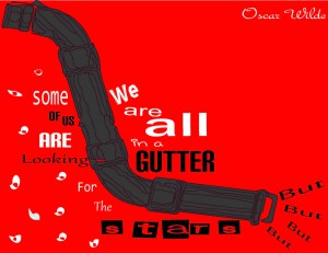
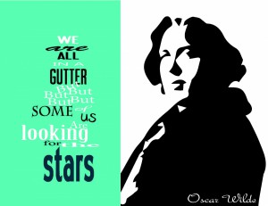
“We are all in a gutter but some of us, are looking for the stars” once said by Oscar Wilde was the quote that I chose to visually enhance for this assignment. My first attempt on creating my three concepts for the quote that I chose to visually enhance was a disaster. I was faced with a few obstacles to create a cohesive design that truly in bodied the meaning of the quote. My first three attempts as you can see below have an excessive use of typefaces throughout in the design, which obviously didn’t work together. After working with these designs and concluding that they weren’t going anywhere, I decided to start over with a few pointers my professor gave me. Thus, “more is less and less is more”.
First Visual Enhance Quotes
In my second attempt at creating my three visually enhance quotation; I decided that I was going to play more with type to achieve my goal of creating a more minimalistic design. In this first design you can notice the use of color was very minimal. I used warm colors and also complementary to each other for the words that I decided to emphasize from the rest of the quote. In this piece I used a sans serif type for the parts of the quotes that I did not want to emphasize but also a typeface that would not go unnoticed. For the Word gutter I chose a typeface that could represent something that looked as if came out straight out off a filthy gutter all wrinkled and dirty, finishing the overall look by using a dark brown color. I also try to contrast using my type by using a very thing sans serif typeface to balance the piece so that the bold sans serif typeface won’t over power the whole design. I also added another version that has a bit more color; I added a black background, which helps the other colors to feel more vibrant.
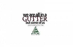

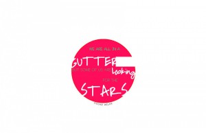
In developing my second design I wanted to achieve something even more simple and delicate, only using two typefaces. Color wise I decided to go with color bright colors that are also contrasting. I chose these colors because I wanted to also represent the flamboyant and delicate personality of Wilde. I also made the conscious decision of placing my quote with the restriction of a circle because it gives the design a soft and classy feel. Although the circle somehow restricts the design it also gives this vive of also being free, personal and almost playful. The circle also helps convey the meaning of the quote in the sense that sometimes individuals conform to what they know in this case a circle, instead stepping out of circle and aiming for the unreachable, which in this case are the stars.
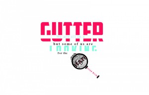
For my third and last concept I also used mostly type and some illustration. For the word gutter and looking I used bold and demanding typeface. I chose to place the line of the quote we are all in a on top or inside of the word gutter because it made the meaning of the quote more literal, instead of using an image of a gutter to get the point across. I also used two very different typefaces to have more contrast within the words one being an old style and a bold sans serif typeface. I played around with the world looking and decided to cut it in half because to show how sometimes we have the tendency of always giving half of our attention to the important things in our lifes. In this design I also tried to get across the literal meaning of looking for the stars by adding a magnifying glass focus on a finger print, by also highlighting the word starts and adding black outline to accentuate the word stars.

