Here is my final presentation about my amazing experience in Unity for Equality, a place that made me feel welcomed and confident with my skills and creativity.
Also, here is the PDF for the presentation.
Here is my final presentation about my amazing experience in Unity for Equality, a place that made me feel welcomed and confident with my skills and creativity.
Also, here is the PDF for the presentation.
During my time at this organization, I have accumulated wonderful memories, honed valuable skills, and bolstered my self-assurance in both personal and professional projects. I am deeply appreciative of the entire Unity for Equality team for making me feel at home and for allowing me to contribute in meaningful ways.
Working on projects aligned with my interests has enriched my experience, and I aspire to pursue similar endeavors in my future career. The tools and programs utilized were well within my expertise, and I encountered no substantial obstacles in executing them. I particularly want to express my gratitude to the company for assigning me a project that was beyond my comfort zone. This particular project was pivotal in instilling in me the confidence that I am capable of tackling any type of work. The project, which I tackled single-handedly, involved developing the company’s online magazine. The trust my supervisor placed in me to handle such a significant project served as a powerful motivator, bolstering my belief in my abilities.
This experience stands out as the most impactful and special moment during my tenure at the company. I am sincerely grateful to my supervisor for their encouragement and support, which ultimately led to exceeding expectations in the project. While I am still charting my professional path, I am elated to realize that I possess the capability to navigate various challenges. I extend my heartfelt thanks to everyone at the company for the opportunities provided. This experience has truly been instrumental in my personal growth and will forever hold a special place in my heart.
During my fourth week, things slowed down a bit as I only had one project on my plate. It was a financial literature project, which was quite new to me. Researching the topic and creating initial sketches for the illustrations took an entire day. Despite working fewer hours that week, I still managed to complete my required 120 hours. I submitted the project on Thursday afternoon, and I was thrilled when it got approved.

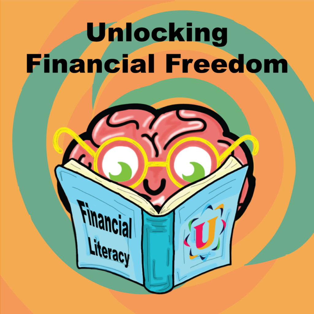
The theme for project 4 was the most challenging to portray through an illustration. I was tasked with representing financial literacy, a topic with which I was not familiar. I had to embark on an extensive research journey to fully comprehend the concept, which took much longer than anticipated due to the varying perspectives on the term. Eventually, after gaining a comprehensive understanding of the different aspects of financial literacy, I was able to form a clear vision for my illustration.
As I began working on the illustration in Adobe Illustrator, I focused on creating a simple and easily recognizable project. The central element of the illustration was a large brain character with eyes, glasses, and a mouth, symbolizing new minds learning about the subject. Additionally, I incorporated a book with the topic title to emphasize its significance, and I opted for a psychedelic-style background to add a dramatic effect.

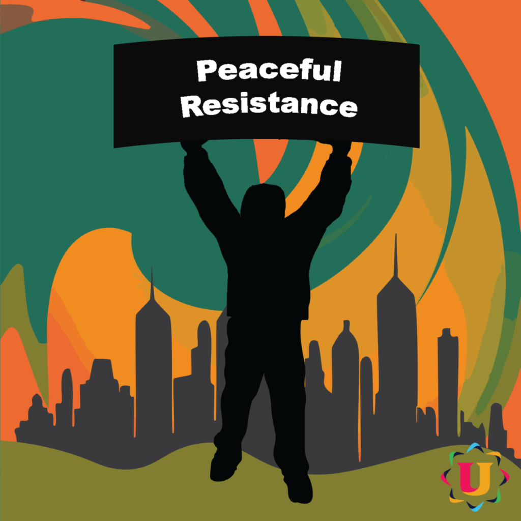
The recent illustration I created was intended for the company’s official Instagram account. I aimed to convey a strong message through a simple yet impactful image about the Disobediance Day. The project had specific guidelines in place, including the use of a color palette limited to orange, green, white, black, and blue. Interestingly, I had significant creative freedom in terms of how I incorporated these colors. Additionally, I was instructed not to include any images in the illustration.
While working on this project, I encountered a major obstacle in grasping the significance of this particular day. I was completely unaware of the existence of this day and its purpose, prompting me to conduct thorough research to gain a better understanding. After spending hours delving into various articles and sources, I finally comprehended the essence of the day and was able to start sketching out ideas for the illustration.
I thought that using a silhouette would be the most inclusive option, as it can represent people of all genders, ages, and backgrounds. I started by creating a black silhouette holding a banner with the powerful message “Peaceful Resistance” to symbolize the essence of the day. Then, I designed a background with swirling green and orange hues to create a dynamic sky-like effect around the silhouette. Lastly, I added a cityscape in the background to underscore the various social issues that plague cities all over the world.
My second project presented a significant challenge for me. Admittedly, I’ve never been particularly fond of working with typography, although I deeply admire and respect the artists who have made a lasting impact through their innovative use of typography. Despite my reservations, I chose to take on this project as an opportunity to step outside of my comfort zone and broaden my skill set. The task at hand involved creating the company’s monthly online magazine, which covers various social issues related to the company’s mission and areas of interest.

The project guidelines specify that a black-and-white color scheme should be maintained, with different layout styles used in each article. Additionally, the use of multiple photos with proper credit to the original author is required. Specific parameters may vary depending on the content and its purpose.
Over just over two weeks, I worked on a project that initially involved creating two articles. However, due to the positive feedback from the marketing directors, my boss assigned me an additional five articles to work on. This expanded scope included designing the magazine cover, merchandise page, and contacts page. Throughout the project, I utilized InDesign and Photoshop for image editing. Each article took me around a day and a half to two days to complete, varying in length and complexity.
Throughout this project, I was incredibly mindful and attentive, always following the guidance and recommendations of my supervisor. I took great pride in the fact that my designs were approved with minimal alterations. The focus of my work on each article primarily involved crafting impactful titles, organizing the text according to my supervisor’s direction, strategically placing and utilizing images, and employing a restrained color palette in the design. It was crucial for all these elements to be executed flawlessly to ensure they complemented each other effectively.
In conclusion, I want to express that this project was quite challenging and caused me a lot of stress, but it was also very rewarding because I was able to create something that not only my superiors appreciated, but that I truly enjoyed working on.
During my third week of internship at Unity for Equality, I had to divide my time in order to finish two projects. I was finally able to complete the longest project of the internship, which was creating the company’s online magazine. Finishing this project in the middle of the week allowed me to start and finish my third illustration in the last three days of the week.
That week, I intended to start a new project but had to put it on hold because my boss asked me to finish the company’s online magazine. The design and marketing team were pleased with my previous work, so I was assigned the last 3 pages of the magazine to complete. Each page took me about 3 and a half days to finish with revisions and corrections.
After wrapping up the magazine project, I started my third project, which involved creating an illustration for Civil Disobedience Day. I had to do some research since I wasn’t familiar with the event. Once I understood the significance of the day, I began working on the illustration for the company’s official Instagram page. I completed the final version and submitted it on Friday at 4 pm. After that, I went over the final edits with my boss until 5 pm. The design was approved, bringing an end to another week of work.

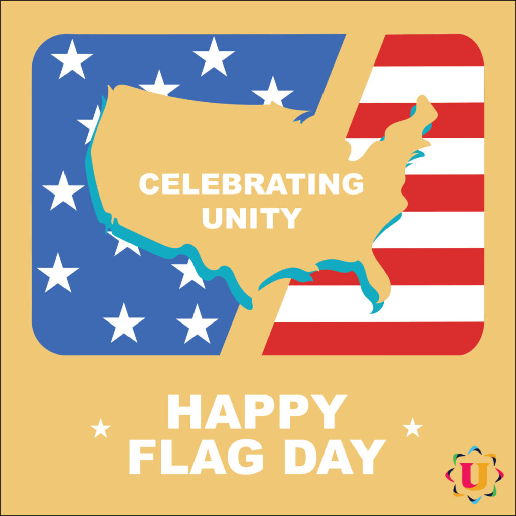
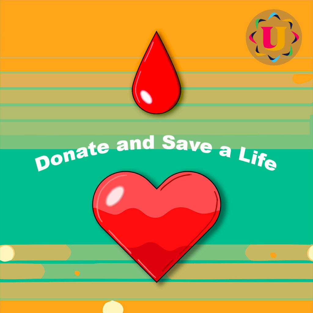
My first project for the company was one that I really enjoyed. The project consisted of two parts: two illustrations, one dedicated to Flag Day, and another dedicated to Blood Donor Day. Both illustrations were for the company’s official Instagram page. For this project, the only parameters I had to follow were a color palette limited to blue, orange, green, and red, not counting the colors of the logo. Other colors could be added if they justified their use and were similar to the previous ones.
For the project commemorating Flag Day, I created the artwork using Adobe Illustrator. My main objective was to evoke a sense of national pride by incorporating symbolic elements and colors associated with the country’s flag. The design follows a minimalist and simple style and features a limited color palette to maintain a clean and impactful look. The text kept to a minimum, is presented in a powerful white font to uphold the overall understated and dignified aesthetic.
In my second illustration, which was also created in Illustrator, I had the opportunity to unleash my creativity and incorporate meaningful symbols. I started by designing a vibrant linear abstract background using various shades of orange and green to make it visually striking from a distance. Then, I proceeded to craft a poignant message for the occasion. I depicted a drop of blood gradually filling a heart, symbolizing hope, health, and the new opportunities provided by countless donors. By creating the drop and the heart in separate layers, I was able to achieve a dynamic and eye-catching effect with different shades of red. Finally, I positioned the company logo in one corner and added a compelling yet uplifting message.
Unity For Equality is a nonprofit organization founded in 2016, dedicated to addressing social and economic inequalities in underserved communities. The organization focuses on a range of programs including education, healthcare, economic development, and advocacy to create a more equitable society. Their education initiatives aim to provide resources and support to students from disadvantaged backgrounds, while their healthcare programs work to ensure access to medical services for all. Unity For Equality also promotes economic development through job training and financial literacy workshops. Active in countries such as the United States, Bangladesh, and India, the organization strives to empower individuals and communities to achieve equality and improve their quality of life by advocating for policy changes and raising awareness about social justice issues.

A) As an illustrator, I typically create my illustrations using my own photos of settings or people. However, during my internship or other graphic design jobs, I may need to use someone else’s creative work. In those cases, I make sure to credit the original creator according to the licensing rules, whether it’s by including the author’s name in the photo or crediting them at the end.
B) What stands out about this article is Shepard Fairey’s legal trouble over his iconic Obama “Hope” poster. Fairey, a well-known street artist, was sentenced to probation and fined for tampering with evidence in a copyright case involving an AP photograph. This situation highlights the tricky balance between artistic inspiration and copyright laws, as well as the serious consequences of legal missteps. Fairey’s experience underscores the personal and professional costs of such battles and the importance of honesty in legal matters. The case, settled without a clear decision on fair use, remains a pivotal example of the challenges artists face in defending their creative rights.
Citations:
Fisher, William, et al. “Reflections on the Hope Poster Case.” Harvard Journal of Law and Technology, vol. 25, 2012, p. 244
The OpenLab is an open-source, digital platform designed to support teaching and learning at City Tech (New York City College of Technology), and to promote student and faculty engagement in the intellectual and social life of the college community.

