Dennis Ulloa
Professor Thelma Bauer
2/22/18
CDMG 1111
Logo Report Essay
 |
he logo I pick is the McDonald’s logo because it something that I see at least once a week because how common this logo really is. Not only that but how this is a lot of people recognize the logo and know already what it represent. This logo got me to wonder how just the letter M just mean Mc Donald and follow by how this simple logo change how people see it and understand it’s recognition.
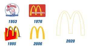
and this logo started in 1962. This logo went to some changes but the most popular design logo is created by a artist name by Jim Schindler. However, one of the McDonald brothers created the McDonald logo but wanted a professional to follow the original concept and make it better. Jim Schindler created the logo by focusing on the arches because he felt that it stick out more so a lot of people will notice more. Not only they made a red background because one of the brothers wanted to use it for the logo. Throughout the years the logo went some changes where the arches are kept because it was very noticeable but add a shadow behind to look 3D. The red was kept to be a symbol color to all fast food joints. This logo is really memorable because a lot of people recognized it and even the golden arches. Not only that, it also uses the slogan “I’m loving it” where it helps with logo where it shows that McDonalds is a family place were a lot of people can come and enjoyed a good Meal. These ideas help change to make the logo or business into think about the future and how to run the business.
I don’t believe the logo of McDonalds didn’t influence any other logo because most of them had their own design and typeface. For example Coca Cola started with only the typeface but back then there wasn’t any color but the typeface help out there. Later on Coca Cola did add the red color but I believe in that time red might have been the popular color and pretty noticeable at that time. I think there was no impact of the McDonalds logo to other logos.
Even though that it didn’t influence other combos it did stand out were others were able to use this method of the logo. For example, the letter M helps with design because the artist made with the shadowing which help designers to visualized the M. Also, the typefaces because even though it just the letter M it helps other to have ideas on how just one letter can be something made for the public to see. I feel that the logo did impact but in a design way because it shows how one can make a design with a single letter.
Looking at the McDonalds logo now and how it advertised their product is both the adult audience and the kids. The reason why is because people to understand that McDonald is a kid friendly environment so all ages can enjoy a good meal. Not only that McDonalds slogan “I’m loving it” is very catchy with the giggles and very noticeable because of how it is phrase to grab the people to believe that their food is great. Not only that but with the color red helps with the rep because with the slogan “I’m loving it” the red background help people view the red as represent love and it fits well. Not only that the logo change how it was back then with a design of a person then later on it turn to just with the letter M.
The reason why I pick the McDonalds logo is because how iconic it is because the minute someone see’s or the first time entering the building you’ll recognize what the letter M mean for the rest of your life. Now knowing how the logo started and how it changes the perspective of the design by using one letter. After all, like I said before something that simple can get a lot of attention and cause a big impact to the industry.


