Everyone,
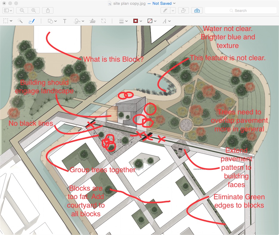
Here are general comments that you all should consider for site plans: (some comments are based on Christian’s progress site plan, but I am using his progress to bring up these issues to all of you)
1. Lineweights: Building Footprints should have heaviest line weights. All pavement, road, pathway, landscape line weights should be light.
2. Sharpen shadows to make them more apparent.
3. Trees should not have too much variation from the middle to the edge of the block. Edges are too light. Make them more consistent from middle color to edge color. Trees in the park are too transparent. Do not change transparency from one tree to another, keep them all the same.
4. Eliminate black heavy pavement lines on road.
5. Consider a pavement pattern rather than a texture at squares.
6. Trees on perimeter walks next to canal, waterfront are not clear. Use same or similar block as others, just smaller.
7. What is the grey ambiguous pavement around your building? Why not just extend beige color for pavement at canal walk right up to your building?
8. Where is the canal terrace we discussed? Not clear. Add umbrellas or something to clarify.
9. Steps to lower canal walk should be 10′ wide at least.
10. Too many color variations on pavement, walkways, highland…. Use one color for all pavement except at public squares. Make general pavement color lighter.
11. Water color should be a “happier” shade of blue and possibly have some texture on it.
12. Avoid ambiguous conditions around your building itself. You should have MORE DETAIL for your building than the surround parts of the site plan. Your buildings should be fully integrated into the place, with landscape and pavement patterns running right up to the face of your building. Integration into place is the name of the game.


