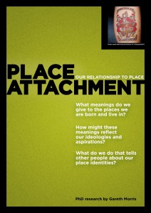
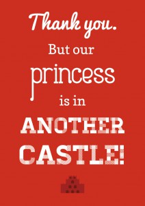
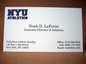
I feel that this type of leading is appropriate for each of the images layouts because it expressed different design looks to represent what message it is trying to accomplish.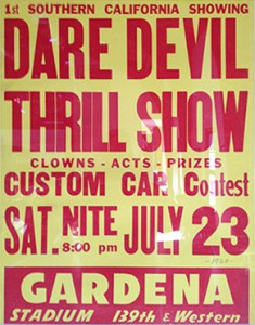
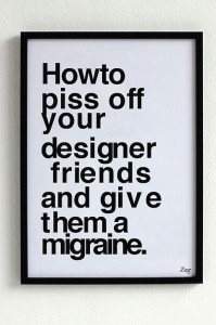
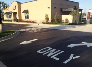
The reason why that I consider these images bad is because the kerning within them makes the words that are spelled out look very distorted and very unprofessional.

