Category Archives: Uncategorized

My Zine Topic

Well, I thought about what I wanted to talk about the most is how my art obsession all started. I have enjoyed looking at art all my life, the different styles that catches my eye. My main point in my main point would be show the evolution of artwork I have done over the years.

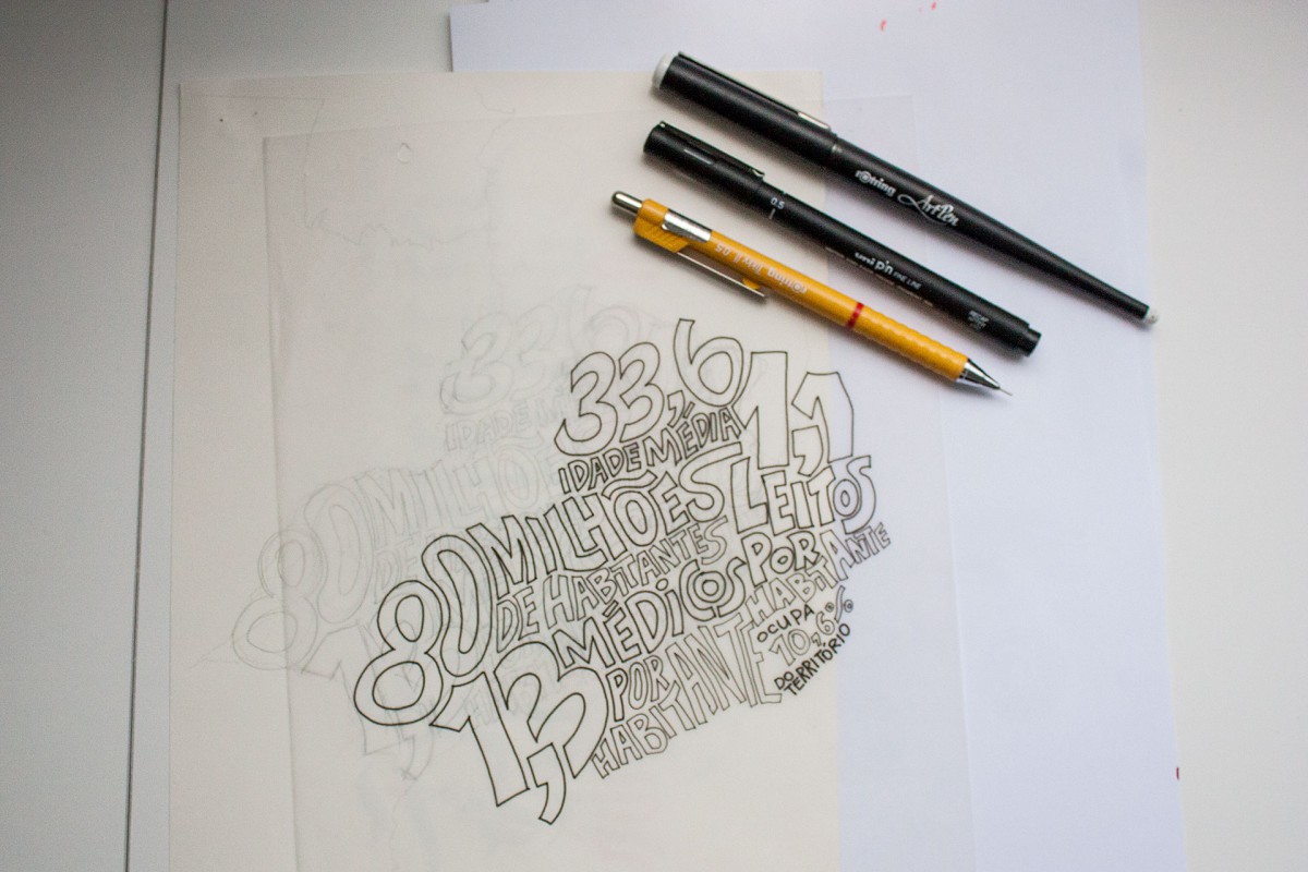
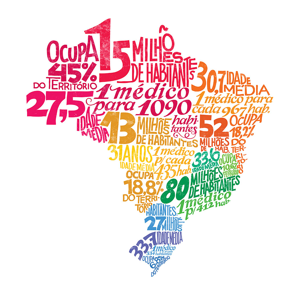
My Zine will incorporate creative writing that will be spread out through the Zine (hopefully I can come up with something for a first). The text will describe each Image and how my technique has got better over time. Images are going to be of my drawing from when I was young to my present day work. I can’t wait to get started. I actually feel the excitement growing within me. Ha!

Journal Research Report :)

The person that I chose to talk about in this report is Jackson Alves. He is a Brazilian Graphic Designer and Typographer that does a lot of awesome work. Alves also teaches other people in workshops how to create there own fonts and how to design them properly. Most of his work is creating custom exclusive lettering to different clients around the world. By looking through his work, his lettering designs looks so awesome when they are hand done.

Jackson Alves work hand done work is mostly in use of Quill pens because creates a much cleaner look to his design will inking. I can’t take the image out, but if you click here, this is what he does when he needs to make a vector version of his type. He adds a letter cut with a number line to make it look more efficient.

Now, there is this project that Alves has done for the Editora Mol ( it is a big company of drugstores in Brazil), to create an overlay of his lettering on the map of Brazil. The way his font look, the way it felt, was very cool, relaxed, and tropical. The feel of his design describe Brazil from his own eyes because it is his homeland.

95b0c5fff4f41556cb4a626ce0fdb1de      280f66526347634e23daced80406c6fb     95ec24fe842a416667e8dd890c70e04a


HW/ Journal week 5

Challenging-Status-Quo-Scientific-Posters mario-gaming-posters-quotes-03_1024x1024 20_offset-pantone-business-card-design-print-downtown-new-york-city-emboss-deboss-corporate-logo-designer-ny


I feel that this type of leading is appropriate for each of the images layouts because it expressed different design looks to represent what message it is trying to accomplish.Bad-poster-1 Shahir-Zag-1 kernonly1


The reason why that I consider these images bad is because the kerning within them makes the words that are spelled out look very distorted and very unprofessional.

5 Family type font

CYMERA_20140221_133717


The reason why this is an Modern style is because the serifs are completely angled from the font. There is no curve in it for it to be lets say a old style or a transitional. Through the strokes of each letter is most of the time squared off.

CYMERA_20140221_133834


The reason why this is a slab serif is because each bracket are very bulky and the strokes of he font are very thick also.

CYMERA_20140221_133950


The reason why this font is a san serif because the font does not contain any serifs.

CYMERA_20140221_134427

I think the reason that this would be Old Style is because that strokes are a lot thicker than old style and the brackets on the corners of the H are more angled looking other than Transition which have more of a curve to its brackets.


CYMERA_20140221_134630

The reason why I think this would be Transitional because the strokes are a lot thinner than transitional and brackets look more sculpted than the Old style.


HW #2

CYMERA_20140213_200140


Here is my anatomy on this inked word

CYMERA_20140213_200002


With this one I tried my best to align the text well but did not come out right. But besides the fact that the bottom line is slanted the leading in this is really bad. The reason why I say the leading is bad is because there will be to much such space to move you eyes which makes it harder to read if the type and leading was formed in a paragraph. If the leading was a lot closer the reading would be a lot more fluently.

HW # 1

CYMERA_20140207_132915 CYMERA_20140207_132930 CYMERA_20140207_133026


The photos that I have taken here are typography that I pass by every day. Now each of these photos has different fonts. With in each of fonts, describes what type of place you would enter. Even though fonts like the Royal food Market and the Botanica are slightly boring and simple, it still represents them. Now the way the Barbershop represent themselves is showing through there design that they are very artistic. I chose these photos because there is different type of fonts between them.