
final design 
final draft 
second draft 
first draft/thumbnail 
outline 3 
outline 2 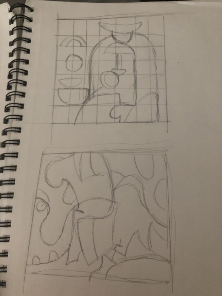
outline 1 
color palate 
color palate color pencil 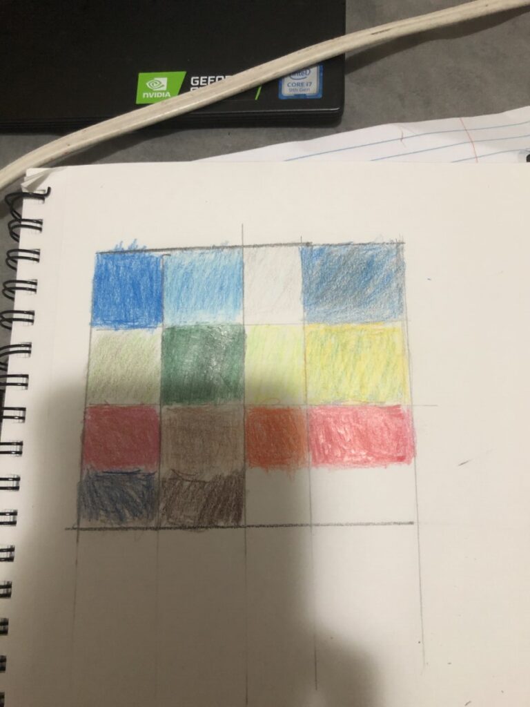
color palate color pencil 1 
color palettes analog 

inspiration 
While doing this project i was inspired by many magazines such as the New Yorker and Art Market. There color palette strike me as beautiful, so i wanted to emulate that same cooler or warmer color contrast in my color palette. On the first section of the color palate I used triad colors specifically 1 primary colors and 2 secondary colors, the contrast I was going for was a low value scale. the 2nd low value color is a monochromic color since I used only used one overall colors but with slight variations. the remaining three color variations are high value complementary colors .


Leave a Reply