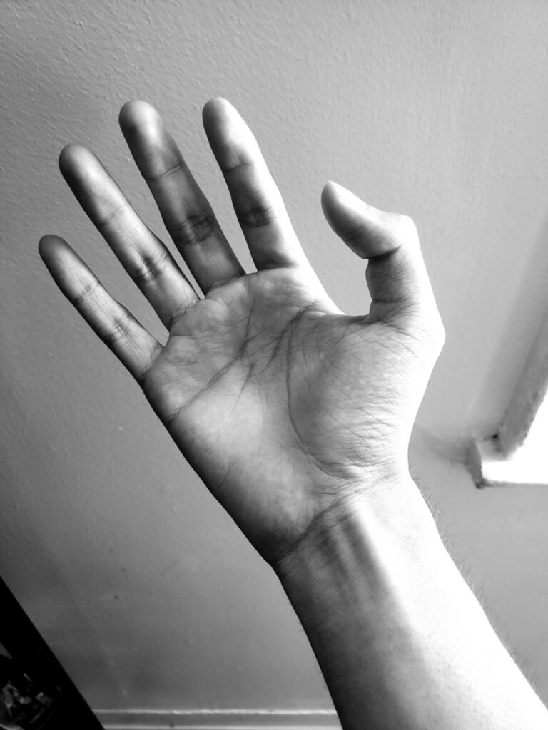
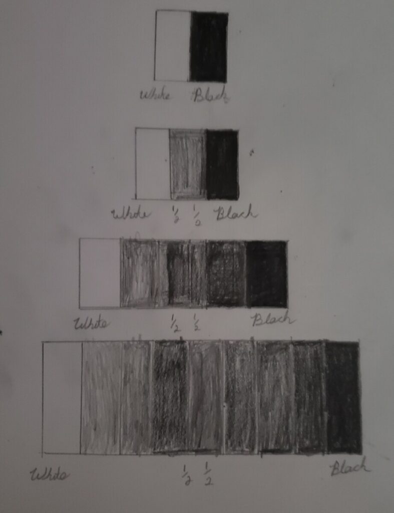
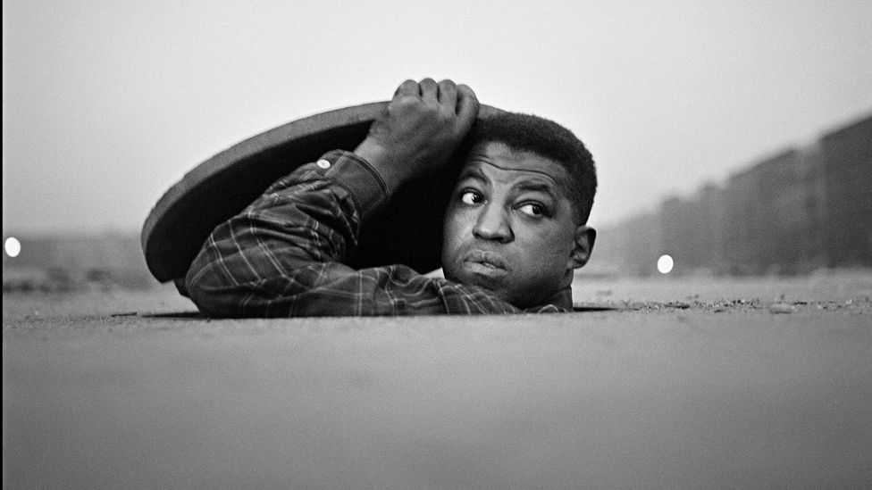
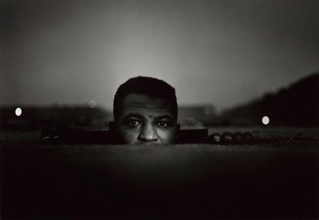
This project was a way for me to recognize how different shades worked within a portrait. Whether that being a hand or face portrait, 5 different value levels stood out that made my portrait stand together. Using photoshop after a long time made me revisit a feature I used back in high school, and it felt nice to use a program that I already had experience in. Some aspects I could’ve done better with in this project is the use of my values when painting, it is much different than the actual portrait, and has less shading as well. I’ll update this post soon to include the completed final product and my notes.
About
Instructor: Carol Diamond
Office hour: 1:30-2:30pm Monday
This basic design and color theory course explores graphic communication through the understanding of the elements and principles of design, as well as the design process, including idea development through final execution. Communication designers use the concepts explored in this course in disciplines such as advertising, graphic design, web design, illustration, broadcast design, photography, and game design.




hi Gabriel, keep going with the Value portrait. I’m glad you posted the full project in progress. Looks like you may be painting on sketch paper so it’s rippling, rather than Bristol paper? that will limit the final effect, but keep pushing those middle values and use smaller brushes slowly to get clear edges.