About
Instructor: Carol Diamond
Office hour: 1:30-2:30pm Monday
This basic design and color theory course explores graphic communication through the understanding of the elements and principles of design, as well as the design process, including idea development through final execution. Communication designers use the concepts explored in this course in disciplines such as advertising, graphic design, web design, illustration, broadcast design, photography, and game design.
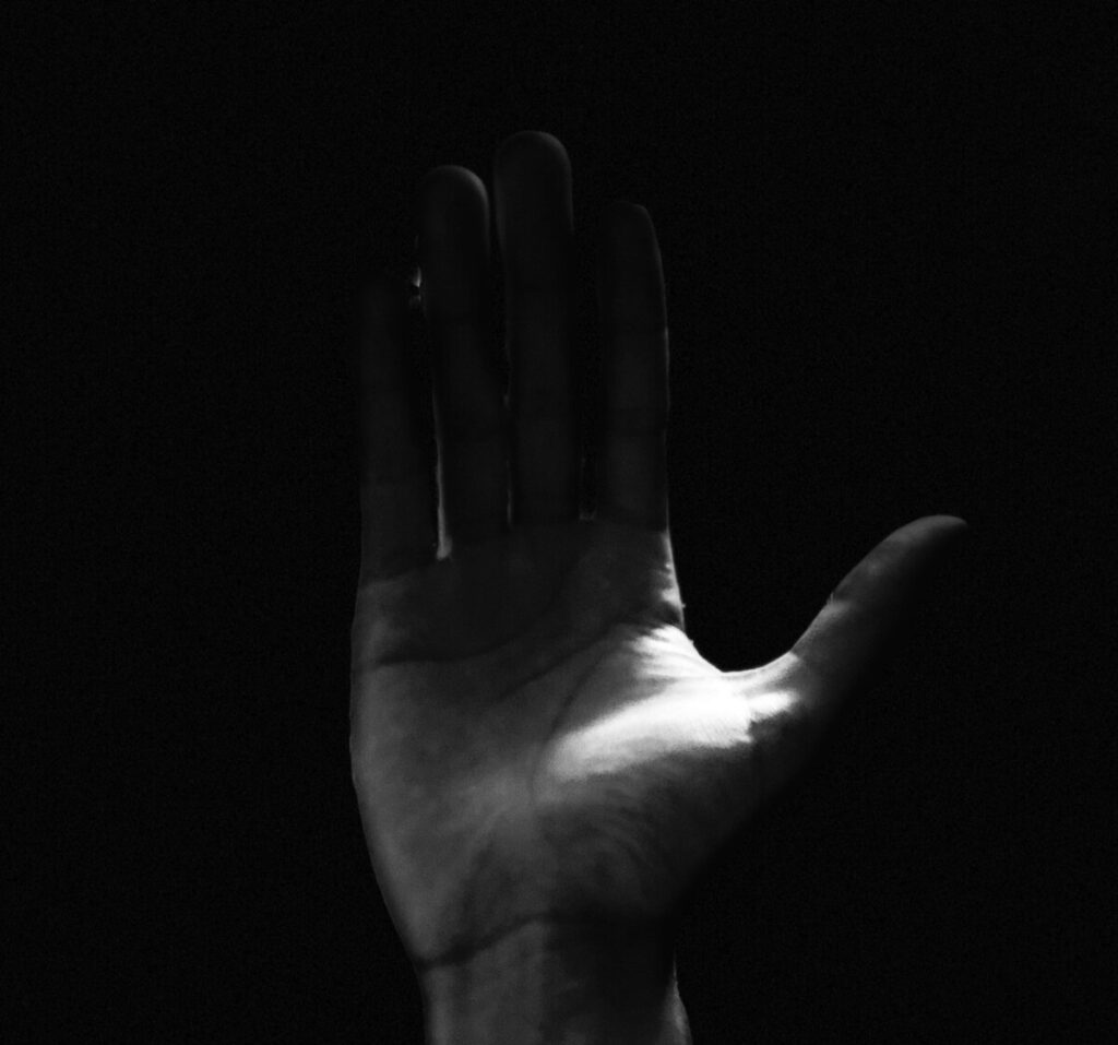
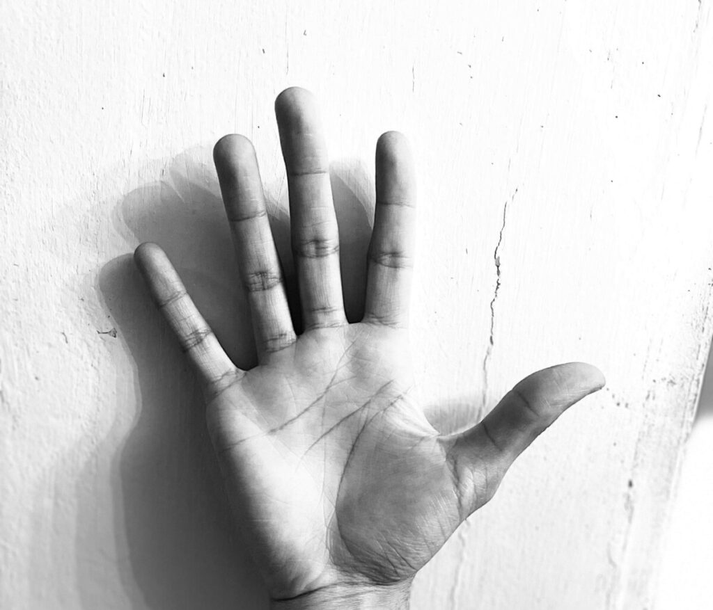

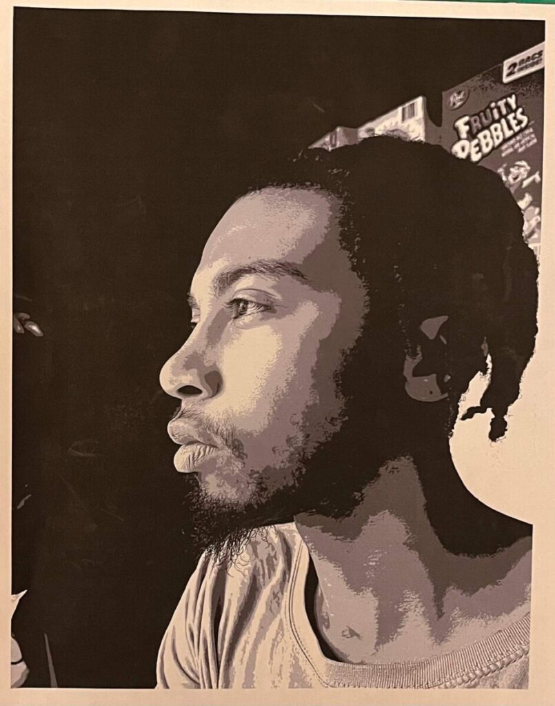
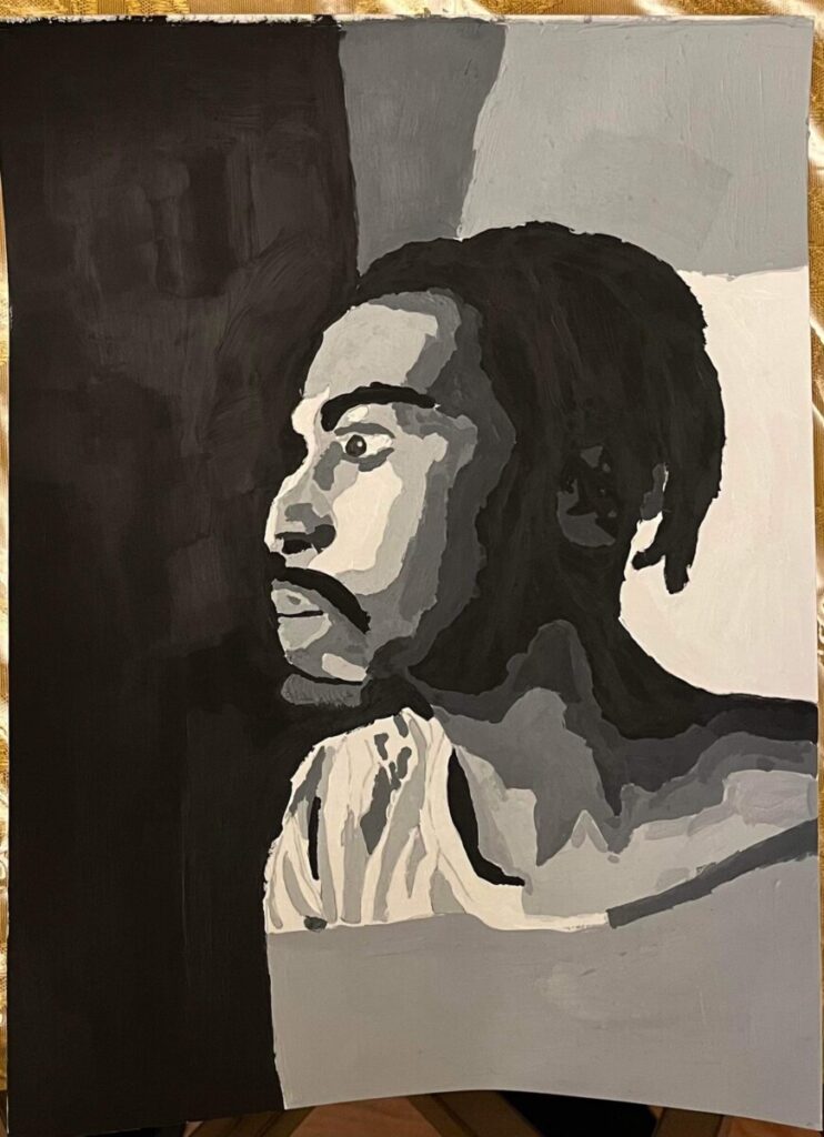
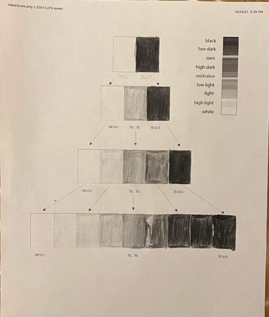
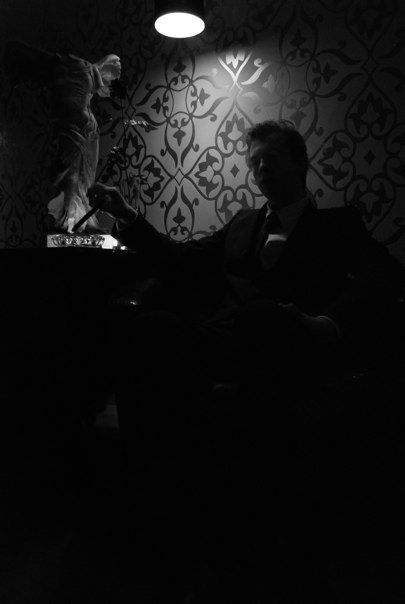
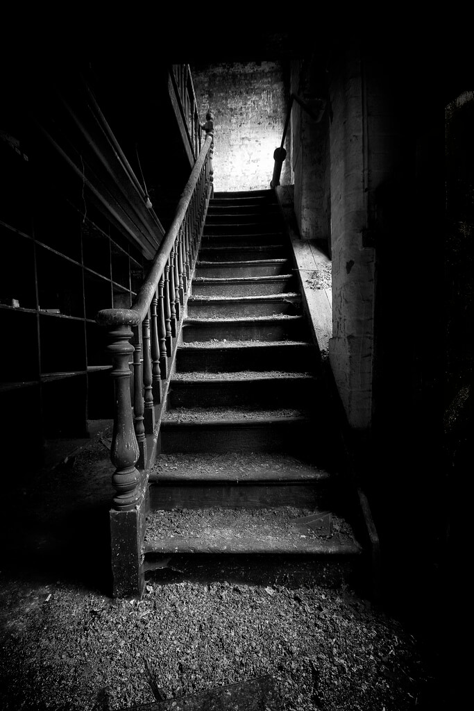
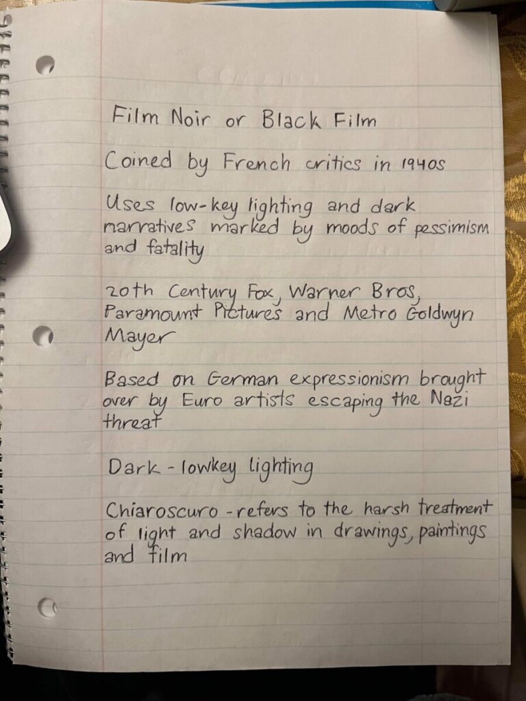


All your photo and portrait photos are understanding the assignment. One, in particular, is the broad value range photo of your hand. You found the right shadow and light to create a photograph that still had a shape of a hand. Without taking that hand shape away you have light bounce from the harsh light on your palm to the edges. Still creating the shape and showing the details of a palm. And keeping all values by having a harsh light and shadow. Your notes show how you have studied the vocabulary, it shows in your photography and painting.
One recommendation I have is if the posterized photo doesn’t fit the 9” 12” bristle then create a white border that won’t be painted on. However, you did a good job of finding a scale that merged well with the shirt. Other than that the portrait is well taken and the use of the bristol was used to the edges of the paper.
Hi Rian, The full value portrait painting comes through nicely; it’s a challenging process but really does capture the mood of the noir photo. The eye is hardest- you could still look closely at the upper lid and bring down to cover a tiny bit of the pupil, to take away the surprised look. Small brushes for details and the soft middle and light grays for gradation. You could slowly reshape the profile at the nose to get the rounder shape.
Nice job though overall. I hope you enjoyed!