I entered my internship with complete dedication and a desire to succeed. Although I had many anxieties before I started, I aspired to overcome them and be the best version of myself that I could be. The organization I interned with is a not-for-profit, and they rely on designs for donors to invest in the organization. At first, I wasn’t sure how creative I should be because the branding guideline document I received was limited. It didn’t include enough information or typography options. I assumed I had to stick to the guidelines to a T. My first design was underwhelming and dull. I was afraid to utilize more creative ideas. When I submitted the project, I asked my supervisor if I may use other forms of typography. She agreed that it was fine as long as I maintain professionalism. That was a game-changer and opened the door to more advanced ideas. My supervisor also recommended I play around with shapes and other embellishments to add dimension. After that, I wasn’t fearful to utilize more diversity in my creations, and most were well received.
The feedback I received I took constructively and used it to better my designs. I am a fan of rules and instructions, and I work best when I have an outline. My supervisor gave all the interns good constructive feedback that was specific for each element. I feel grateful that she went out of her way to make sure we understood what was needed. Before submitting the final designs, I mentioned that I was more than happy to make any revisions she felt were necessary.
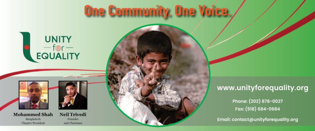
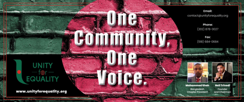
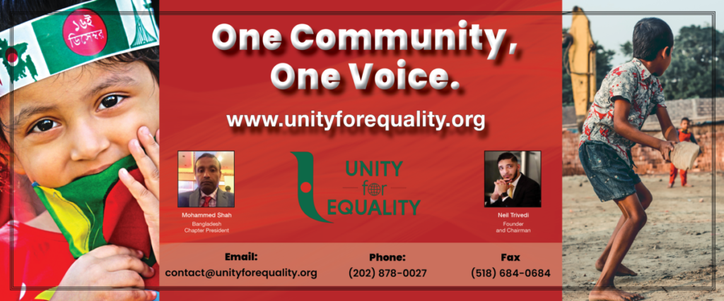
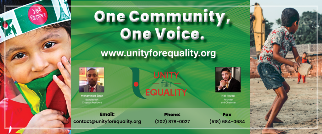
The most challenging project I had was the Bangladeshi Chapter banners. I was asked to include a lot of company information in a small work area. Additionally, I had to include two photos of members of the organization, their names, and titles, which did not fit in well with the design. It took a lot of trial and error before I found a placement I thought was successful. Because the Bangladesh Flag consists of red and green, I wanted to incorporate those colors onto the banner. However, the organization’s Bangladesh logo shares the same colors, and it clashed with many of my initial ideas. I had to play around with the color tone and contrast to find a good balance. I have included updated designs of the banner below, which came after I received feedback. The project was successful, and my supervisor was happy with the outcome.
The most inspiring project I worked on was for hat designs. I found fun ways to incorporate the company information and tagline into a small space. I researched other successful hat patterns, and I found layout tutorials to learn how to utilize specific techniques in Illustrator and Photoshop. I designed about eight, and I felt each design was more comprehensive than the last. After I submitted the project, I was asked to incorporate the company globe into them. I found inventive ways to add in the embellishment, and my supervisor was highly impressed.
My experience working with the non-profit organization was very positive, and with each assignment, I took in a lot of information and grew with it. The projects grew more challenging, and I became more determined to overcome those challenges. Seven weeks later, I feel I am a stronger designer, and I have more confidence in a professional work setting.


