Contents
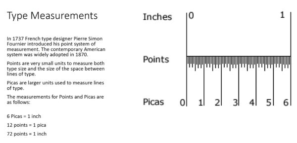
Measurements
6 Picas = 1 inch
12 points = 1 pica
72 points = 1 inch
Points and x-height, are essential for a designer to understand.
Picas and points
These are the foundational units of typographic measurement. Think of them as the centimeters and meters (or inches and feet) of typography… though you’ll probably rarely use picas and will use points constantly. I understand that these technical definitions might not mean a lot now, but they will be useful later.
Picas
Not used as widely as it once was, the pica is about ⅙ of an inch. You may see it represented in InDesign as a number in front of a lowercase p. For example, 3p is 3 picas.
Points
The smallest and most common typographic unit of measure, the point is 1⁄72 of an inch or 1⁄12 of a pica. It was originally based on the size of the metal body on which characters were cast. If using pica-based measurements in InDesign, points are the number after the lowercase p. For example, 3p2 is 3 picas and 2 points.
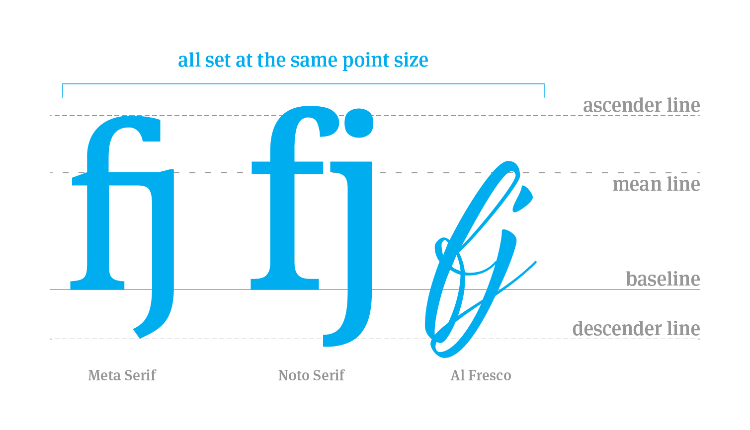
Point size inconsistency
Don’t trust the point size of a typeface to tell you the whole story. As you can see from this example, point size does not guarantee consistent sizing across typefaces. The measuring lines in this example are all set to Meta Serif. There are subtle differences between Meta Serif and Noto Serif and major differences between Meta Serif and Al Fresco. Just because the software says it is 12 points doesn’t mean it will always be the same size as another typeface at 12 points. In time you’ll be able to gauge this with your eye but when in doubt, print it out.
Ems and ens
Those sound a lot like letters, don’t they? That’s because these width measurements are roughly based on the uppercase (and sometimes lowercase) M and N. Though you’ve likely never heard of them before, they’re important units of measurement that are used for dashes and spaces.
about:blank
Em and en dash size inconsistencies
Because some typeface designers feel the em dash is too large, they often take liberties with its size. As you can see in this example, em dashes are rarely the width of an actual em, while en dashes are typically more accurate. Some graphic designers prefer to use the en dash in place of the em dash because of how large the em dash can feel. Personally, I like ‘em. Pun intended.
about:blank
Character measures and invisible lines
The key ones to understand are the baseline and x-height, but there’s nothing wrong with learning about all of them. Click on each unit of measurement to learn more about it.
From https://openeducationalberta.ca/typographyhandbook/chapter/measurements/

