We do not meet on Fri 5/25 – class is over. Have a great summer!
My mailbox is in room 1112 under my last name “Daiga”. Graded projects will be there starting Tues 5/30 through September. You can collect them during that time.
Due 5/22
1. Design Journal entry #28 (post to your eportfolio)
Take pictures of your final project and tell us what you learned creating it.
2. Project 5 due by the end of class
+ Include 2 sheets of tracing paper following our regular format directions. The bottom sheet is for your self assessment, the top is for me.
(no late projects will be accepted)
Due 5/19
1. Design Journal entry #27
Process color, spot color and hex triplets
2. On your eportfolio post 3 pictures of things that you would like to take a color inventory of. Any kind of picture will do- found on the internet (with a source) or taken with a camera yourself, it can be a picture from a game, or of an object, or a landscape, etc.
3. Project 5 40% complete (a good example would be to have margins marked, the color proportions painted)
Details colorinventoryformat
Link to video explaining color inventories
This will be due on Tuesday 5/23
Due 5/16
1. Design Journal entry #26
Listen to the beginning of this podcast and write what you think about it (you only have to listen to the first few minutes about the gray squares).
2. On your eportfolio post an example from the Cooper Hewitt collection, of each color relationship from your last design journal entry:
- monochromatic
- analogous
- complementary
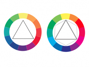
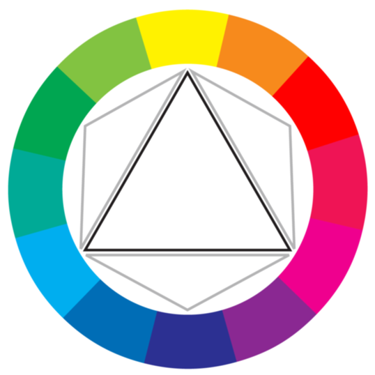
- triad
- tetrad
3. If you have not yet, read pgs 96-101, 106-117 from Design Elements by Timothy Samara, 2nd edition.
Due 5/12
1. Design Journal #25
All of the following terms in regards to color wheel relationships: monochromatic, analogous complementary, triad and tetrad.
2. Project 4 due at the beginning of class.
This includes both color wheels and the saturation continuum with two sheets of tracing paper attached. Bottom sheet has your self assessment.
3. In class 5/9 and 5/12 color interaction exercise which you will post to your eportfolio
There should be five in total:
- Change in hue
- Change in saturation
- Change in value
- Change in hue, saturation and value
- 2 different colors that look like the same color
4. Read pgs 96-101, 106-117 from Design Elements by Timothy Samara, 2nd edition.
Due 5/9
1. Design Journal entry #24
Prismatic color, muted color, achromatic gray, chromatic gray, additive color, subtractive color, Bezold effect, and color interaction
2. CMY and RYB color wheel with saturation continuum 85% done at the beginning of class (we will not be working on it in class today).
- All of Project 4, which includes both color wheels and the saturation continuum, will be due on Friday 5/12 at the beginning of class.
These will need two sheets of tracing paper attached. Bottom sheet has your self assessment.
3. Find an article in the New York Times about color and write a post about it on your eportfolio and include a link to the article.
A good example of the ryb and cmy color wheels.
Due 5/5
1. Design Journal entry #23
Josef Albers, Johannes Itten and Albert Munsell
Who were they and what did they contribute to color theory?
2. CMY color wheel 30% finished at the beginning of class.
Use the template that we handed out in class to create the a CMY color wheel using gouache. Color wheel template BLANK fall2015
- CMY color wheel

Source: http://www.sitepoint.com/rgb-or-cmyk/
Explore the colors. Notice the color when it is wet and when it is dry. Try to create swatches with even coats and no brush strokes or streaks. Glue the swatches in a circle of the center (horizontally and vertically) of a 9″x 12″ piece of bristol.
3. If you have a smart phone or tablet, try out Blendoku
Keep bringing all of your materials to class including paint.
Due 5/2
1. Design Journal entry #22
Color wheel, primary triad, secondary triad, tertiary hues, cmyk, rgb
2. Read pgs 86-95, 102-105 from Design Elements by Timothy Samara, 2nd edition
Read pgs 70-83 from Graphic Design The New Basics by Ellen Lupton
3. Write a post on your eportfolio about something new that you learned about color from the reading assignment.
Due 4/28
1. Design Journal entry #21
Color, hue, saturation and intensity
2. Bring in an example of the most true red that you can find
3. Project 3 due at the beginning of class
This includes:
1. Value Scale set Valuescale_formatguidelines
2. Composition in pencil
3. Composition in pen/ink texture
4. Composition in magazine
5. Composition in gouache
For the compositions, the format is 7″x7″ picture plane centered on your bristol in portrait layout.
Each with 2 sheets of tracing paper cut to size neatly attached to the bristol. The bottom tracing paper must have your self assessment. Point out what needs work and what you did well. What is working in terms of your design principle, transparency, layering and value?
Due 4/25
1. Design Journal entry #20
Why is a self assessment a critical part of your project? What do you get out of doing this? What don’t you get if you don’t complete it?
2. Project 3 70% complete
This includes:
1. Value Scale set Valuescale_formatguidelines
2. Composition in pencil
3. Composition in pen/ink texture
4. Composition in magazine
5. Composition in gouache (don’t worry about the gouache yet, we will learn about this on Tuesday 4/25)
The focus of this project is transparency and layering, so make sure that both are very present. As always, no symbolism. Apply all of the things that you have learned about design principles and elements so far in this class.
For the compositions, the format is 7″x7″ picture plane centered on your bristol in portrait layout.
Each with 2 sheets of tracing paper cut to size neatly attached to the bristol. The bottom tracing paper must have your self assessment. Point out what needs work and what you did well. What is working in terms of transparency, layering and value?
Exercise in class 4/21
Due 4/21
1. Design Journal entry #19
Find 3 companies in NYC that you would be interested in working for and why. Look them up and tell us whether they are hiring interns for the summer.
2. Project 3 30% complete
This includes:
1. Value Scale set Valuescale_formatguidelines
2. Composition in pencil
3. Composition in pen/ink texture
4. Composition in magazine
5. Composition in gouache
The focus of this project is transparency and layering, so make sure that both are very present. As always, no symbolism. Apply all of the things that you have learned about design principles and elements so far in this class. Don’t forget about figure ground!
**Extra Credit opportunity**
Over spring break visit a museum, gallery or boutique store which feature design (any kind of design but not fine art) and write a post about the visit using what you’ve learned about design elements and design principles.
Due 4/7
1. Design Journal entry #18
Proportion, rule of thirds, golden rule
2. Start the value scale
This is part 1 of Project 3, so craftsmanship counts!!
Valuescale_formatguidelines
3. Create proposal compositions for Project 3. To do this create 3 different compositions with 9 value steps, exploring layering and transparency (this can include ideas started in thumbnails for Tuesday) These are rough drafts (but a little nicer than thumbnails) and can be either in illustrator or in your design journal. Number each value to be sure that you have 9 (and remember that this includes the ground).
4. Bring a magazine to cut up in class (any will do). Gather your painting supplies for Friday 4/21.
5. Read pgs 70-73 and 82-84 in Design Elements, 2nd Edition by Timothy Samara
Due 4/4
1. Design Journal entry #17
Low key, high key, narrow range and broad range in regards to value, texture density and gouache
2. Create 10 value scales by creating textures and manipulating their density. White to black.
3. Create 10 large thumbnails, with transparency and layering using a 9 step value scale.
4. Write a post on your eportfolio about 3 companies in NYC that you would be interested in working for and why. Include links to their websites.
Due 3/31
1. Design Journal entry #16 (post this to your eportfolio)
Tonal progression, shade, tint, tone and venn diagram
2. Post on your eportfolio a venn diagram that you think is funny
3. Find 3 successful examples of transparency and layering in design from the Cooper Hewitt collection and post it to your eportfolio with a paragraph about what makes them successful.
4. Create 5 thumbnail sketches in illustrator exploring transparency and layering and post it to your eportfolio.
4. Read pgs 76, 94-95 and 102-103 in Design Elements, 2nd Edition by Timothy Samara.
Due 3/28
1. Design Journal entry #15
Value
2. Project 2, Sound movement books completely finished with 3 layers of tracing paper due at the beginning of class.
– bottom layer, draw arrows to show intended movement of composition
– middle layer, your self assessment
– top layer, blank for me
************** MIDTERMS start Tuesday 3/28 *********************
I will be checking your design journals and eportfolios starting today.
In class exercise:
http://veerle.duoh.com/design/article/illustrator_full_spectrum_spirograph
Due 3/26
1. Design Journal entry #14
Layering, transparency and spatial depth
2. 80% of Project 2 (sound movement book) complete at the beginning of class
Remember to focus on movement, rhythm and contrast.
song movement book, the panels are 4in x 4in cut out in bristol
Do not use any representative shapes or symbols. Do not hide pictures in the compositions. Get inspiration from the design principles and think about visual hierarchy in each panel.
3. Take pictures of Project 2 in process and post them to your eportfolio with a quick summary about what you’ve learned.
4. Read pgs 64-67 and 80-81 in Design Elements, 2nd Edition by Timothy Samara.
Read p 126-157 from Graphic Design The New Basics by Ellen Lupton (digital edition through the library)
Project 2 is due 3/28 at the beginning of class
************** MIDTERMS start Tuesday 3/28 *********************
I will be checking your design journals and eportfolios starting today.
Due 3/21
1. Design Journal entry #13
Choose a design principle that inspires you and tell us why.
2. Find 3 successful examples of movement and 3 successful examples of rhythm in design from the Cooper Hewitt collection and post it to your eportfolio with a paragraph about what makes them successful.
3. 40% of your sound movement book complete at the beginning of class
Remember to focus on movement, rhythm and contrast.
song movement book, the panels are 4in x 4in cut out in bristol.
Do not use any representative shapes or symbols. Do not hide pictures in the compositions. Get inspiration from the design principles and think about visual hierarchy in each panel.
3/14 is a snow day- enjoy!
For Friday 3/17, have all of the assignment for 3/14 finished.
Also, extra credit if you come in with 8 perfectly cut 4″x4″ squares of white bristol and 8 perfectly cut 4″x4″ squares in black paper. No partial extra credit will be given.
Due 3/14
1. Design Journal entry #12
What does rhythm have to do with design? Can a composition not have a rhythm? Write a brief paragraph in your design journal and look up a successful example of rhythm in design.
2. 3 mock ups completed on both sides inspired by the songs you chosen to work with
Remember to focus on movement, rhythm and contrast.
song movement book
3. 40 thumbnails inspired by songs of your choice
Extra credit opportunity
Using a scanner, scan the pattern that you created and email it to me
Due 3/10
1. Design Journal entry #11
Mock-up, composition
2. Create 30 thumbnail sketches exploring movement
Create 30 thumbnail sketches exploring rhythm
3. Read p 29- 40 from Graphic Design The New Basics by Ellen Lupton
Read p 59 and p 80-85 in Design Elements, 2nd Edition by Timothy Samara.
Due 3/7
1. Design Journal entry #10
Rhythm, movement
2. Look on Coroflot to find 3 strong examples of rhythm and 3 strong examples of movement in design. Post it to your eportfolio with a paragraph about what makes them successful examples.
3. Take photos of 3 subway platform posters which show a strong visual hierarchy and post it to your eportfolio with a brief explanation.
4. Read p 114-125 and 214-233 from Graphic Design The New Basics by Ellen Lupton (digital edition through the library)
Due 3/3
1. Design Journal entry #9
Visual hierarchy and emphasis
2. Create 30 thumbnail sketches exploring contrast
3. Find 3 successful examples of the design principle contrast from the Cooper Hewitt collection (or from anywhere on their website if the pictures aren’t appearing on their collection page) and post it to your eportfolio with a paragraph about what makes them a successful example of contrast.
4. Read p 28-39 from Graphic Design The New Basics by Ellen Lupton (digital edition through the library)
Read pgs 60-63, 68-77 in Design Elements, 2nd Edition by Timothy Samara.
Due 2/28
1. Design Journal entry #7 (#8)
What is the difference between art and design?
2. Project 1 completely finished with tracing paper at the beginning of class
This includes 2 sets of 2 black paper cutouts with frames and one hand inked pattern. Double check format directions to be sure that you did this correctly. Good craftsmanship is essential!
Format guidelines for both parts of the project:
Project1_formatguidelines_9x12
Project1_formatguidelines_ink
Tracing paper guidelines for project 1:
Tape 3 layers of tracing paper cut to size and folded over in the back.
- The bottom layer is for you to sketch in the negative space from your original composition.
- The second layer is for your self-assessment.
- The third (top) layer is for me.
Do not use any representative shapes or symbols. Do not hide pictures in the compositions.
3. Post pictures of Project 1 on your eportfolio and write a post about what you learned.
4. 12 quick textures in your design journal
Due 2/24
1. Design Journal entry #7
Visual weight, contrast, tension
2. 40% of your inked pattern finished Project1_formatguidelines_ink
3. Take 3 pictures of a found textures close up and post it to your eportfolio. Tell us how you might use it for a design project.
4. Read p 28-39 from Graphic Design The New Basics by Ellen Lupton (digital edition through the library)
Read pgs 60-63, 68-77 in Design Elements, 2nd Edition by Timothy Samara.
Due 2/21
1. Design Journal entry #6
Pattern, texture, repetition, craftsmanship
2. Part 1 of Project 1 (black paper cutouts) completed
Create 4 compositions using your knowledge of geometric and organic shapes and the figure ground relationship.
Format guidelines here: Project1_formatguidelines_9x12
(to create 4 compositions you will be creating 2 sets). Double check format directions to be sure that you did this correctly. Good craftsmanship is essential!
Tips
- Do not use symbolic or representative shapes (no pictures of lemons, turtles, suns, people, words, etc).
- Less is more.
- Play with scale and the relationship of the shapes to each other.
The second part of project 1 is to create an inked pattern. Project1_formatguidelines_ink
Tracing paper guidelines for project 1:
Tape 3 layers of tracing paper cut to size and folded over in the back.
- The bottom layer is for you to sketch in the negative space from your original composition.
- The second layer is for your self-assessment.
- The third (top) layer is for me.
3. Find a current design students’ work that you like (from any school in the world), post a link to their work and tell us why you like them on your eportfolio.
4. Read pgs 54-57 in Design Elements, 2nd Edition by Timothy Samara.
Read p 184-197 from Graphic Design The New Basics by Ellen Lupton
Due 2/17
1. Design Journal entry #5
Symmetry, asymmetry, axis, balance
2. Part 1 of Project 1 (black paper cutouts) completed
Create 2 compositions using your knowledge of geometric and organic shapes and the figure ground relationship.
Format guidelines here: Project1_formatguidelines_9x12
Tips
- Do not use symbolic or representative shapes (no pictures of lemons, turtles, suns, people, words, etc).
- Less is more.
- Play with scale and the relationship of the shapes to each other.
3. Read p 28-39 from Graphic Design The New Basics by Ellen Lupton (digital edition through the library)
Read pgs 60-63, 68-77 in Design Elements, 2nd Edition by Timothy Samara.
Due 2/14
1. Design Journal entry #4
Scale, harmony, unity
2. Look for perks that you get as a CUNY student (i.e. free entrance to Cooper Hewitt Museum, free digital ny times membership, discounts, etc) and write a post on your eportfolio about your favorite perk.
3. Cut out a 2″ x 2″ square in the middle of a 4″x 4″ sheet of paper (bristol or even design journal paper is fine). Place this over multiple areas of your original composition and take a zoomed in picture of these framed micro compositions. Post 4 of these pictures to your eportfolio and write a few sentences about how frame and scale affected your composition.
4. Four more of these compositions, so there will be 8 total.
Figure ground paper assignment due at the beginning of class. Cut out two 4″ x 4″ squares in white Bristol and two 4″x 4″ squares in black paper. Cut out various shapes in both white Bristol and black paper to create compositions exploring figure ground on the square background. Use white Bristol shapes on the black background and black paper shapes on the white background. There should be 4 compositions in total at the beginning of class. Do not use any representative shapes or symbols. Do not hide pictures in the compositions. The goal is to explore balance shape and space- positive and negative while working on craftsmanship.
5. Read pgs 58-59, 70-71 in Design Elements, 2nd Edition by Timothy Samara.
Read p 84-111 from Graphic Design The New Basics by Ellen Lupton (digital edition through the library)
Due 2/10
1. Design Journal entry #3
Picture plane, frame, format, space and Gestalt theory
2. Figure ground paper assignment due at the beginning of class. Cut out two 4″ x 4″ squares in white Bristol and two 4″x 4″ squares in black paper. Cut out various shapes in both white Bristol and black paper to create compositions exploring figure ground on the square background. Use white Bristol shapes on the black background and black paper shapes on the white background. There should be 4 compositions in total at the beginning of class. Do not use any representative shapes or symbols. Do not hide pictures in the compositions. The goal is to explore balance shape and space- positive and negative while working on craftsmanship.
3. Finish 10 thumbnails exploring shape and and 10 thumbnails exploring figure ground if you did not get to complete it during class.
4. Read pgs 58-59, 70-71 in Design Elements, 2nd Edition by Timothy Samara.
Read p 84-111 from Graphic Design The New Basics by Ellen Lupton (digital edition through the library)
Due 2/7
1. Design Journal entry #2
Shape, form, geometric shape, organic shape and figure ground
2. Make sure that you have bought all of the materials (with the exception of painting supplies) and bring them to class every day.
3. Read pgs 06-09, 40-53, 288-291 in Design Elements, 2nd Edition by Timothy Samara and p 11-23 from Graphic Design The New Basics by Ellen Lupton
4. Write a post on your eportfolio about why it is important or useful to start the design process with thumbnail sketches.
5. Make 10 thumbnails exploring point, 10 thumbnails exploring line, and 10 thumbnails exploring plane/shape using any of your materials for class in your design journal. (3o total thumbnail sketches)
*TIP: Think about size, location, grouping- in general the elements in relation to each other.
No symbolism or representative shapes!
Due 2/3
1. Buy materials
2. Design Journal entry #1 (see below for guidelines)
Point, line, plane
3. Set up your ePortfolio on OpenLab and write an introduction on your page.
Include:
1. write out your design goal, why are you taking the class?
2. what type of work inspires you? what else inspires you?
3. what is your preferred design process – how do you like to work? (i.e. coding, on the computer, with a marker, pencil, in small notebooks, murals, collages, planned out, spontaneous, etc.)
4. what types of projects would you be interested in collaborating on?
4. Eportfolio: Go to www.nytimes.com/passes and sign up with your CUNY email
Find one design related article and write what you thought of the article. Please include the link to the article in your post.
Daily Design Journal assignment
Will be announced online and in class
You will be given visual terms to explore by completing the following (for each term):
1. Write the formal definition and the source
2. Write a definition in your own words
3. Find or create a visual example of this term.
Assignments for your design journal may also include a reflection question on areas of contemporary design and your experience.

