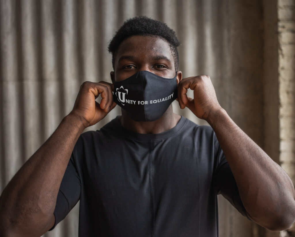
The second task I was asked to create was face mask mockups using the organization’s logo. This was due on the 22nd of June. I came up with 3 designs. A design for a white mask, a design for a black mask, and a patterned mask design. I did not want to overcomplicate them so I made sure they were clear, easy, and readable. I only used Adobe Photoshop for my design process.
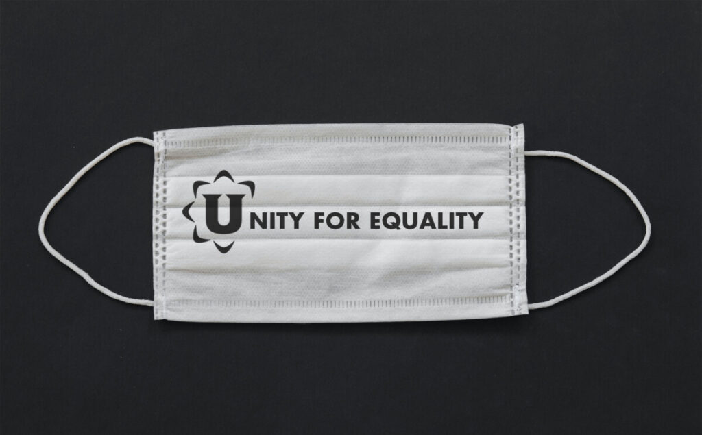
For the first design I took the Logo and made it black then I wanted to incorporate the logo in the design so I used the “U” almost as if it was a drop cap and wrote out the words. I asked my director for the name of the font family used in their logo so that I can match it. I was told the font’s name was Poppins, but he also told me I had the creative freedom to use whatever font I wanted. I decided to go with Futura standard bold because I figured the bold strokes of the logo would compliment that font very well. For the black mask, I took the same logo and painted tooled it white however, I had a new challenge of putting the design into a mask perspective to make it look like someone was wearing the design. I utilized a combination of skewing, transforming, and liquifying.
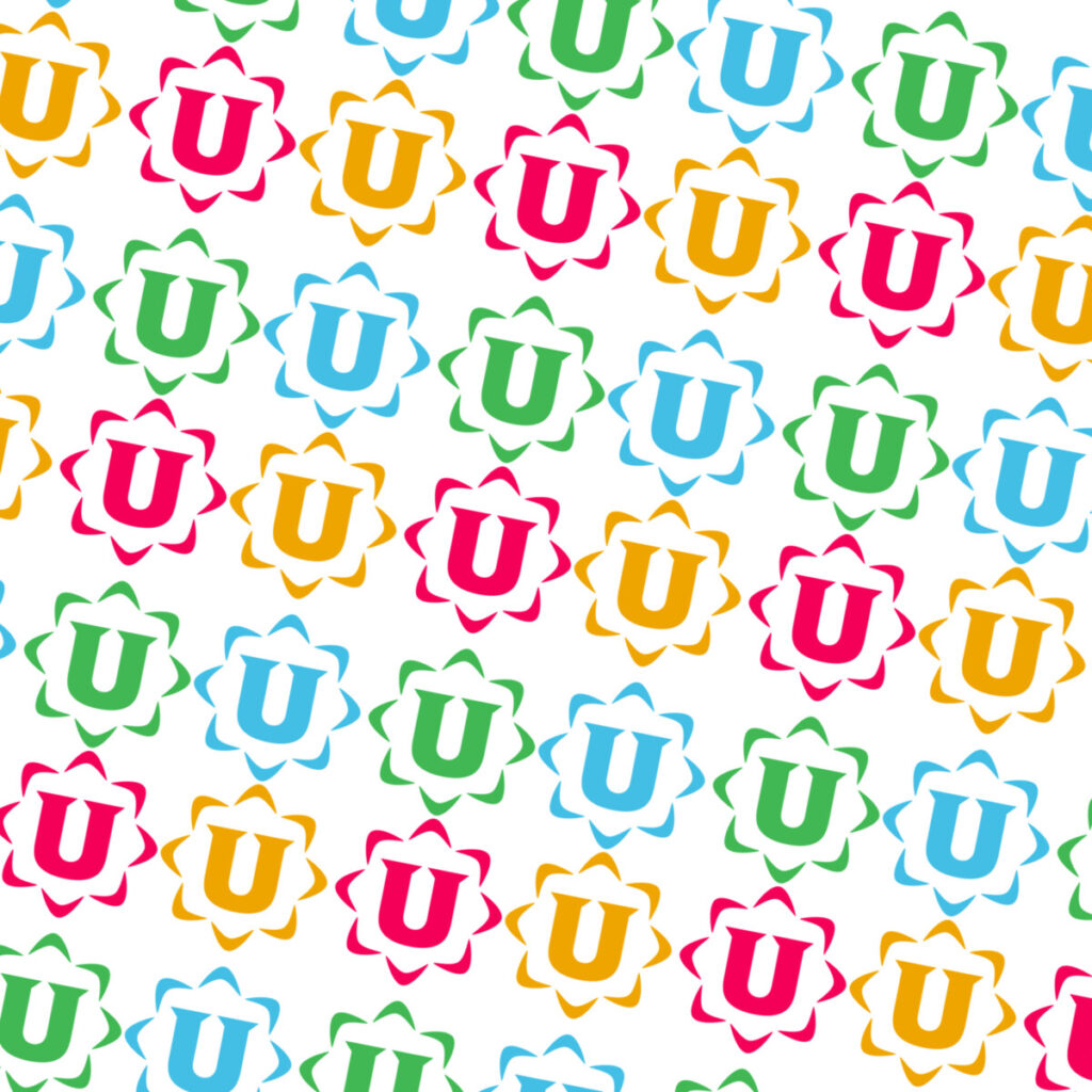
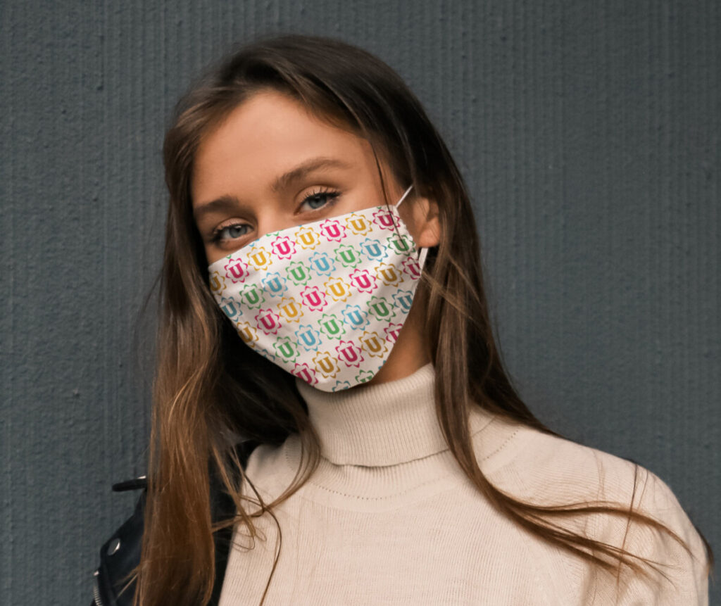
After about an hour I got it just right. For the third design, I wanted to do something very different from the other two. I wanted to make the mask look more expressive so I created a pattern. I took the organization’s logo and made 6 duplicates of it. I spaced them out evenly then I colored each duplicate into a different color of the brand colors. Once I finished the design I went into photoshop and I set the 6 duplicates as a pattern that spread out throughout the entire page. I cut out the mask with the pen tool and masked the pattern to that mask layer. Lastly, I transformed and liquified the pattern then colored in the lights and shadows to make the mock-up more convincing. I think out of the 3 designs I am most proud of the pattern mask.