Author: Patrick Rogers (Page 1 of 2)

Working Bibliography
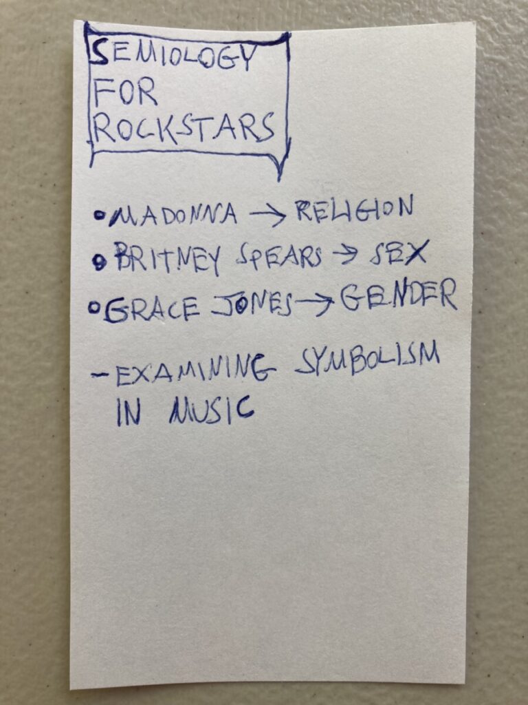
K, Stephanie. “Religion through the Eyes of Lady Gaga and Madonna.” Medium, Medium, 15 Oct. 2016, https://medium.com/@stephanie.karp/religion-through-the-eyes-of-lady-gaga-and-madonna-b9327da95d3.
Freitas, Donna. “Madonna’s Cross Raises Thorny Questions.” NPR, NPR, 16 Aug. 2006, https://www.npr.org/2006/08/16/5658956/madonnas-cross-raises-thorny-questions.
The New York Times. “60 Times Madonna Changed Our Culture.” The New York Times, The New York Times, 16 Aug. 2018, https://www.nytimes.com/interactive/2018/08/16/arts/music/madonna-birthday-impact.html.
Walters, Barry. “As Much as I Can, as Black as I Am: The Queer History of Grace Jones.” Pitchfork, Pitchfork, 25 Aug. 2015, https://pitchfork.com/features/from-the-pitchfork-review/9708-as-much-as-i-can-as-black-as-i-am-the-queer-history-of-grace-jones/.
“Why Grace Jones Was the Most Pioneering Queen of Pop.” BBC Culture, BBC, 22 June 2020, https://www.bbc.com/culture/article/20200619-why-grace-jones-was-the-most-pioneering-queen-of-pop.
Jabbar, Sumayra. “12 Amazing Facts About Grace Jones.” Mentalfloss, Mentalfloss, 7 Jun. 2019, https://www.mentalfloss.com/article/581140/grace-jones-facts.
Wow, so much to say here is my first reaction to this text. Two big main points I think of are, how taking elements from other designers’ work is a huge part of the design process, and I also think of how many designers just blatantly copy other designers work and plug it into a different context.
It’s interesting, there really is a fine line between copying a designer and gathering inspiration from a designer. Sometimes it’s really debatable whether a designer copied someone else or just used elements of that designer’s signatures. Sometimes, however, it is absolutely obvious how lazy a designer is because it is so clear that their work is a copy of someone else’s.
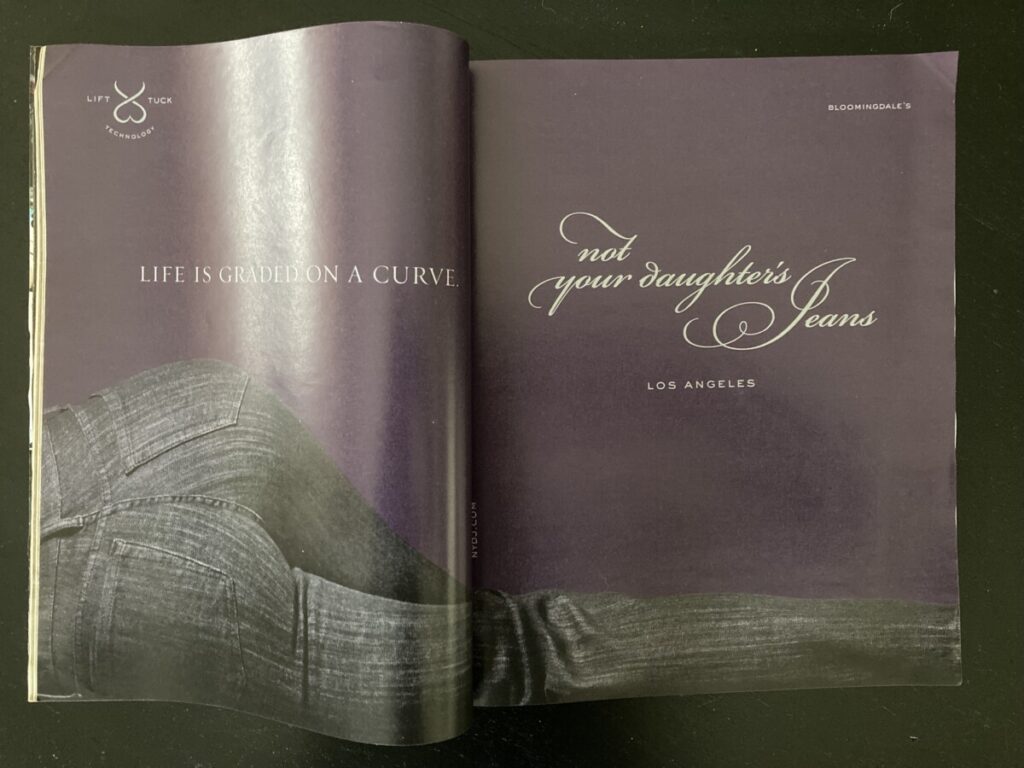
There is an art director I immediately think of, who shall remain nameless, who copied almost every detail of a photograph made many years ago by a renowned British photographer and used it as an album cover for a new recording artist. What’s interesting to me too is that many young consumers today were born after the original photograph was made, and have no idea that this recording artist’s album cover is an almost exact copy of that photograph. I guess it’s true that, in a way, there really is nothing new out there.
When I think of how media extends humanity, the thing that springs to my mind is social media. And social media springs to my mind quickly and forcefully when I think of answering this question, because social media has connected, and therefore amplified and extended humanity pretty drastically. It is mind boggling to me that people in let’s say Tokyo can see what people in New York City post to their social media channels, and therefore sort of have surveillance on what those people are doing, from halfway across the world. It’s easy to understand based on that example alone how ideas are so very rapidly spreading across the world now thanks to social media.
And then when it comes to the hazards of technological progress on individuals and society, social media is also the first thing I think of. And within that topic, the first thing I think of is online bullying. Youth are the main victims of this phenomenon, and it’s such a problem because it affects young people’s self esteem, and therefore ability to contribute to society.
I don’t think the work of a designer is subordinate to the media they use to create, because I think the content of the work is what people really respond to. For example, I don’t think people really focus on the fact that the Mona Lisa is a painting. I think they focus on the mysteriousness of her expression and the mythology surrounding the artwork. However, I do think some ideas work better in some forms of media more so than others.
I think form follows function is really powerful, and it’s interesting to me that Tschichold rejected anything outside of form follows function as ineffective. A part of me loves that, but a bigger part of me loves highly decorative, less functional typography and design in general. Tschichold seems to champion sober, highly functional, rather plain typography, but I must admit I love the other side of the coin. Why can’t typography and other types of design be decorative and frivolous, with pleasure being the sort of ‘function’ of the design?
I find Gerstner’s programme for designing to be mathematical, clinical, and devoid of emotion. I suppose it is one way of designing, and most definitely a unique one and probably a powerful and effective one I will admit. However, for me, it defeats the purpose of design. I try to design with emotion, and I express my personal point of view in my designs. For me it is so much more enjoyable that way.
Muller-Brockmann’s design ethos is again, for me, far too mathematical, objective, and cold. There is one element of his design ethos that I agree with, that is the technique of systemizing processes. Systemizing is something I do in my design work and life in general, because I find it makes every process easier, since once I design the system, all I have to do is execute that system over and over again to get to my desired outcome.
In the Gropius text, he mentions that “no longer can anything exist in isolation”. This very much speaks to contemporary times, with the ubiquitous presence of the internet and social media. It’s crazy to think how in Gropius’ time you couldn’t just open your phone and run a search on a topic you want to learn about. You had to go to a library and spend hours searching for books on the subject instead. It’s also crazy to think how anything we post to social media can be looked at by anyone in the world with a smartphone. Nothing exists in isolation anymore, certainly.
The Bauhaus was absolutely forward thinking in its approach. It prioritized connection to industry, which is precisely where art and design was headed at that moment. Also, I think the curriculum of the Bauhaus was so clever. The idea of a preliminary course is not only the logical starting point for creative education, but a brilliant way to make the starting point egalitarian.
Bayer seems to be very critical of our alphabet and writing system in general in his On Typography text, but I think our writing system is simple and effective. I would not change anything about it. Bayer writes about how advances in typography will not come from design variations of long-established forms such as the book, and I think he’s absolutely right.


Recent Comments