Author: Darren Le (Page 1 of 2)
Let's making a design

A Reference for sketches 


A working bibliography…..
Los Angeles Times. (2018, September 4). ‘just do it’: The surprising and morbid origin story of Nike’s slogan. Los Angeles Times. Retrieved May 4, 2022, from https://www.latimes.com/business/la-fi-nike-colin-kaepernick-20180904-story.html
Wilson, J. (2020, May 3). The last dance: How a spike Lee and Michael Jordan commercial came to be. The Last Dance: How a Spike Lee, Michael Jordan commercial came to be. Retrieved May 2, 2022, from https://hoopshabit.com/2020/05/03/last-dance-spike-lee-michael-jordan-commercial/amp/
Laliberte, M. (2021, April 2). The surprising origin of Nike’s “Just do it” slogan. Reader’s Digest. Retrieved May 2, 2022, from https://www.rd.com/article/nike-just-do-it-origin/
Wilson, J. (2020, May 3). The last dance: How a spike Lee and Michael Jordan commercial came to be. Hoops Habit. Retrieved May 2, 2022, from https://hoopshabit.com/2020/05/03/last-dance-spike-lee-michael-jordan-commercial/
Ahla. (2020, November 14). Ahla. Kickzon. Retrieved May 2, 2022, from https://kickzon.com/the-air-jordan-spizike-and-spike-lees-importance-to-jordan-brand/
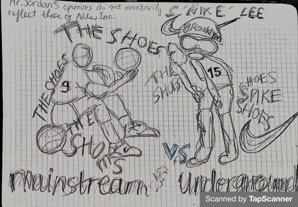
For Heller, the issue of mainstream vs. subterranean is essential in the current design because, despite the stile’s popularity, designers often duplicate or steal ideas. Heller introduces the argument in the paragraph that current design became significant because marketers were continuously looking for new methods to express themselves and relied on modern culture to do it. Heller also continues to talk about how they will alter the work slightly if even that, then they reissue them, to the world as new products.
So, sometimes the original work goes unnoticed while the copy gets a lot of credit. As an artist student I couldn’t say I didn’t know that these types of things go on. It’s understandable to get inspiration from past products but to take old ideas and copy them just isn’t right and has a bad effect on the design world. For one when doing this you’re not really being creative and before you know it everyone will all have designs that look almost the same, which gets boring and would eventually lose the attention of the audience because it doesn’t intrigue them anymore. The underground designs had no formal link with the designs that came to mind. They did, however, emerge as a byproduct in order to deter the public’s attention. It is in fact, that the underground appears to have only two options for dealing with the mainstream: join it or change it. The underground will either adhere to or disconnect from the ideology provided, depending on the individual and the ideology presented.
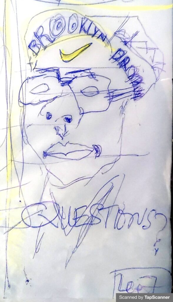
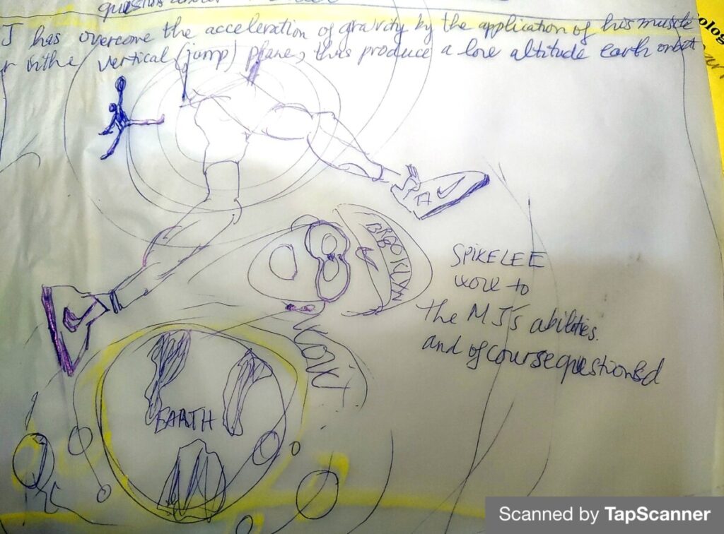
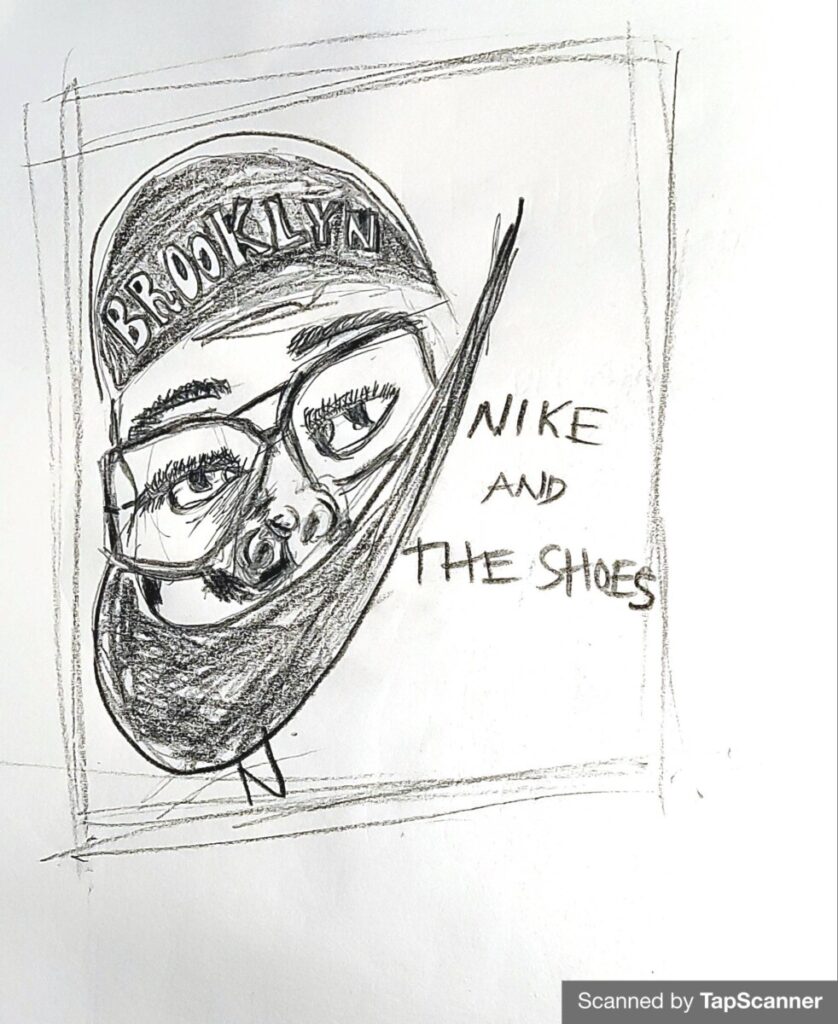
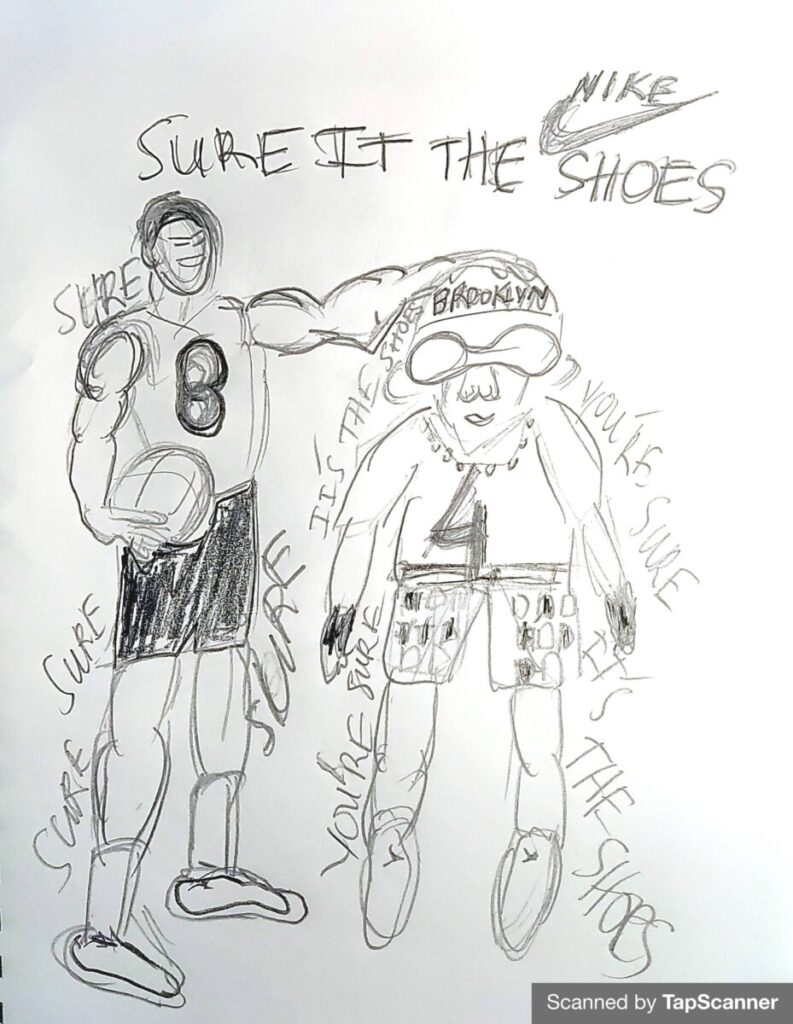
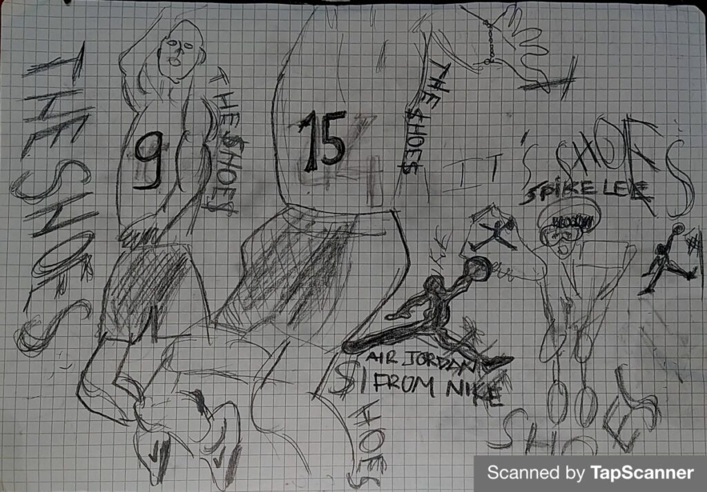
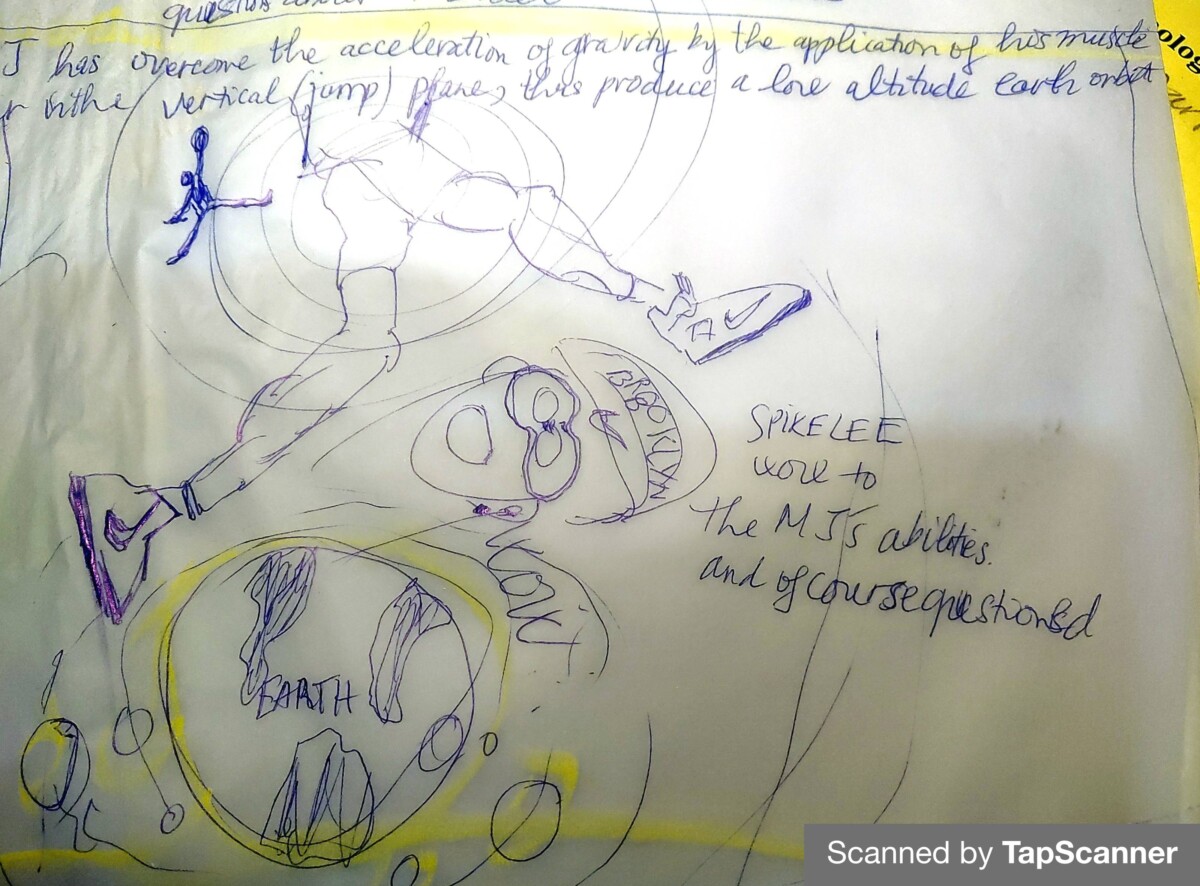
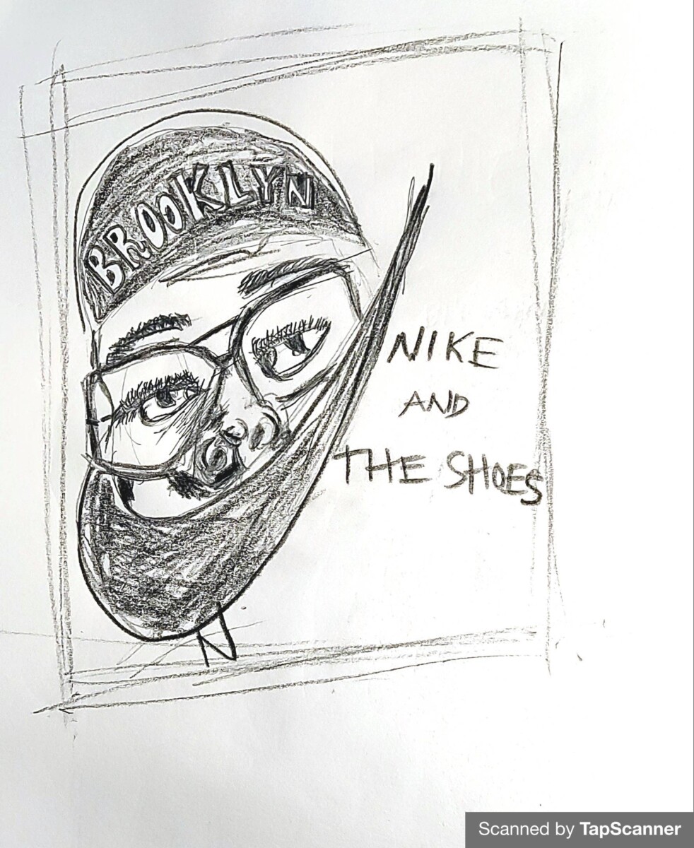
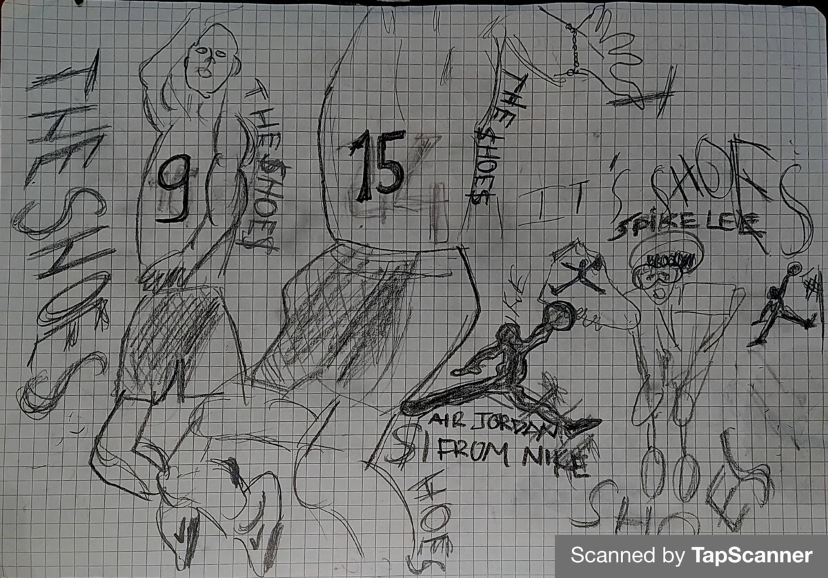
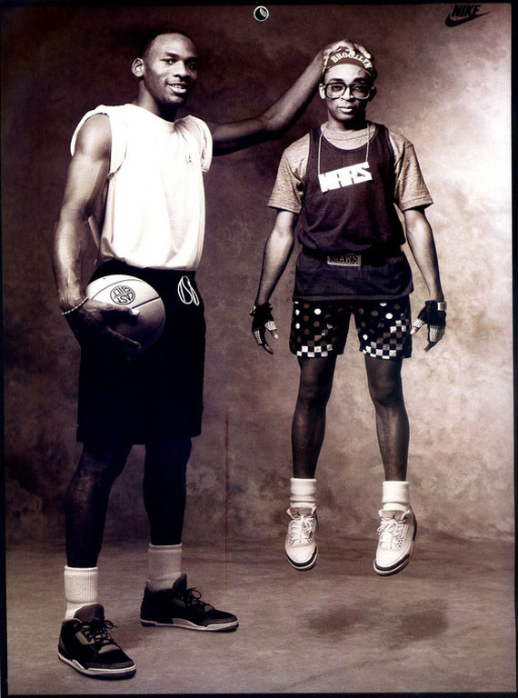
What gets our audiences and get people looking at what our doings are our unique styles and how we present things to them, it’s all about standing out. For instance, in Nike ad saying, when it comes to the designer, the phrase that Spike Lee used was “Just Do It”. He stole this slogan from a man named Gary Gilmore, who when on death row said, “let’s do it”. Dan Wieden then took off lets and added just and that’s how Nike came up with their famous slogan. That’s one of the only times I can think of when they stole an idea or altered one to make a new product or campaign. This is where the designs or the designer that I will be addressing for my final presentation fit into this separation.
Underground design that affects related jobs is mainstream, and corporate culture steals ideas from the underground counterculture movement. The specific posters I chose was the collaborations between Michael Jordan and Spike Lee. When reading an article on what was the inspiration for the ad campaign, I found they were trying to sell Michael Jordan sneakers, there were a bunch of Michael Jordan sneakers coming out at this time. When doing this Nike tried to tap into the “Sneaker Head Culture”. The shoe industry was growing fast, and people started to have somewhat of an addiction to shoes. Most people were fine with a couple pairs of sneakers, but some people were collecting more than a hundred pairs of shoes. I think these are ways has the work in question shaped the mainstream.
Sneaker Head is people who is collecting shoes
Citations
https://nike-justdoit.weebly.com/influence-on-pop-culture.html. (n.d.).
Barnard, Malcolm. Graphic Design As Communication, Taylor & Francis Group, 2005. ProQuest Ebook Central,
Meggs, Philip B., and Alston W. Purvis. Meggs’ History of Graphic Design, John Wiley & Sons, Incorporated, 2016. ProQuest Ebook
In Roland Barthes’ “Rhetoric of the Image” essay, he explains how images hold and convey meaning through three messages, linguistic message, non-iconic decoded message and coded iconic message. Signs, signifiers, and signified are used within images as a written language to help communicate the message. Barthes simplified the science of advertising, breaking down the three messages. We understand this information because of our cultural awareness, social and personal experiences. Looking at the image a product or service advertisement content is used to explain the message.
- An appeal to history and a symbol of purity are seen as a guarantee of quality
2. The second paradox is that KAB(Keep American Beautiful) is made up of leading beverage and packaging companies.

Kristine Danielsen commented that she never forgot the ad, respecting nature from a very young age and passing it on to her children and grandchildren.
Ads 3,4) About “Equality in conditions”(Hall.pg.2)

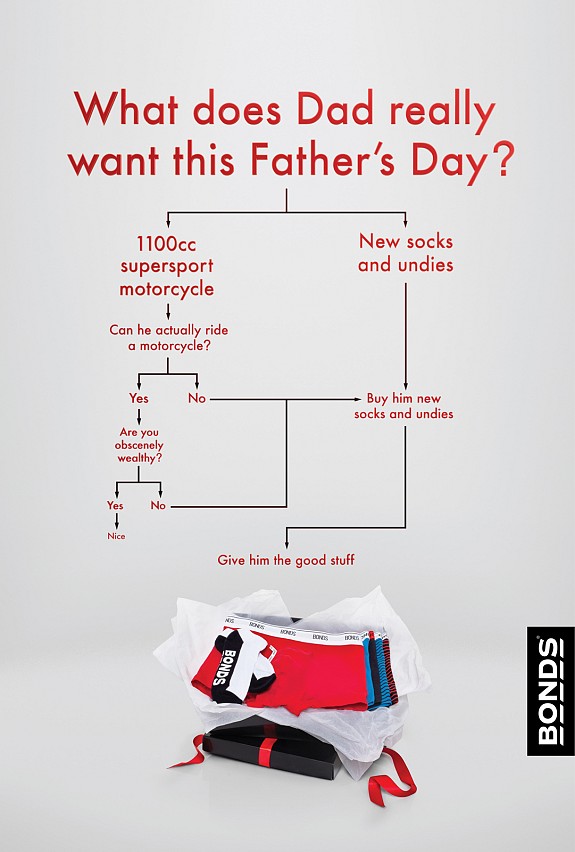
Diapers are now the test, not the dads . Huggies uses the example of “funny fathers”—that is a campaign to incompetent male parents who seem to have no idea how to change a diaper or care for an infant in advertising—as an example of these traditional roles. A funny father is often contrasted with a loving, capable mother. Final ad is about Bonds: Motorcycle. An ad on TV
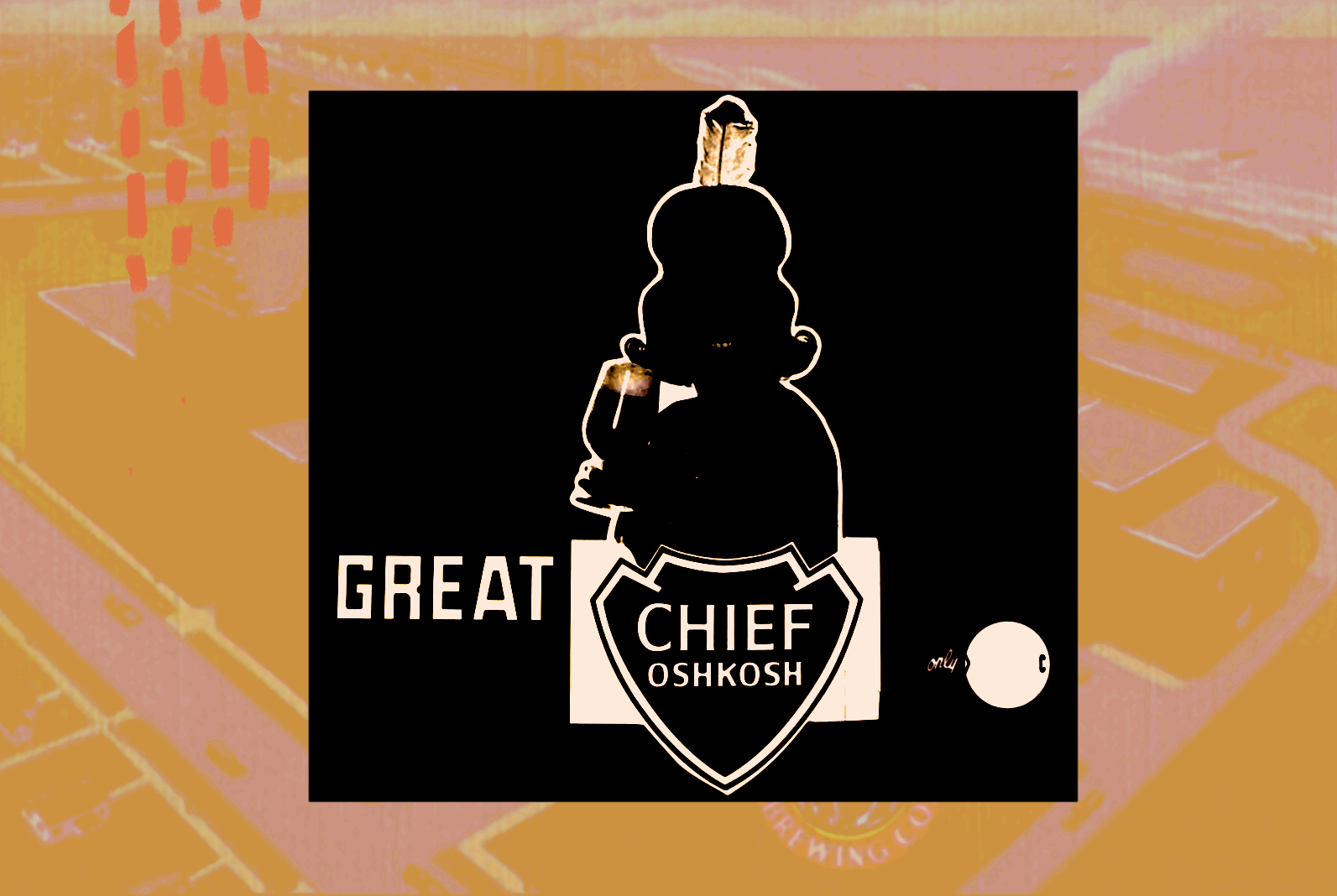
https://www.goodbeerhunting.com/blog/2021/9/21/chiefs-maidens-and-myth-making-a-history-of-american-indians-in-beer-advertising. (n.d
Bonds: Motorcycle. Best Ads on TV. (n.d.). Retrieved March 30, 2022, from https://www.bestadsontv.com/ad/31605/Bonds-Motorcycle
Luis Quijano – digitalcommons.liberty.edu. (n.d.). Retrieved March 30, 2022, from https://digitalcommons.liberty.edu/cgi/viewcontent.cgi?article=1779&context=honors
Watts, A. (2012, March 15). Huggies listened to dads – why it matters. The Good Men Project. Retrieved March 30, 2022, from https://goodmenproject.com/families/huggies-listened-to-dads-why-it-matters/
Marshall McLuhan’s concentration is on English literature, and he is beginning write about the media in the late 1950s. Media ‘passive entertainment,” meaning they change or altar all aspects of our lived experiences. While I study on the technologies that strengthen the internet infrastructure, I have made a collaborative attempt to provide more individual, face-to-face time with friends, colleagues, and family pre, during and post pandemic. This fact has convinced me that tools such as Facebook, Twitter and blogs can be abused by their own makers and cause people to lose the ability to physically interact with others. Public library, book shop, physical bookstore etc.…is replacing the internet in Western culture as the main thing we read.
This is the way of media and design related in comparison’s way. Marshall McLuhan said, “Societies have always been shaped more by the nature of media by which men talk than by the content of the message.” I can tell in the text “Understanding media” that harm is in the technological advances that may be brought to the individual humans do not study media meaning that there is not enough creativity done in technology. “The electric light escapes attention as a communication medium just because it has no “content.” (McLuhan,8).” Media, today’s essential tool that reshapes the pattern of communication, where we must spend on the internet for entertainment purposes, informational research, publishing, broadcasting and more. For instance, there are printed newspapers, which are mainly bought and read by elders on the subway or bus. One of the major risks that might come with technological improvement is the impact it has on the older group using technology. They are going to have a harder time living in a developing modern society, which puts them at a disadvantage when coming to new chances.
Because of the high speed of the internet communication, everybody time is valuable so, I don’t think we can be too slow to show that our designs are relevant or effective. The statement “Media is a massage” means that the way something is conveyed affects the way the meaning is carried by a creator, for example, a political advertisement with lots of color and noise can obscure what’s being said by a designer, and it’s a kind of perceptive alert about social mass media. Another example, you can learn how to do anything online because there are sure to be YouTube videos on how to do it. The interplay between old and new environments creates many questions and confusions. Marshall McLuhan’s collaboration with graphic designer Quentin Fiore uses visual drawing to question conventions associated with print media. A 1967 NBC television experiment even referred to subliminal messages. Subliminal information includes visual or auditory stimuli that the conscious mind cannot recognize. Getting to know more about words/ images presented below our conscious awareness:
The truth about subliminal messages [infographic]. Visme Blog. (2021, November 26).
Designers should be well aware of the positive and negative aspects of the communication tools they are employing and by keeping these ideas in mind, they should try to produce the content that hopefully makes the world a better place.
References
Berke, R. L. (2000, September 12). Democrats see, and smell, rats in G.O.P. AD. The New York Times. Retrieved March 23, 2022, from https://www.nytimes.com/2000/09/12/us/the-2000-campaign-the-ad-campaign-democrats-see-and-smell-rats-in-gop-ad.html
The truth about subliminal messages [infographic]. Visme Blog. (2021, November 26). Retrieved March 23, 2022, from https://visme.co/blog/subliminal-messages/
According to Jan Tschichold, Karl Gerstner and Josef Müller-Brockmann, how should be designed? I personally do not judge any design however, below are my thoughts
We read about how designers should be able to design in a way that they can express themselves. According to Jan Tschichold, the design should be based on the differences between the old typography and the new innovative typeface. Most of his work is in red and black color. Hence, I firmly believe that this place is the main goal of every designer, to create something that everyone can receive and understand clearly. The goal of old typography held a sense of attractiveness and clearness, but Tschichold points out that new lettering also had a feel of simplicity and clarity. When we design with a purpose and incorporate details that improve the functionality, we are able to develop a great design
When we design with a purpose and incorporate details that improve the functionality, we are able to develop a great design. There are some points that our three designers above agreed on. Even though, Müller-Brockmann’s approach is more general, he details the benefits of grids in his article and gives insight into how the grid system “implies the will to systematize” (pg63). However, they state that the typographer not only has to choose the font, but also figure with its weight, height, color, arrangement of lines. There is always a group of solutions, one is the best under specific conditions. Because grouped colors, fonts, sizes (from reading: basics, colors, appearance, and the expression) can be generated behind text and design. They also state that what sets the design apart is the ability to decide where you want to place illustrations, text, and more. Depending on the position, you can get any type of result. Some examples in the article show how complex a design can appear in terms of the shapes used, but the text itself is still well organized such as how letters are formed and are located grids or number of spacing areas by these illustrators.
In conclusion, the value of the text and not be designated according to the way we want to do it, exactly as a technological or natural element had been designed according to their functions.
According to these authors, the lack of art and education in the past is a lack of appreciation for the creation of art, a focus on lettering, writing, principles, structure, and typography. Typography and photography should play the emerging role of technology in shaping the aesthetics and practice of graphic design for the new art. For a long time, “we have all accepted the existence of different languages in use today”, said by Moholy-Nagy. Languages or speech play interacting role in art and design. Speaking language such as speech and presentation writing ways have been adopted in all the languages. In the age of technology, where artists are close to creating the art forms of the future, they should speak to trends that every typographer or typographer must be a part of. Education or “the academy” should teach artists about their field that this is a kind of a challenging profession, and they need to keep creative part and business part at the same time. The Bauhaus idea may be updated to remain relevant in the 21st century by translating the idea of honesty and integrity into every object that incorporates open-air architectural elements, such as exposed beams and visible metalwork. Designers try to create excellent, modern objects that work well in minimalist spaces. Typography is the message made up of fonts. Photography the communication made up of photographs. Visually, typophoto is made up of word’s shapes and pictures.
References
Walter Gropius; The Theory and Organization of the Bauhaus (1923)
László Moholy-Nagy; Typophoto (1925)
Herbert Bayer; On Typography (1967)


Recent Comments